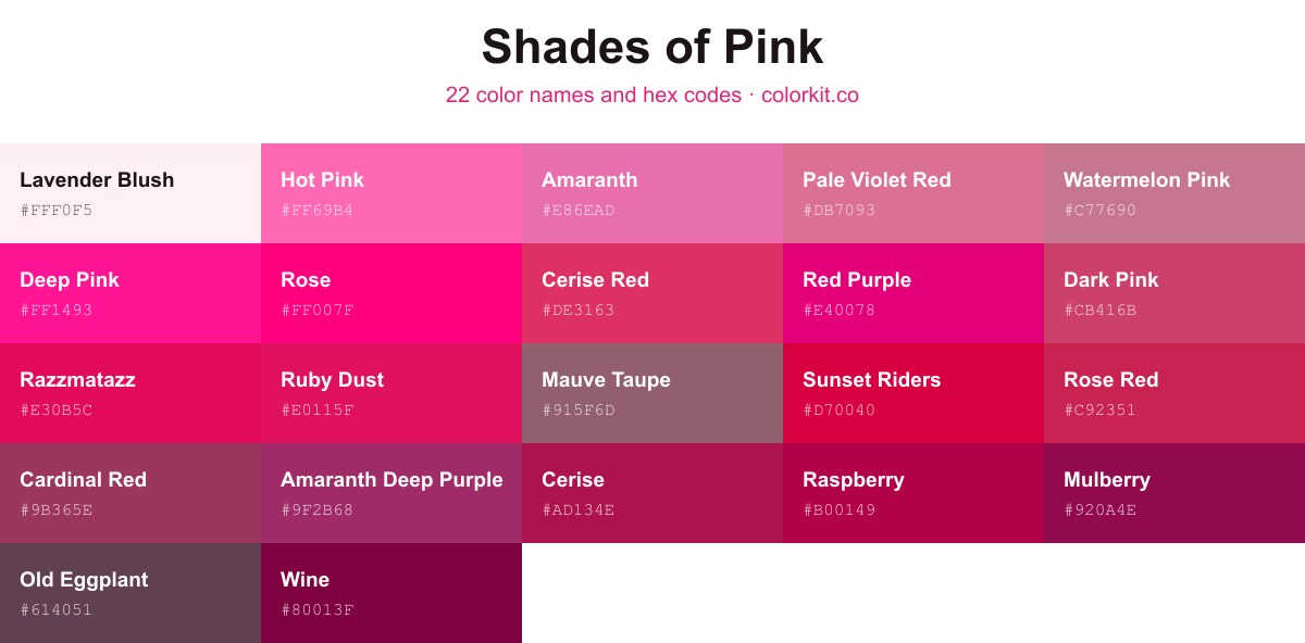
Pink runs from the barely-tinted Lavender Blush (#fff0f5) through bright Deep Pink (#ff1493) and Rose (#ff007f) down to the dark, wine-stained Wine (#80013f). This guide collects 22 named pink shades, each with its hex code. Click any swatch to copy the code, or open it for the RGB, CMYK, and HSL values plus the palette generator.
Old Eggplant is a deep, muted shade that bridges the gap between dark violet and dusty rose. Its brownish-purple undertones give it a grounded, vintage quality, making it a sophisticated alternative to traditional bright pinks. Because of its subtle gray cast, it works beautifully in both minimalist and eclectic palettes, offering a moody warmth that anchors bolder, lighter accent colors without feeling overly dramatic.
Amaranth Deep Purple is a rich, evocative hue that sits confidently at the intersection of bold pinks and deep, regal violets. This saturated color carries a sense of sophistication and intensity, making it an excellent choice for designs that require a touch of luxury or drama. Because of its complex undertones, it works beautifully as a high-impact accent color or as a grounding base for palettes that lean toward floral and sunset-inspired themes. It commands attention without being overwhelming, offering a balanced warmth that resonates well in both modern branding and artistic compositions.
Medium Violet Red is a bold, sophisticated hue that bridges the gap between deep pink and cool purple. This vibrant color commands attention without being overwhelming, making it an excellent choice for accentuating designs that need a touch of intensity and modern elegance. Because it sits comfortably in the pink family while carrying a slightly cooler, violet undertone, it offers designers a versatile alternative to standard magenta. Use it to add a sense of luxury, creativity, or high-energy flair to your palette.
Lavender Blush is a whisper-soft, off-white shade with subtle pink undertones that evoke the delicate beauty of early spring blossoms. As a pale pastel, it serves as a versatile neutral for design projects that require a touch of warmth without overwhelming the senses. Its ethereal quality makes it an excellent choice for backgrounds or high-key color palettes where a clean, airy, and romantic aesthetic is desired.
Pale Violet Red is a soft, mid-tone pink with distinct violet undertones that lend it a sophisticated and slightly cooler appearance than brighter, warmer pinks. This versatile shade balances the playfulness of a traditional pink with a muted, elegant depth, making it an excellent choice for designs that require a touch of romance or refined warmth without becoming overly saccharine. It serves as a gentle yet impactful accent color, pairing beautifully with both neutral grays and contrasting deep greens or teals to create balanced, visually appealing palettes.
Hot Pink is a bold, high-energy hue that brings an immediate sense of excitement and playfulness to any design palette. As a vibrant and intense shade of pink, it commands attention, making it an excellent choice for accent pieces, branding that needs to stand out, or creative projects where a pop of saturation is required. Its distinctively bright character adds a youthful and unapologetic flair, balancing well against neutral tones or serving as a dynamic contrast when paired with cooler colors.
Pink is a quintessential soft pastel that embodies gentleness, playfulness, and a lighthearted charm. This delicate hue feels airy and sweet, making it a timeless choice for designs that aim to evoke feelings of tenderness or whimsy. Because of its muted, balanced tone, it serves as an excellent foundation for color palettes that require a touch of warmth without overwhelming the viewer. Whether used as a primary feature or a subtle accent, this classic shade brings a clean, approachable quality to any visual project.
Deep Pink is an intensely vivid, energetic hue that commands immediate attention. This striking shade balances the playful nature of traditional pink with a high-saturation intensity that leans toward a fuchsia undertone. Because of its bold presence, Deep Pink works exceptionally well as an accent color for designs that need to evoke passion, excitement, or a sense of modern whimsy. It is a powerful choice for digital graphics, branding, and fashion, standing out effectively against neutral backgrounds or contrasting cool tones.
Watermelon Pink is a soft yet vibrant mid-tone hue that captures the gentle essence of summer fruit. Balancing the sweetness of classic pink with subtle, earthy undertones, this shade offers a sophisticated alternative to brighter, more saturated magentas. In design, it serves as an excellent accent color that feels both playful and polished, making it a versatile choice for branding, textile design, and digital illustrations that require a touch of warm, organic color.
Wine is a deep, sophisticated shade that sits at the intersection of rich purple and bold pink. Evoking the classic elegance of a vintage Bordeaux, this intense hue brings a sense of luxury and warmth to any design palette. Because of its dark, saturated nature, Wine works beautifully as a grounding accent against lighter, pastel pinks or as a dramatic primary color that commands attention without being overwhelming. It is a timeless choice for projects that require a touch of refinement and depth.
Tyrian Purple is a deep, luxurious shade that sits at the intersection of red and purple, carrying a sense of ancient prestige and artistic sophistication. This rich, dark magenta hue commands attention without being loud, offering a grounded and velvety aesthetic that works exceptionally well as a bold accent or a dramatic primary element. Its complex undertones bring a touch of historical elegance to modern digital designs, making it an excellent choice for projects that need a hint of opulence or a moody, refined atmosphere.
Rose is a vibrant, high-energy magenta with a captivating intensity that demands attention. As a brilliant, saturated pink, it balances playful warmth with a sleek, modern edge. Designers often use this shade to create focal points or inject a sense of dynamic excitement into branding, fashion, and digital interfaces. Its electric quality makes it a versatile choice for accenting softer palettes or acting as a bold centerpiece in high-contrast compositions.
Red Purple is a high-energy, vibrant hue that sits confidently on the spectrum between bold pink and deep magenta. With its intense saturation, this color commands attention and brings a modern, electric feel to any design palette. It acts as a powerful accent, perfect for creating dynamic visual contrast when paired with softer neutrals or complementary cool tones. Its vivid character makes it an excellent choice for branding or digital art that needs to exude boldness, passion, and creative flair.
Puce is a muted, brownish-pink hue that bridges the gap between classic rose and earthy mauve. Its subtle complexity makes it a sophisticated choice for designs requiring a soft, vintage aesthetic without appearing overly saccharine. In a palette of pinks, Puce stands out for its desaturated undertones, offering a grounded, neutral quality that balances more vibrant or neon shades effectively. It works particularly well in branding or illustration projects where an understated, mature elegance is desired.
Mulberry is a rich, sophisticated shade that sits at the intersection of deep pink and purple. It carries a luxurious, berry-toned intensity that adds instant warmth and elegance to any palette. This color feels both grounded and vibrant, making it an excellent choice for designs that require a touch of drama or a bold, authoritative accent. Because of its dark, saturated nature, Mulberry pairs beautifully with softer neutrals or complementary gold and brass metallics to create a sense of modern refinement.
Mauve Taupe is a sophisticated, muted blend that bridges the gap between classic pink and earthy neutral. This dusky shade carries an inherent sense of calm, offering a dusty rose undertone grounded by the stabilizing properties of taupe. Its subtle, desaturated character makes it an excellent choice for designers looking to introduce warmth to a palette without overwhelming the composition with high-chroma color. Whether used as a primary background or a complementary accent, Mauve Taupe provides a timeless, understated elegance that works beautifully in both digital and print applications.
Dark Pink is a rich, vibrant shade that brings a sense of sophisticated energy to any design palette. This medium-toned pink balances the playfulness of brighter hues with a deeper, more grounded intensity, making it an excellent choice for accentuating floral designs, adding warmth to modern branding, or creating a bold pop of color in digital art. Its versatility allows it to pair beautifully with soft neutrals, crisp whites, or even deep, contrasting charcoals, providing a striking visual impact without overwhelming the composition.
Cerise is a deep, saturated shade of pink that leans toward a vivid, reddish-purple hue. This bold color evokes the rich tones of overripe cherries, offering a sophisticated alternative to brighter, neon pinks. Because of its strong chromatic presence, it brings a sense of energy and warmth to design projects, serving as an excellent accent color that pairs well with neutrals or darker, dramatic palettes. Its commanding nature makes it a popular choice for branding, graphic design, and artistic applications that require a touch of elegance combined with intensity.
Cardinal Red is a sophisticated, deep hue that bridges the gap between intense fuchsia and a muted, earthy maroon. This complex shade carries a subtle warmth, making it a compelling choice for designs that require a bold pop of color without the overwhelming brightness of standard primary reds. For artists and designers, it serves as an excellent anchor color, providing enough depth to ground lighter pastels or add a touch of elegant drama to a minimalist palette. Its versatility allows it to shift between a romantic, berry-inspired tone and a grounded, professional accent depending on the surrounding shades.
Amaranth is a vibrant, saturated pink with subtle magenta undertones that command attention. This energetic hue bridges the gap between deep rose and bright fuchsia, offering a bold choice for projects that require a sense of warmth and playfulness. Its intense, lively quality makes it an excellent accent color for modern designs looking to add a touch of confident sophistication without straying too far from classic pink palettes.
Amaranth
How many shades of pink are there?
A screen can display millions of distinct pinks, since each one is just a mix of red, green, and blue values. This guide narrows that down to 22 named shades of pink with set hex codes. They range from the pale, near-white Lavender Blush (#fff0f5) to the deep, purplish Wine (#80013f).
What are the most popular shades of pink?
Some of the most recognized named pinks are Deep Pink (#ff1493), Rose (#ff007f), Pale Violet Red (#db7093), Raspberry (#b00149), Ruby Dust (#e0115f), and Amaranth (#e86ead). These cover the bright, hot end as well as softer and deeper variations. Each has its own hex code you can copy from the list above.
What is the darkest shade of pink?
Wine (#80013f) is the darkest pink on this page, a deep red-purple that reads almost maroon. Close behind it are Mulberry (#920a4e) and Amaranth Deep Purple (#9f2b68). These work well as anchor or accent colors against lighter pinks.
What is the lightest shade of pink?
Lavender Blush (#fff0f5) is the lightest pink here, a soft off-white with a faint pink cast. The next-palest options are Amaranth (#e86ead) and Pale Violet Red (#db7093). Lighter pinks like these suit backgrounds and large areas where a stronger pink would overwhelm.
What colors make pink?
Pink is a tint of red, made by adding white to red. The more white you add, the paler and softer the pink becomes. On a screen, pink is a high red value with raised green and blue, such as #ffc0cb.
Found a pink you like? Click it to open the full color page, then send it to the palette generator to build a scheme around it, or drop it into the color picker to fine-tune the exact tone. If you’d rather start from a finished scheme, browse our pink color palettes.