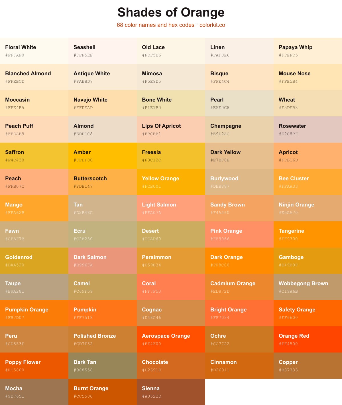
Orange ranges from the palest near-whites like Floral White (#fffaf0) and Blanched Almond (#ffebcd) through warm mid-tones like Amber (#ffbf00) and Tan (#d2b48c), down to deep browns like Sienna (#a0522d). This guide collects 68 named shades of orange, each with its hex code. Click any swatch to copy the code or open its RGB, CMYK, and HSL values and the palette generator.
68 shades of orange with their names and hex codes
Beaver is a sophisticated, muted brown that draws inspiration from the natural, earthy tones of woodland fur. As a member of the orange color family, it offers a desaturated, brownish-orange hue that provides a sense of warmth, stability, and organic comfort. This grounded shade works exceptionally well as a neutral anchor in design palettes, offering enough depth to be substantial without overpowering lighter or more vibrant colors. Designers often utilize Beaver to create a rustic, professional, or cozy aesthetic, making it an excellent choice for backgrounds, text, or accent elements that require a subtle, earthy touch.
Cinnamon is a warm, earthy shade of orange that captures the deep, spiced tones of the spice for which it is named. This rich hue sits firmly between burnt orange and golden brown, offering a grounding presence that feels both cozy and sophisticated. Its depth and subtle vibrancy make it an excellent choice for designs that aim to evoke comfort, autumnal warmth, or a touch of organic elegance. Use Cinnamon to add warmth to palettes without overwhelming them, as it pairs beautifully with creams, dark navies, and muted forest greens.
Ninjin Orange is a warm, earthy tone that balances the vibrancy of traditional orange with a grounded, muted softness. Reminiscent of a sun-ripened carrot or warm terracotta clay, this shade offers a sophisticated alternative to brighter, more aggressive oranges. Its gentle saturation makes it an excellent choice for designs that require a cozy, organic feel without overwhelming the viewer. Whether used as a primary accent or a subtle background element, Ninjin Orange brings a natural, inviting quality to any color palette.
Cobre is a warm, earthy shade of orange that captures the deep, metallic luster of burnished copper. This rich, brownish-orange hue brings a sense of grounded sophistication to design palettes, evoking feelings of stability, antique charm, and natural warmth. Because it bridges the gap between vibrant orange and neutral brown, it serves as an excellent accent color for branding or interior design schemes that aim to balance energy with a timeless, organic aesthetic.
Pumpkin is a vibrant, saturated shade of orange that captures the essence of a ripe harvest. This spirited hue feels both energetic and warm, making it an excellent choice for designs that need to evoke a sense of playfulness, enthusiasm, or autumn nostalgia. Its high intensity ensures it commands attention, whether used as a bold accent color or a primary element in a creative palette.
Poppy Flower is a vibrant, high-energy orange that captures the intense warmth of a sun-drenched petal. This shade leans heavily into the warm side of the spectrum, offering a saturated, almost glowing quality that immediately draws the eye. Because of its fiery intensity, it works exceptionally well as a bold accent color in designs that require a touch of enthusiasm or urgency. Whether used in illustrative work or UI elements, Poppy Flower brings a sense of organic liveliness and cheerful optimism to any color palette.
Wobbegong Brown is a warm, earthy hue that bridges the gap between soft terracotta and sandy beige. Reminiscent of sun-baked clay and natural driftwood, this versatile shade brings a grounded quality to any palette. Its muted orange undertones make it an excellent choice for designs that require a touch of organic warmth without being overly saturated. Whether used as a subtle background or a muted accent, Wobbegong Brown provides a sophisticated, tactile feel that pairs beautifully with cool grays or deep, natural greens.
Bee Cluster is a spirited, golden-orange hue that captures the warmth of a sun-drenched afternoon. This vibrant shade balances the energy of yellow with the richness of deeper orange tones, creating an inviting and optimistic presence in any design palette. Its cheerful undertones make it an excellent choice for adding a touch of liveliness to graphic projects, branding, or accent illustrations that aim to feel both approachable and dynamic.
Dark Orange is a vibrant, saturated hue that balances the warmth of a traditional orange with a deeper, more concentrated pigment. Reminiscent of a setting sun or autumn foliage, this color commands attention without the aggressive intensity of a pure red. For designers and artists, it serves as an excellent choice for accents, calls-to-action, or branding elements that require high energy and visual impact. Because of its boldness, Dark Orange works best when paired with neutral tones or contrasting cool colors to create a balanced, dynamic composition.
Burlywood is a warm, light tan that bridges the gap between gentle beige and soft, sun-drenched orange. Named after the wood of the burly tree, this versatile shade brings an organic, earthy feel to any palette. Its muted undertones make it an excellent neutral for designers looking to add warmth without the intensity of brighter orange hues. Because it pairs effortlessly with both deep browns and vibrant accents, Burlywood serves as a reliable grounding color in everything from minimalist branding to interior design concepts.
Sienna is a rich, warm earth tone that captures the essence of raw clay and burnt soil. This deep reddish-brown sits comfortably within the orange color family, offering a grounded and organic aesthetic often associated with ancient pigments and autumnal landscapes. Its robust character makes it a versatile choice for designers looking to introduce stability and warmth into a palette, providing a sophisticated alternative to brighter, more saturated oranges. Because of its natural, rustic quality, it pairs exceptionally well with creams, sage greens, and deep slate blues.
Sandy Brown is a warm, earthy orange with strong golden undertones that evoke the feeling of sun-drenched coastal dunes. This inviting shade sits comfortably between orange and brown, offering a soft, muted vibrancy that feels both natural and grounded. Its versatility makes it an excellent choice for designs that require a touch of organic warmth without the intensity of brighter, more saturated oranges. Whether used as an accent or a primary element, Sandy Brown brings a tactile, nostalgic quality to any color palette.
Light Salmon is a warm, inviting hue that bridges the gap between delicate pink and soft orange. Reminiscent of a sunrise or the gentle tint of a coastal evening, this pastel shade brings a sense of comfort and optimism to any design palette. It is a versatile color that feels both organic and refreshing, making it an excellent choice for adding a touch of approachable elegance to digital interfaces, illustrations, or branding projects that require a softer, more subtle energy.
Peru is a rich, warm shade of orange that captures the essence of earthy, sun-baked clay and natural landscapes. It strikes a balance between a deep tan and a muted terracotta, offering a grounded yet vibrant aesthetic. This versatile hue works exceptionally well in design palettes that require a touch of organic warmth, serving as an excellent bridge between neutral browns and bolder, more energetic oranges. Whether used as a primary accent or a subtle background element, it brings a comfortable, grounded sophistication to any artistic project.
Chocolate is a warm, rich orange-brown that mimics the earthy tones of unsweetened cocoa. This grounding shade balances the vibrancy of bright orange with the depth of a dark neutral, making it an excellent choice for designs that require a sophisticated, organic feel. Its cozy and established presence works well to anchor palettes, providing a sense of comfort and stability often found in nature-inspired color schemes.
Papaya Whip is a soft, warm pastel shade that bridges the gap between creamy white and a pale, sun-drenched orange. This delicate hue carries a subtle tropical sweetness, evoking the gentle, fleshy tones of ripe papaya fruit. Because of its low saturation and high lightness, it functions exceptionally well as a sophisticated neutral, offering a comfortable, inviting alternative to stark white without overwhelming a color palette. Designers often turn to Papaya Whip when they need to add a touch of warmth and approachability to modern, minimalist, or vintage-inspired compositions.
Navajo White is a warm, pale yellow-orange that captures the soft, inviting glow of sun-drenched desert landscapes. As a light, desaturated shade, it offers a sophisticated neutral option for designers seeking to evoke feelings of comfort, warmth, and natural light. It functions exceptionally well as a backdrop for both bold, high-contrast palettes and subtle, monochromatic schemes, providing a creamy, understated elegance without overwhelming other elements in a composition.
Antique White is a soft, warm off-white shade with subtle peach and yellow undertones, evoking the elegance of aged paper or weathered parchment. Because of its gentle, neutral character, this hue serves as an excellent alternative to pure white for backgrounds and interfaces, offering a sophisticated warmth that is easy on the eyes. In design palettes, it bridges the gap between neutral bases and lighter orange or beige tones, making it a versatile choice for creating harmonious, high-end compositions.
Linen is a light, airy neutral that sits comfortably between white and a very pale orange. With its soft, warm undertones, this shade mimics the natural, unbleached look of flax fabric, bringing a sense of organic tranquility to any design. It offers a subtle warmth that is less sterile than pure white, making it an excellent choice for backgrounds where you want to evoke comfort, cleanliness, and a sophisticated, minimalist aesthetic.
Peach Puff is a warm, delicate pastel that evokes the soft, sun-kissed skin of a ripe peach. This gentle orange hue strikes a balance between vibrant warmth and neutral subtlety, making it a versatile choice for designs that require a light, airy touch. Often associated with comfort, health, and youthful vitality, Peach Puff adds a sense of approachable serenity to both digital interfaces and print projects. Its muted quality pairs beautifully with earth tones, crisp whites, or soft pinks, serving as an excellent accent color or a welcoming backdrop.
Polished Bronze is a warm, metallic shade that bridges the gap between deep orange and earthy brown. It evokes the timeless luster of aged metal, bringing a sense of heritage and grounded sophistication to any design project. This rich, brownish-orange hue feels both rustic and refined, making it an excellent choice for adding depth and a touch of organic elegance to color palettes.
Lips Of Apricot is a delicate, pale orange hue that captures the soft warmth of sun-ripened fruit. This pastel shade carries a gentle, creamy undertone, making it an excellent choice for designs that require a touch of subtlety rather than high-energy vibrancy. It bridges the gap between a neutral peach and a bright apricot, offering a soothing, approachable palette that works beautifully in soft illustrations, minimalist branding, or as a calming accent against deeper, earthier tones.
Tan is a warm, light-brown hue that evokes the classic appearance of sun-bleached sand and raw linen. Often categorized within the orange family due to its soft, earthy undertones, this versatile neutral provides a grounded, organic backdrop for design projects. Its understated nature makes it an excellent choice for creating balance, allowing more vibrant accent colors to pop while maintaining a sophisticated and natural aesthetic.
Coral is a warm, inviting hue that bridges the gap between vibrant orange and gentle pink. This energetic shade captures the essence of a tropical sunset, balancing playful warmth with a sophisticated, softened intensity. Its natural appeal makes it a versatile choice for designers looking to add a lively, optimistic touch to their palettes without overwhelming the viewer. Whether used as a bold accent or a subtle highlight, Coral brings a cheerful and spirited vitality to any creative project.
Seashell is a whisper-light, off-white hue with a subtle, warm undertone. Reminiscent of bleached sand and organic beach finds, this delicate shade offers a clean and inviting alternative to stark white. Because of its faint orange-pink warmth, it brings a soft, airy quality to design palettes, making it an excellent choice for backgrounds or high-key compositions where you want to avoid the clinical feel of a pure white. Its neutral nature allows it to pair effortlessly with soft pastels, earthy terracottas, and vibrant sunset tones.
Yellow Orange is a vibrant, warm hue that captures the energy of golden hour sunlight. It sits comfortably between the brightness of primary yellow and the depth of classic orange, making it a versatile choice for designs that need to feel both cheerful and grounded. In artistic compositions, this color serves as an effective accent when you need to draw the eye toward a specific element or add a sense of optimistic warmth to a palette. Its high visibility and friendly character make it a staple for creative projects looking to convey positivity and approachable energy.
Taupe is a sophisticated, grounded neutral that sits comfortably between warm earthiness and cool sophistication. As a muted, grayish-brown hue, it brings a sense of calm stability to any design palette, acting as the perfect bridge between richer, more saturated tones and lighter creams. Its versatility makes it an essential choice for artists and designers looking to add depth and organic elegance without overwhelming the visual space. Whether utilized as a primary background color or a subtle accent, this shade offers a timeless, understated quality that grounds composition.
Tangerine is a high-energy, saturated orange that balances the intensity of red with the brightness of yellow. It evokes feelings of warmth, playfulness, and immediate optimism. Because of its vibrant, citrus-like quality, this shade works exceptionally well as a primary accent color for call-to-action buttons, illustrative highlights, or anywhere you need to draw the viewer’s eye with a punchy, enthusiastic tone. In design applications, Tangerine pairs beautifully with deep navies or cool teals to create a dynamic, high-contrast palette.
Safety Orange is a high-visibility hue designed to stand out against natural backgrounds, making it an essential tool for designers who need to capture immediate attention. This vibrant, saturated shade demands focus and serves as a classic choice for accents, warnings, and bold design elements where clarity is paramount. Its intense energy bridges the gap between caution and creativity, providing a punchy, unmistakable look that remains universally recognizable.
Rosewater is a delicate, muted shade of orange that leans heavily into pale, dusty pink undertones. Its soft, warm character evokes a sense of vintage romance and understated elegance, making it an excellent choice for designs that require a subtle, neutral foundation. As a gentle variation within the orange color family, it pairs beautifully with creams, soft browns, and deeper terracottas, adding a touch of sophisticated warmth without overwhelming the overall palette.
Pumpkin Orange is a warm, spirited hue that captures the essence of late autumn harvests and vibrant foliage. This bright, energetic shade balances deep red undertones with a punchy yellow base, making it an excellent choice for adding a touch of cozy nostalgia or high-impact energy to a project. Because it leans slightly toward a saturated, earthy tone, it pairs beautifully with dark neutrals like charcoal or navy, though it also stands out effectively against soft creams and whites. It is a bold, lively option for designers looking to evoke feelings of seasonal change, comfort, and playful creativity.
Pink Orange is a vibrant, warm hue that balances the energy of sun-drenched citrus with the soft, inviting glow of a summer sunset. This cheerful color bridges the gap between traditional orange and a gentle coral, making it a versatile choice for designs that need to feel both playful and approachable. Because of its high visibility and optimistic undertone, it works exceptionally well as a highlight color, an accent in branding, or a lively addition to digital illustrations where you want to evoke a sense of warmth and creativity without overwhelming the palette.
Persimmon is a vibrant, warm orange hue that balances the energy of a sunset with the earthy richness of a ripe autumn fruit. This golden-leaning shade carries an inviting, sun-drenched quality, making it an excellent choice for designs that require a touch of enthusiasm or approachable warmth. Its balanced saturation allows it to function beautifully as a stand-alone accent or as a lively complement to deep teals, navy blues, and neutral grays, bringing a natural, organic feel to any palette.
Peach is a soft, warm hue that bridges the gap between delicate pinks and vibrant oranges. With its gentle luminosity and inviting undertone, this shade brings a sense of comfort and sun-drenched optimism to any design palette. It works exceptionally well as an accent color for creating balance in high-contrast layouts or as a soothing background choice for branding that feels approachable, youthful, and lighthearted.
Ochre is a warm, earthy pigment that bridges the gap between deep yellow and rich orange. Reminiscent of natural clay and sun-baked landscapes, this versatile hue brings a grounded, organic feel to design palettes. Its muted undertones offer a sense of stability and historical authenticity, making it an excellent choice for projects that require a sophisticated, grounded touch rather than the vibrancy of brighter oranges. Ochre pairs exceptionally well with cool neutrals, deep greens, and soft creams, allowing it to serve as both a bold focal point or a subtle, natural accent.
Mocha is a warm, mid-tone brown that carries the comforting richness of a perfectly brewed coffee. As a sophisticated member of the orange color family, it balances earthy undertones with a subtle, inviting glow. Its versatile nature makes it an excellent choice for creating grounded, natural palettes or serving as a neutral anchor for more vibrant accent colors. Whether used in branding or interior design, Mocha offers a sense of stability and approachable elegance.
Mango is a vibrant, golden-orange hue that captures the warmth and sweetness of its namesake fruit. This energetic color sits comfortably in the sunny spectrum of orange tones, offering a tropical brightness that feels both inviting and optimistic. Its balance of rich saturation and yellow undertones makes it an excellent choice for adding a pop of cheerful intensity to design projects, whether used as an accent or a primary focal point.
Mahogany is a deep, rich reddish-orange that evokes the warmth and sophistication of dark, polished hardwood. This earthy hue sits firmly between burnt orange and brownish-red, offering a sense of stability and timeless elegance. Its intense saturation makes it an excellent choice for adding depth and weight to a design palette, working particularly well as an accent color that commands attention without being overly aggressive. Because of its organic undertones, Mahogany pairs beautifully with neutrals, creams, and lighter wood tones, providing a grounded contrast that feels both luxurious and inviting.
Golden Brown is a deep, warm, and earth-toned shade that bridges the gap between vibrant orange and muted chestnut. With its strong yellow undertones and rich, saturated pigments, this hue evokes the feeling of autumnal foliage, antique wood, or burnished metallic finishes. Its sophisticated presence makes it an excellent choice for designs that require a touch of natural warmth, rustic charm, or a vintage aesthetic. In digital applications, Golden Brown provides a grounded, stable accent that pairs beautifully with cool blues, deep greens, or neutral creams.
Gamboge is a deep, rich golden-yellow pigment that bridges the gap between warm mustard and vibrant orange. With its historical origins as a tree resin, this hue carries an organic, earthy warmth that feels both nostalgic and energizing. It brings a sophisticated, sun-drenched quality to design palettes, making it an excellent choice for accentuating layouts that need a touch of natural brilliance without being overly aggressive or neon.
Fawn is a soft, muted beige with subtle golden-brown undertones, reminiscent of the gentle warmth found in natural, earthy landscapes. This sophisticated neutral balances the vibrant energy of orange with a calming, sandy quality, making it an excellent choice for designs that require a grounded and organic feel. Its understated elegance provides a versatile backdrop for richer, bolder palettes or serves as a comforting primary tone in minimalist projects.
Dark Yellow is a warm, sun-kissed shade that captures the essence of a fading summer afternoon. Its golden undertones are balanced by a gentle softness, making it an inviting choice for projects requiring a touch of cozy elegance. As a muted member of the orange family, this versatile hue works beautifully to ground vibrant palettes or to provide a sophisticated, earthy accent in design compositions. Whether used as a primary tone or a subtle highlight, Dark Yellow brings a reliable sense of comfort and understated luxury to any visual space.
Copper is a warm, metallic earth tone that balances the vibrancy of orange with the grounding stability of brown. As a quintessential rustic hue, it carries a sense of timeless craftsmanship and industrial heritage, making it an excellent choice for designs that aim to feel sophisticated yet approachable. Because of its natural shimmer and rich undertones, Copper adds depth to color palettes, providing a reliable accent that evokes feelings of warmth, comfort, and organic beauty.
Cognac is a warm, earthy orange that evokes the rich depth of aged spirits and autumn landscapes. This sophisticated shade balances the vibrancy of classic orange with a grounding, toasted undertone, making it an excellent choice for designs that require a touch of vintage elegance or organic comfort. Because of its complex, spiced character, Cognac pairs beautifully with deep forest greens, creamy off-whites, and dark wood textures, bringing a sense of timeless luxury to any project.
Champagne is a soft, warm neutral that captures the delicate essence of sun-bleached sand and sparkling wine. As a muted shade within the orange family, it offers a sophisticated alternative to stark whites and creams, providing a gentle luminosity that feels both elegant and approachable. Its subtle golden undertones make it an incredibly versatile choice for design projects, acting as a calm foundation that pairs beautifully with earthy textures, deep navies, or vibrant metallic accents. This airy, light-filled hue brings a touch of refined comfort to any palette, balancing warmth with a clean, minimalist aesthetic.
Cadmium Orange is a warm, vibrant hue that captures the intensity of a sun-drenched afternoon. Sitting comfortably between deep yellow and true orange, this color radiates energy and optimism without being overly aggressive. Artists often favor this shade for its rich, saturated quality, making it an excellent choice for adding a pop of warmth to designs or creating a striking focal point. It balances a bold, citrus-like zest with a grounding, earthy undertone, perfect for projects that require a touch of liveliness and approachable sophistication.
Butterscotch is a warm, inviting shade of orange that evokes the rich, sweet tones of its namesake confection. This vibrant hue balances golden-yellow undertones with a subtle depth, making it an excellent choice for designs that require a touch of optimism, nostalgia, or autumnal comfort. Because of its cheerful and energetic nature, Butterscotch works beautifully as an accent color in digital illustrations, branding projects, or interior design palettes that aim to create a cozy, sun-drenched atmosphere.
Burnt Orange is a rich, warm hue that bridges the gap between vibrant orange and deep earthy tones. Often associated with autumn foliage and rustic textures, this color exudes a sense of comfort and nostalgia. Its balanced saturation makes it a sophisticated choice for design projects that need a touch of natural energy without being overly bright or intense. Whether used as a primary accent or a secondary shade, Burnt Orange adds a grounded, inviting quality to any color palette.
Bright Orange is a vibrant, high-energy hue that commands immediate attention. With its warm, citrus-inspired undertones, this shade feels both modern and approachable, making it an excellent choice for designs that need to evoke enthusiasm, creativity, or urgency. It sits confidently between a bold red-orange and a sunny yellow, offering enough intensity to serve as an effective accent color without overwhelming a composition. Whether used to draw the eye to a call-to-action button or to add a touch of liveliness to a branding palette, Bright Orange brings a dynamic, optimistic quality to any creative project.
Apricot is a warm, inviting shade that captures the soft glow of golden hour. This muted orange hue sits delicately between vibrant citrus and earthy peach, offering a gentle, sun-kissed quality to any palette. Its balanced saturation makes it an excellent choice for designers looking to add a touch of approachability and comfort to their work without overwhelming the visual space. Whether used as a primary accent or a subtle highlight, Apricot brings a sense of organic optimism and quiet energy to modern compositions.
Blanched Almond is a soft, warm, and off-white shade that evokes the subtle, creamy tones found in blanched nut skins. As a very light orange, it acts as a versatile, neutral background color, offering a delicate warmth without overwhelming a palette. Its gentle, muted quality makes it an excellent choice for designers looking to soften harsh contrasts or add a touch of understated elegance to web and print projects.
Bisque is a soft, pale orange that radiates a gentle, warm glow. This understated hue captures the essence of toasted sand or sun-bleached clay, offering a delicate balance between a neutral base and a warm, inviting tone. In design, Bisque serves as a versatile background color that adds a subtle touch of comfort without overwhelming a palette. Its muted quality pairs beautifully with earthy greens, soft browns, or crisp whites, making it an excellent choice for creating balanced, organic, and sophisticated visuals.
Almond is a gentle, sophisticated neutral that sits on the warmer end of the orange spectrum. This muted, sandy hue evokes a natural, organic feel, reminiscent of toasted nuts or sun-drenched stone. Because of its subtle, earthy undertones, it serves as an excellent balancing color in design palettes, offering warmth without overwhelming the senses. It pairs beautifully with deeper browns, soft greys, or muted greens, making it a versatile choice for minimalist aesthetics and projects that require a grounded, comforting touch.
Almond
How many shades of orange are there?
A screen can display millions of distinct orange values, since each one mixes full red with a varying amount of green light. Named shades are far fewer because each needs a recognized label. This guide collects 68 named shades of orange, running from pale Floral White (#fffaf0) and Peach Puff (#ffdab9) through Amber (#ffbf00) to deep Sienna (#a0522d).
What are the most popular shades of orange?
Amber (#ffbf00), Tan (#d2b48c), Chocolate (#d2691e), Sienna (#a0522d), Moccasin (#ffe4b5), and Peach Puff (#ffdab9) are among the most recognized named oranges. They cover the full span from bright signal oranges to soft, muted browns. Click any swatch on this page to copy its hex code.
What is the darkest shade of orange?
Sienna (#a0522d), a deep red-brown, is the darkest shade of orange on this page. Chocolate (#d2691e) and Cognac (#d48c46) are the next darkest, both warm and muted. These work well as grounding tones against lighter oranges.
What is the lightest shade of orange?
Floral White (#fffaf0), an off-white with a faint warm cast, is the lightest shade of orange here. Blanched Almond (#ffebcd) and Moccasin (#ffe4b5) are slightly deeper but still very pale. These tints suit backgrounds and soft accents.
What colors make orange?
Orange is a secondary color made by mixing red and yellow. More red gives a deeper red-orange, while more yellow produces a lighter amber. On screen, orange is full red combined with mid green, such as #ffa500.
Found an orange you like? Click it to open the full color page, then send it to the palette generator to build a scheme around it, or drop it into the color picker to fine-tune the exact tone. If you’d rather start from a finished scheme, browse our orange color palettes.