Color Wheel
Everything you need to know about the color wheel and color theory
A color wheel arranges colors in a circle so you can see how they relate, mix, and pair. It’s how designers pick palettes that work, how artists mix pigments without muddying them, and how anyone working with color stops guessing.
This guide walks through what the color wheel is, how primary, secondary, and tertiary colors fit together, the main color schemes (complementary, analogous, triadic, split-complementary, tetradic, monochromatic), and how to actually use the interactive wheel on the right.
If you want to skip ahead and just play, set a hex code in the wheel on the right and pick a scheme from the dropdown.
The Quick Version
The color wheel explains color relationships for design and art. Use additive RGB for screens, subtractive RYB/CMYK for print. Know your primary, secondary, and tertiary colors (the key hues), and try out different shades, tints, and tones. Try complementary, analogous, or triadic schemes for different levels of harmony and contrast.
What is the Color Wheel?
A color wheel is a circular diagram that organizes colors by their hue and shows how they relate to each other. Isaac Newton built the first one for his 1704 treatise Opticks, after splitting white light into a spectrum and bending it into a circle. Goethe, Itten, and Munsell all refined the idea over the following centuries.
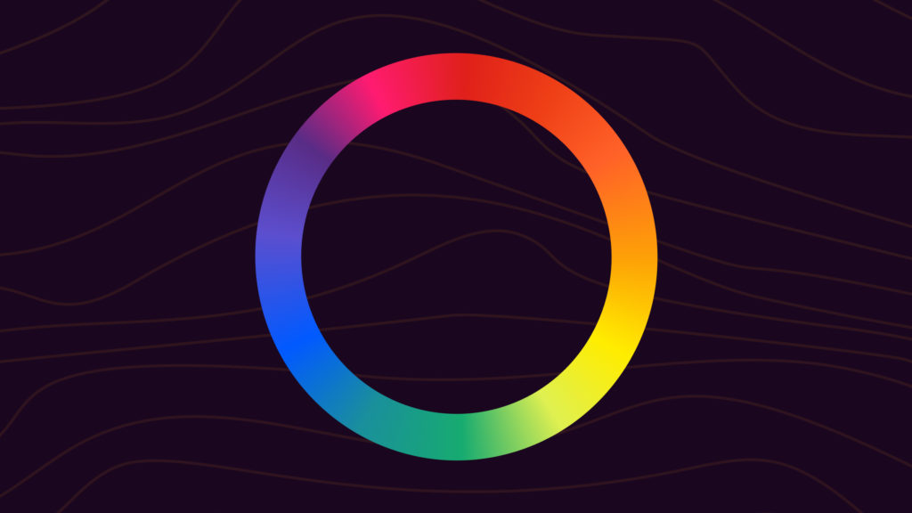
There are two flavors of color wheel, depending on whether you’re working with light or pigment:
- Additive (RGB): Red, Green, Blue. Used for screens like phones, monitors, and TVs. The display starts black and adds light to produce color.
- Subtractive (RYB or CMYK): Red, Yellow, Blue for paint, or Cyan, Magenta, Yellow, and Key (black) for printing. The surface starts white and pigments absorb wavelengths, leaving the rest to reflect back as color.
A screen turning on is the cleanest way to picture the additive model. Pixels start black, then mix red, green, and blue light to create everything you see. A canvas works the opposite way. The painter starts with white, then layers pigments that subtract wavelengths from the light bouncing off the surface.
If you’ve used a paint set or run something through a printer, you’ve used the subtractive wheel. If you’ve designed for the web, picked a font color in a doc, or shot a photo, you’ve used the additive one.
What is Color Theory?
Color theory is the set of rules and patterns that describe how colors interact and what they make us feel. It covers which colors pair well, which ones clash, how to create contrast or harmony, and how cultural meaning shapes the way we read color.
You don’t need to memorize all of it. You need enough to make decisions: what color goes where, what combinations carry the right mood, and when to break the rules on purpose.
Color choices shape how a brand feels, how easy a product is to use, and how a piece of art lands emotionally. The wheel is the shortcut that gets you there faster.
Primary, Secondary, and Tertiary Colors
These three groups make up the structure of any color wheel.
Primary Colors
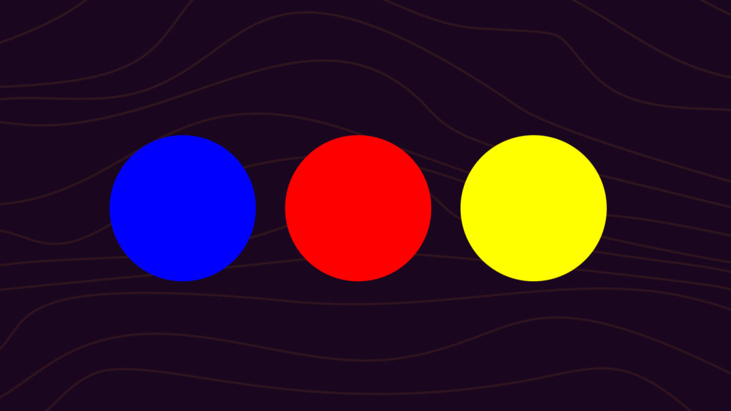
Primary colors can’t be made by mixing other colors. On the RYB wheel (paint), the primaries are red, yellow, and blue. On the RGB wheel (screens), they’re red, green, and blue. Everything else builds from these.
When you’re mixing paint, you can’t make a primary from other colors. You start with the primaries and adjust them with other hues, black, or white. Plenty of brands skip the primaries and lean on a secondary as their dominant color: Cadbury and Yahoo on purple, Dunkin’ on orange, Starbucks on green. Knowing the primaries that build those secondaries helps you find shades and tints that pair well.
Secondary Colors
Secondary colors come from mixing two primaries together:
The cleaner the primaries you start with, the closer you get to a true secondary. Use the purest form of each primary (its hue) and the result will be a vivid secondary. Use dull primaries and the secondary will look muddy.
Tertiary Colors
A tertiary color comes from mixing a primary with the secondary that sits next to it on the wheel. Mixing colors that sit opposite each other (orange and blue, red and green) gives you a brown or gray, not a tertiary. You can test this in the color mixer to see how complementary pairs cancel out toward neutral. There are six tertiaries:
- Magenta: red plus purple
- Vermillion: red plus orange
- Amber: yellow plus orange
- Chartreuse: yellow plus green
- Teal: blue plus green
- Violet: blue plus purple
Looking for palette inspiration? You can build your own with the color palette generator, or extract one from any image with the color palette from image tool.
How to Use the Color Wheel
The wheel is most useful when you have a starting color and need to figure out what works alongside it. The basic flow:
- Start with one color. Pick the dominant hue for your design, brand, or piece of art and drop its hex into the wheel on the right.
- Pick a scheme. Use the dropdown to switch between Complementary, Analogous, Triad, Split-Complementary, Tetradic, and Monochromatic. Each one builds a different relationship around your starting color.
- Adjust lightness and saturation. Pure hues are loud. Tone things down with shades, tints, or muted versions to set the mood you want.
- Test the contrast. Make sure text and key UI elements have enough contrast to be readable before you ship anything.
- Save the result. Open the palette in the editor to refine it, or use the color palette generator to extract a full palette from an image you like.
Using Complementary Colors in Designs
Complementary colors sit directly opposite each other on the wheel. Blue and orange, red and green, yellow and purple. Draw a straight line through the center of the wheel and you’ll land on a complementary pair, or pick “Complementary” from the dropdown on the right.
The pairing creates strong contrast. Each color makes the other look brighter and more saturated, which is why complementary palettes feel alert and high-energy. Sports logos, movie posters, and call-to-action buttons lean on this hard.
If a pure complementary pair feels too aggressive, soften it with lighter or darker versions of each color. In most layouts, let one color dominate and use its complement only as an accent. A blue background with orange buttons works. Equal parts blue and orange usually doesn’t.
Complementary pairs almost always combine a warm and a cool color, which adds depth to a palette. Want to dig deeper? See the complementary colors guide or play with hex pairs in the color picker.
Using Analogous Colors in Designs
Analogous colors sit next to each other on the wheel: blue, blue-green, green, or red, red-orange, orange. They share undertones, so they blend smoothly. Pick “Analogous” from the dropdown to see the analogous set for any starting color.
Analogous palettes feel calm and unified. There’s variation, but nothing fights for attention. They work well for backgrounds, branding, and any design where you want flow over contrast. Sunset photography, forest landscapes, and most moody UI palettes are analogous.
To keep an analogous scheme from feeling flat, vary the lightness or saturation. Pair a deep teal with a lighter mint and a soft sky blue. Drop in a neutral (white, gray, beige) for breathing room.
More on this in the analogous colors guide.
Using Triadic Colors in Designs
A triadic scheme uses three colors evenly spaced around the wheel, forming a perfect triangle. Red, yellow, and blue is the classic. Purple, green, and orange is another. Pick any color and trace an equal triangle to find its triad, or pick “Triad” from the dropdown.
Triadic palettes are bold and balanced at the same time. The colors are spaced enough to create contrast, but spread evenly enough that they don’t fight for attention. Logos, posters, and packaging use triadic schemes often.
The trick is moderation. Pick one of the three to lead, use the other two as accents. You can also tone the effect down by using desaturated versions of each color while keeping the triadic spacing. Full breakdown in the triadic colors guide.
Using Split-Complementary Colors in Designs
A split-complementary scheme starts with one color and uses the two colors next to its complement, instead of the complement itself. Blue’s complement is orange, so blue’s split-complement is red-orange and yellow-orange.
You get the contrast of a complementary pair without the in-your-face intensity. It’s a good first scheme if straight complementary palettes feel too loud, and it gives you three colors to work with instead of two, which is often easier to balance in a real design.
More on the structure in the split-complementary colors guide.
Using Tetradic and Square Colors in Designs
A tetradic scheme uses four colors in two complementary pairs (a rectangle on the wheel). A square scheme is a special case where the four colors are evenly spaced, forming a perfect square.
Both are rich and flexible, but harder to balance than the simpler schemes. Pick one color to dominate, treat the other three as supporting roles, and watch the warm-cool balance carefully so the palette doesn’t feel chaotic. These work well for editorial layouts, illustration, and any design that wants lots of color without going monochrome. More on the structure in the tetradic colors guide.
Using Monochromatic Colors in Designs
A monochromatic palette uses one hue and varies its lightness and saturation to build the rest. Think a navy to royal blue to sky blue to pale blue ramp. Everything shares a parent color, so the palette feels cohesive by default.
Monochromatic schemes are forgiving and almost impossible to get wrong, which makes them a strong starting point if color theory feels overwhelming. The tradeoff is energy. Without contrast from a second hue, you have to lean on typography, layout, and texture to keep things interesting.
Build full ramps with the color shades generator, or read more in the monochromatic colors guide.
Hues, Shades, Tints, and Tones
These four words get used loosely in everyday speech, but each one means something specific.
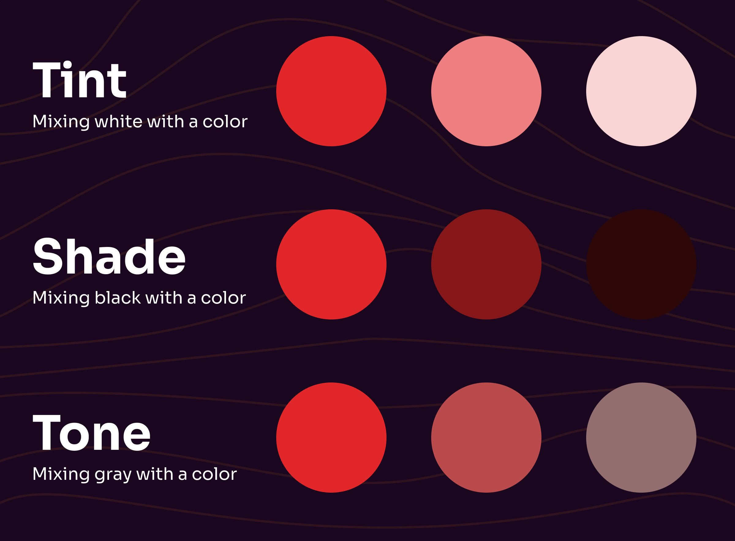
Hue
Hue is the pure form of a color, with no white, black, or gray added. Red, blue, and yellow at full saturation are hues. So is every primary, secondary, and tertiary color. When someone asks “what hue is that?” they mean “what color family does this belong to?”
Hues matter when you’re combining primaries to create a secondary. Without using the true hues of each primary, you won’t get the true hue of the secondary.
Shade
Shade is what you get by adding black to a hue. The more black, the darker the shade. Forest green is a shade of green. Burgundy is a shade of red.
Tint
Tint is the opposite of shade. Add white to a hue and you get a tint. Pink is a tint of red. Sky blue is a tint of blue. The more white, the lighter the tint.
Tone
Tone is what you get by adding gray (white plus black) to a hue. Tones are muted, not necessarily lighter or darker. In digital design, this overlaps with saturation. In painting, “tone” is the more common term.
Warm vs. Cool Colors
The wheel divides naturally into warm and cool halves.
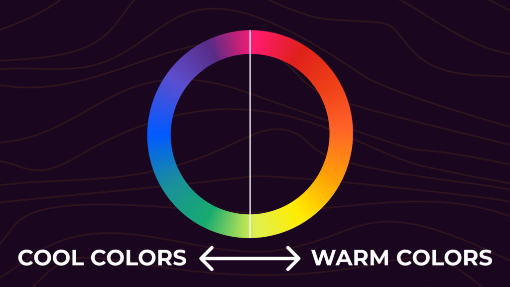
Warm colors (red, orange, yellow, plus their shades and tints) have longer wavelengths and feel lively, attention-grabbing, and close. They tend to sit in the foreground of a design. Warm colors evoke energy, comfort, and excitement, but they can also signal anger or urgency.
Cool colors (blue, green, purple, plus shades and tints) have shorter wavelengths and feel calm, distant, and quiet. They typically sit in the background. Cool colors evoke calm, trust, and depth, but can lean toward sadness or coldness.
If you’re painting from life, watch out for ambient light. A white wall under afternoon sun reads warm. The same wall under fluorescent light reads cool.
Colors and Emotions
Different colors carry different emotional and cultural weight. The associations below are common in Western and US design contexts. Treat them as starting points, not laws.
- Red: power, energy, urgency. Used to push action (sale tags, “buy now” buttons).
- Orange: enthusiasm, warmth, confidence. Friendly without being soft.
- Yellow: attention, optimism, intellect. Why highlighters work.
- Green: growth, health, money. Default for “go,” “complete,” or anything natural.
- Blue: calm or trust depending on the shade. Light blues feel airy. Dark blues feel professional.
- Purple: luxury, creativity, royalty. Best in small doses.
- White: clean, simple, peaceful. Why hospitals and tech brands lean on it.
- Black: authority, mystery, premium. Useful as negative space and for contrast.
If you’re designing for a global audience, double-check meaning. White is the color of mourning in much of East Asia, not black. Red is celebratory in China. Green carries religious weight in parts of the Middle East. The wheel is the same; the meaning isn’t. More in the color emotions guide.
Color Wheel Frequently Asked Questions
What is a color wheel?
A color wheel is a visual tool that organizes colors based on their relationships. It displays primary, secondary, and tertiary colors and their hues, tints, and shades. The wheel is the foundation for picking color schemes that feel intentional instead of random.
What’s the difference between an RGB and an RYB color wheel?
The RGB color wheel is used in digital displays and photography. Its primaries are red, green, and blue, and they create color by mixing light. The RYB wheel is used in traditional painting. Its primaries are red, yellow, and blue, and they create color by mixing pigment. RGB is for screens. RYB is for paint.
What’s the difference between RGB and CMYK?
RGB stands for Red, Green, Blue. It’s used in monitors, phones, and TVs to mix light into color. CMYK stands for Cyan, Magenta, Yellow, and Key (black). It’s used in printing to mix ink into color. RGB is additive (light starts black, color is added). CMYK is subtractive (paper starts white, ink absorbs wavelengths).
What are primary colors on a color wheel?
Primary colors are the three base colors that can’t be made by mixing other colors. On the RGB wheel they’re red, green, and blue. On the RYB wheel they’re red, yellow, and blue. Every other color on the wheel is built from the primaries.
What are secondary colors on a color wheel?
Secondary colors are made by mixing two primary colors. The three secondaries are orange (red plus yellow), green (blue plus yellow), and purple (red plus blue).
What are tertiary colors on a color wheel?
Tertiary colors are made by mixing a primary with the secondary next to it on the wheel. The six tertiaries are magenta, vermillion, amber, chartreuse, teal, and violet.
What is the purpose of a color wheel?
A color wheel helps designers, artists, and anyone working with color choose palettes that look intentional. It also makes it easier to create contrast and balance in a design without trial and error.
What is a complementary color?
A complementary color is the color directly opposite a given color on the wheel. Complementary pairs (blue and orange, red and green, yellow and purple) create strong contrast when used together.
What is an analogous color scheme?
An analogous color scheme uses colors that sit next to each other on the wheel, like blue, blue-green, and green. Analogous palettes feel harmonious and easy on the eye.
What is a monochromatic color scheme?
A monochromatic color scheme uses variations of a single hue, ranging from light tints to dark shades. The result is cohesive by default and almost impossible to get wrong.
What is a triadic color scheme?
A triadic color scheme uses three colors evenly spaced on the wheel, forming a triangle. Triadic palettes are vibrant but balanced, like red, yellow, and blue.
What is a split-complementary color scheme?
A split-complementary scheme uses a base color and the two colors that sit next to its direct complement. It gives you the contrast of a complementary pair without the intensity, plus an extra color to work with.
What is a tetradic color scheme?
A tetradic color scheme uses four colors in two complementary pairs, forming a rectangle on the wheel. A square scheme is a special tetradic where the four colors are evenly spaced. Both schemes are rich but harder to balance, so pick one color to lead and treat the rest as accents.
Putting It Together
The color wheel is just a map. The point is to use it without thinking about it: glance at the wheel, pick a relationship that fits the mood, adjust until it feels right, and ship.
Try a starting color in the wheel on the right. Switch the dropdown to see how the same hex behaves across complementary, analogous, triadic, and monochromatic schemes. When you find a combination that works, open it in the palette editor or build it out further with the color palette generator, the color palette from image tool, or the curated palette library.