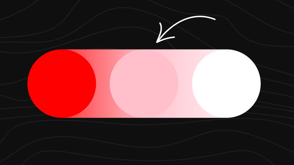
Pink is made by mixing red with white. In paint, the simplest recipe is cadmium red plus titanium white, in roughly a 1-to-4 ratio for a soft pink and 1-to-2 for a vivid one. On screens, pink is built by raising the green and blue channels of red toward white (RGB #FF0000 becomes #FFC0CB as green and blue rise together). The exact shade of pink depends on which red you start with, how much white you add, and whether you nudge the mix warmer with yellow or cooler with magenta.
Pink is one of the easier colors to mix in paint, which is why most artists learn it before anything else. The interesting part is the range. The pink family spans from soft baby pink to neon hot pink to dusty millennial pink, and each named shade has a slightly different recipe. To experiment with any pink in real time, drop colors into the color mixer, or browse curated pinks in the pink palette library.
The Short Answer
Pink is a tint of red. The two-color recipe is red plus white, in any ratio (more white for lighter pinks, less white for hotter ones). For warmer pinks like coral or salmon, add a touch of yellow or orange. For cooler pinks like magenta or fuchsia, push toward purple by adding a small amount of blue or quinacridone. To darken pink, add a small amount of red or a touch of burnt umber, not black (which mutes the saturation toward gray).
Pink does not have a single recipe because “pink” itself covers a huge range of named shades. Hot pink, blush, salmon, fuchsia, baby pink, and millennial pink are all in the pink family but mix differently. The named-shade recipes below walk through each one.
What Colors Make Pink?
There are three reliable ways to make pink, depending on the medium you are working in.
In Paint (RYB)
Mix cadmium red (or any pure red pigment) with titanium white. The ratio determines the shade. About 1 part red to 4 parts white gives a soft pastel pink. 1 to 2 gives a vivid mid-pink. Less white leans toward hot pink and coral. To shift the temperature, add a small amount of yellow for warmer pinks (salmon, coral) or a small amount of quinacridone magenta for cooler pinks (rose, fuchsia).
On Screens (RGB)
Pink is a tint of red in RGB. Start with red (R=255, G=0, B=0) and raise the green and blue channels together to add white. #FFC0CB is the CSS named color “pink” and corresponds to roughly 75 percent white added to pure red. #FF69B4 is “hotpink.” #FFB6C1 is “lightpink.” The color mixer shows the exact result of any red plus white combination instantly.
In Print (CMYK)
Pink in CMYK is made by mixing magenta with a small amount of yellow, with no cyan or black. The closer your magenta is to pure (100 percent), the closer the result is to fuchsia or hot pink. Adding small percentages of yellow shifts the result toward coral and salmon. Subtracting magenta (or adding white paper density) produces the lighter, baby-pink end of the spectrum.
How to Make Pink (Step-by-Step)
The simplest, most reliable approach uses the red-plus-white recipe in paint:
- Pick your red. Cadmium red gives a warm, slightly orange-leaning pink. Alizarin crimson gives a cooler, slightly purple-leaning pink. Quinacridone magenta gives the most vivid hot-pink result. Pick the red based on which direction you want to lean.
- Add white in small amounts. A little goes a long way. Start with a fingertip-sized dab of red on your palette and add white in increments. The pink shifts dramatically with each addition, so check often.
- Stir thoroughly. Pink is unforgiving of incomplete mixing. Streaks of pure red or white in a pink swatch are obvious. Mix until the color is uniform.
- Adjust temperature. If the pink looks too cool (purple-leaning), add a tiny touch of yellow or cadmium orange. If it looks too warm (orange-leaning), add a tiny touch of quinacridone magenta.
- Test on a swatch. Pink looks different next to other colors than in isolation. Pink also dries slightly lighter in oils and acrylics. Mix small, swatch it next to your target, decide.
- Darken with red, not black. If your pink is too light, add a small amount of red. Adding black or burnt umber mutes the saturation toward gray-pink, which is sometimes what you want (dusty pink, mauve) but usually not.
Mixing Different Shades of Pink
The pink family is wider than most colors. Each named shade has a slightly different recipe. Click any palette below to open its full color reference page.
How to Make Hot Pink
Hot pink is a saturated, bright pink leaning slightly cool. Mix hot pink by combining quinacridone magenta with a small amount of cadmium red and a touch of white, in roughly 4:1:2 ratio. The magenta gives hot pink its high-saturation character. Common in fashion, beauty, and 80s-revival branding.

How to Make Fuchsia
Fuchsia is a vivid, slightly purple pink at maximum saturation. In paint, fuchsia is hard to mix from scratch because it requires a pure magenta pigment. The closest mix is quinacridone magenta with a tiny touch of cadmium red. In CMYK, fuchsia is pure magenta with no other ink.

How to Make Magenta
Magenta is a deep, vivid pink-purple, technically a primary color in CMYK printing. The closest paint mix is quinacridone magenta with a tiny touch of cadmium red. Slightly darker and more purple-leaning than fuchsia. Used in print branding, T-Mobile, and bold modern design.

How to Make Bubblegum Pink
Bubblegum pink is a soft, light, slightly cool pink that sits between hot pink and baby pink. Mix bubblegum by combining hot pink (or quinacridone magenta) with a generous amount of white, in roughly a 1:3 ratio. Common in candy, kids’ branding, and playful packaging.

How to Make Rose
Rose is a deep, slightly cool pink that sits between red and magenta. Mix rose by combining quinacridone magenta with cadmium red in roughly a 2:1 ratio, then a small amount of white to brighten. Avoid burnt umber, which dulls the saturation. Common in floral branding, romance themes, and Valentine’s design.

How to Make Salmon Pink
Salmon is a warm, peachy pink with strong orange undertones. Mix salmon by combining cadmium red with a small amount of cadmium yellow and a generous amount of white, in roughly 2:1:4 ratio. For a slightly cooler salmon, reduce the yellow. Common in beauty, hospitality, and sunset-themed palettes.

How to Make Coral Pink
Coral pink is similar to salmon but leans more orange and slightly more saturated. Mix coral pink by combining cadmium red with cadmium orange and a generous amount of white, in roughly 2:2:3 ratio. Used in summer-leaning, warm, and beach-themed branding.

How to Make Coral Blush
Coral blush is a muted, dusty coral with strong peach undertones. Mix coral blush by combining cadmium red with cadmium orange plus a small amount of burnt umber and a generous amount of white, in roughly 2:1:0.5:4 ratio. The umber softens the coral into a sophisticated, slightly aged finish. Common in modern weddings, minimalist branding, and editorial photography.

How to Make Peach Pink
Peach is a soft, light pink leaning toward orange. Mix peach by combining cadmium red with cadmium orange and a generous amount of white, in roughly 1:1:5 ratio. For a slightly warmer peach, add a tiny touch of yellow ochre. Common in beauty, baby products, and pastel hospitality branding.

How to Make Sweet Apricot
Sweet apricot is a warm, golden pink with subtle orange undertones. Mix sweet apricot by combining cadmium red with cadmium yellow and a generous amount of white, in roughly 1:1:5 ratio plus a tiny touch of yellow ochre for warmth. Common in stationery, lifestyle branding, and soft-sunset palettes.

How to Make Pale Pink
Pale pink is a very light, slightly peachy pink, softer than baby pink. Mix pale pink by combining cadmium red with a heavy amount of white and a tiny touch of cadmium orange, in roughly 1:7:0.3 ratio. The orange keeps the result from feeling too cool. Common in nursery design, bridal palettes, and quiet luxury branding.

How to Make Baby Pink
Baby pink is a very light, soft, slightly warm pink (slightly more saturated than pale pink). Mix baby pink by combining cadmium red with a heavy amount of white and a tiny touch of yellow ochre, in roughly 1:8:0.3 ratio. The ochre is optional but adds warmth. Common in baby products, nursery design, and gentle pastel palettes.

How to Make Pink Quartz
Pink quartz is a pale, slightly cool pink with a lavender undertone, named after the gemstone. Mix pink quartz by combining quinacridone magenta with a small amount of cobalt blue and a heavy amount of white, in roughly 2:0.3:6 ratio. The cobalt is what gives it the slight lavender shift. Common in crystal-themed branding, jewelry, and ethereal aesthetics.

How to Make Blush Pink
Blush pink is a dusty, slightly muted pink with warm undertones (deeper than peach pink or coral blush). Mix blush by combining cadmium red with a small amount of burnt umber and a generous amount of white, in roughly 3:1:4 ratio. The umber is what gives blush its slightly aged, sophisticated quality. Common in beauty, weddings, and minimalist design.

How to Make Strawberry Jubilee
Strawberry jubilee is a muted, dusty mauve-pink with sophisticated, slightly vintage undertones. Mix strawberry jubilee by combining cadmium red with burnt umber and a moderate amount of white, in roughly 2:1:2 ratio. The result reads sophisticated and slightly aged. Common in vintage editorial, autumn weddings, and slow-living lifestyle branding.

How to Make Millennial Pink
Millennial pink is a creamy, slightly nude pink with a peach undertone. Mix millennial pink by combining cadmium red with a generous amount of white plus a small amount of yellow ochre, in roughly 1:6:0.5 ratio. The ochre gives the slightly desaturated quality that defined the 2014 to 2018 design trend. Common in beauty (Glossier, Drunk Elephant), modern minimal interiors, and editorial photography.

How to Make Rose Gold
Rose gold is a warm, metallic-leaning pink with bronze undertones. Mix rose gold by combining cadmium red with yellow ochre and a moderate amount of white, in roughly 2:1:2 ratio. The ochre is what gives it the gold character. For a truly metallic look, layer with copper or bronze pigments. Common in jewelry, tech (rose gold iPhone era), and premium consumer products.

Quick Reference: Pink Mixing Cheat Sheet
Every pink shade above in one extractable table. Save it, copy it, paste it wherever you need it.
| Shade | Hex | Mixing Recipe |
|---|---|---|
| Hot Pink | #FF69B4 | Quinacridone Magenta + Cadmium Red + White (4:1:2) |
| Fuchsia | #FF00FF | Pure Quinacridone Magenta (or Magenta ink in CMYK) |
| Magenta | #C71585 | Quinacridone Magenta + tiny Cadmium Red |
| Bubblegum Pink | #FFC1CC | Hot Pink + lots of White (1:3) |
| Rose | #FF007F | Quinacridone Magenta + Cadmium Red (2:1) + small White |
| Salmon Pink | #FA8072 | Cadmium Red + Yellow + lots of White (2:1:4) |
| Coral Pink | #F88379 | Cadmium Red + Orange + lots of White (2:2:3) |
| Coral Blush | #E29C8D | Red + Orange + small Burnt Umber + White |
| Peach Pink | #FFC2B2 | Cadmium Red + Orange + lots White (1:1:5) |
| Sweet Apricot | #FFC1A3 | Red + Yellow + White + tiny Yellow Ochre |
| Pale Pink | #FFD2C8 | Cadmium Red + lots White + tiny Orange (1:7:0.3) |
| Baby Pink | #F4C2C2 | Cadmium Red + tons White + tiny Yellow Ochre |
| Pink Quartz | #FFBDF6 | Quinacridone Magenta + tiny Cobalt + lots White |
| Blush Pink | #DE5D83 | Cadmium Red + small Burnt Umber + lots White |
| Strawberry Jubilee | #BC868F | Cadmium Red + Burnt Umber + White (2:1:2) |
| Millennial Pink | #F6C8C1 | Cadmium Red + lots White + small Yellow Ochre |
| Rose Gold | #B76E79 | Cadmium Red + Yellow Ochre + White (2:1:2) |
Why Your Pink Mix Goes Wrong
Pink is easier than most colors but has a few common failure modes:
- Your pink turned salmon. Your white had a yellow tint, or your red leaned warm. Switch to titanium white (the cleanest) and try alizarin crimson or quinacridone magenta instead of cadmium red.
- Your pink looks gray or muddy. You added too much complementary green by accident, or your white was off-white with a green undertone. Pull back, add fresh red, and switch to a cleaner white.
- Your hot pink looks washed out. You used too much white, or your starting red was not saturated enough. Restart with quinacridone magenta and add white in tiny amounts.
- Your light pink looks chalky. Your white may be too cool or low-quality. Try a titanium-zinc blend, or add a tiny touch of yellow ochre to warm the result without darkening it.
- Your dark pink looks brown. You added burnt umber or black to deepen it. Both mute the color toward gray-brown. Use more pigment (red plus magenta) at lower lightness instead, or accept dusty pink as the result you actually wanted.
On screen, pink lives in a wide HSL band. Hue values 330° to 360° (and 0° to 10°) with saturation above 50% and lightness between 50% and 90% read as pink. Drift toward 320° pulls toward magenta and rose. Drift toward 20° pulls toward salmon and coral. If a pink looks wrong on screen, check the hue first, lightness second.
Pink in Branding and Culture
Pink has more cultural baggage than almost any other color, and brands have leaned into it deliberately:
- Schiaparelli Shocking Pink (1937). Italian designer Elsa Schiaparelli created her signature pink (a vivid, slightly bluish hot pink) and named it ‘Shocking.’ It became one of the first fashion-brand colors with a real cultural identity.
- Barbie Pink (Pantone 219C). Mattel trademarked a specific shade of pink in 1959 and has used it consistently for over 60 years. The 2023 Barbie film triggered a global pink-paint shortage during production.
- Pepto-Bismol Pink. One of the most recognizable brand colors in pharma. The slightly chalky, pale pink has not changed since 1901.
- T-Mobile Magenta. T-Mobile holds a registered trademark on a specific magenta (Pantone Process Magenta) and has aggressively defended it in court, including suing other telecom brands for using magenta in their logos.
- Millennial Pink (2014 to 2018). A creamy, slightly nude pink that defined a design era. Glossier built its identity on it. Acne Studios used it for shopping bags. Wes Anderson’s Grand Budapest Hotel (2014) is often credited with predicting the trend.
- The Pinkest Pink (2016). Stuart Semple created the most saturated pink pigment ever made as a direct response to Anish Kapoor’s exclusive licensing of Vantablack. The pigment carries a legal disclaimer at checkout barring Kapoor from purchasing it. One of the most public color feuds in art history.
- Owens Corning Pink. The insulation company trademarked the color pink for fiberglass in 1987. The Pink Panther has been their mascot since the 1980s.
How to Use Pink in Design
Pick a pink with intent
Pink is the most semantically loaded color in design. Hot pink reads loud and confident. Blush reads sophisticated and quiet. Bubblegum reads playful and young. Millennial pink reads contemporary and slightly ironic. Pick the shade based on the emotional register you want, not just visual aesthetics.
Pair pink with unexpected colors
Pink defaults to feminine-coded combinations (pink + white, pink + gold). The strongest pink-led palettes break that expectation. Pink plus deep green, pink plus burnt orange, pink plus navy, or pink plus terracotta all feel more grounded and modern than pink plus rose gold.
Mind the cultural connotations
Pink carries gender associations that vary by culture and era. In Western contexts since the 1950s, pink reads as feminine. Before WWII, pink was considered a masculine color (a ‘strong’ red softened for boys). In Japan, cherry-blossom pink has separate meaning. Design choices should account for who is reading the color.
Use pink as an accent, not just dominant
Pink works as a dominant brand color (Barbie, T-Mobile, Glossier) but is often more effective as a deliberate accent against neutral backgrounds. A single hot-pink CTA button on a black or off-white background draws more attention than an entire pink design system.
Test contrast for accessibility
Most pink shades fail WCAG contrast requirements for body text on white backgrounds. Reserve pink for headers, accents, fills, and decorative elements, and rely on near-black or near-white for text. Always verify with a contrast checker before shipping.
Mixing Pink in Different Mediums
The same red-plus-white logic applies across mediums, but execution shifts:
Acrylic Paint
Acrylics dry darker than they look wet, especially for pinks. Mix slightly lighter than your target. Acrylic pinks can look chalky if you over-add white; if that happens, add a tiny touch of yellow ochre or warm red to recover.
Oil Paint
Oils give the cleanest, most luminous pinks because the binder is transparent and pigments don’t gray out. Quinacridone magenta plus titanium white produces a glowing hot pink in oils that is hard to achieve in acrylics. Slower dry time, but the saturation is worth it for portrait and floral work.
Watercolor
Watercolor pinks are particularly responsive to paper. Pigment dries 30 to 50 percent lighter than it looks wet, and paper warmth changes the final read. Quinacridone rose or permanent rose mixed with water (not white) produces the cleanest washes. Avoid Chinese white in watercolor pinks; it muddies the result.
Digital (RGB)
In design tools, set the red channel high (200-255) and raise green and blue together to add white. Pure pink is around #FFC0CB. For hot pink, raise the blue channel slightly above green. For salmon, raise green slightly above blue. The HSL hue range for pinks is roughly 330° to 360°.
Frequently Asked Questions
What colors make pink?
Pink is made by mixing red and white. The ratio determines the shade: more white for lighter pinks (baby pink, blush, pale pink), less white for hotter pinks (hot pink, fuchsia). To shift the temperature, add a small amount of yellow for warmer pinks (salmon, coral) or quinacridone magenta for cooler pinks (rose, fuchsia).
Is pink a tint of red?
Yes. By definition, a tint is a color produced by adding white to another color. Since pink is made by adding white to red, pink is technically a tint of red rather than its own primary or secondary color. This is why the pink family is so broad: depending on the starting red and how much white you add, you can land anywhere from baby pink to hot pink to magenta-leaning rose.
How do I make hot pink?
Hot pink is made by combining quinacridone magenta with a small amount of cadmium red and a touch of white, in roughly a 4:1:2 ratio. The magenta gives hot pink its high-saturation, slightly purple character. The closest hex code is #FF69B4.
How do I mix pastel pink?
Pastel pink is made by combining red with a large amount of white, in roughly a 1:6 ratio or higher. For a cooler pastel pink (like baby pink), use quinacridone magenta. For a warmer pastel pink (like peach pink), use cadmium red with a tiny touch of yellow ochre. The key is using a clean titanium white. Off-whites with yellow or green undertones produce muddy pastels.
How do I create pink with printer inks?
In CMYK printing, pink is made by reducing the magenta ink coverage. About 30 percent magenta with no other ink produces a light pink. About 60 to 80 percent magenta with a small amount of yellow produces hot pink and coral. Pure 100 percent magenta with no other ink produces fuchsia. For a more sophisticated dusty pink, add a small percentage of cyan (around 10 percent) to mute the saturation.
What colors make baby pink?
Baby pink is made by combining cadmium red with a heavy amount of white and a tiny touch of yellow ochre, in roughly a 1:8:0.3 ratio. The ochre is optional but adds warmth that prevents the result from feeling synthetic. The closest hex code is #F4C2C2.
What colors make magenta?
Magenta is technically a primary color in CMYK printing, so you can’t truly mix it from RYB primaries. The closest paint mix is quinacridone magenta straight from the tube (it is a single-pigment color). To shift toward pink, add a tiny touch of cadmium red. To shift toward purple, add a tiny touch of blue. The closest hex code is #C71585.
Why does my pink look orange?
Your red leans warm. Cadmium red contains a hint of yellow, so when mixed with white it can shift toward salmon or coral rather than true pink. Switch to alizarin crimson, quinacridone magenta, or rose madder for a cooler red that produces a cleaner pink result.
Can I make pink with food coloring?
Yes. Most food coloring sets include a red, which when added to white frosting or batter in tiny amounts produces pink. For a more vibrant pink, use gel food coloring rather than liquid (it has higher pigment concentration). For a more sophisticated dusty pink, add a tiny drop of brown along with the red.
What’s the difference between pink and magenta?
Pink is a tint of red (red plus white). Magenta is a fully saturated red-violet that sits between red and purple on the color wheel. In CMYK printing, magenta is one of the four primary inks. Pink is what happens when you dilute or lighten any color in the pink-magenta-red family. Magenta is brighter and more purple-leaning than most pinks.
Putting It Into Practice
Start with the simplest recipe: a clean red plus titanium white. Drop your chosen red into the color mixer with red and white prefilled at 1-to-4 and adjust the ratio until the result matches what you want. From there, push warmer with a touch of yellow or cooler with a touch of magenta to land on a specific named shade.
Need a pink ramp from light to dark? Open any pink hex in the color shades generator for an instant ramp of tints and shades, or browse the shades of pink reference. Want to build a full palette around a pink? Use the color palette generator, or pull pink-led palettes from the pink palette library.