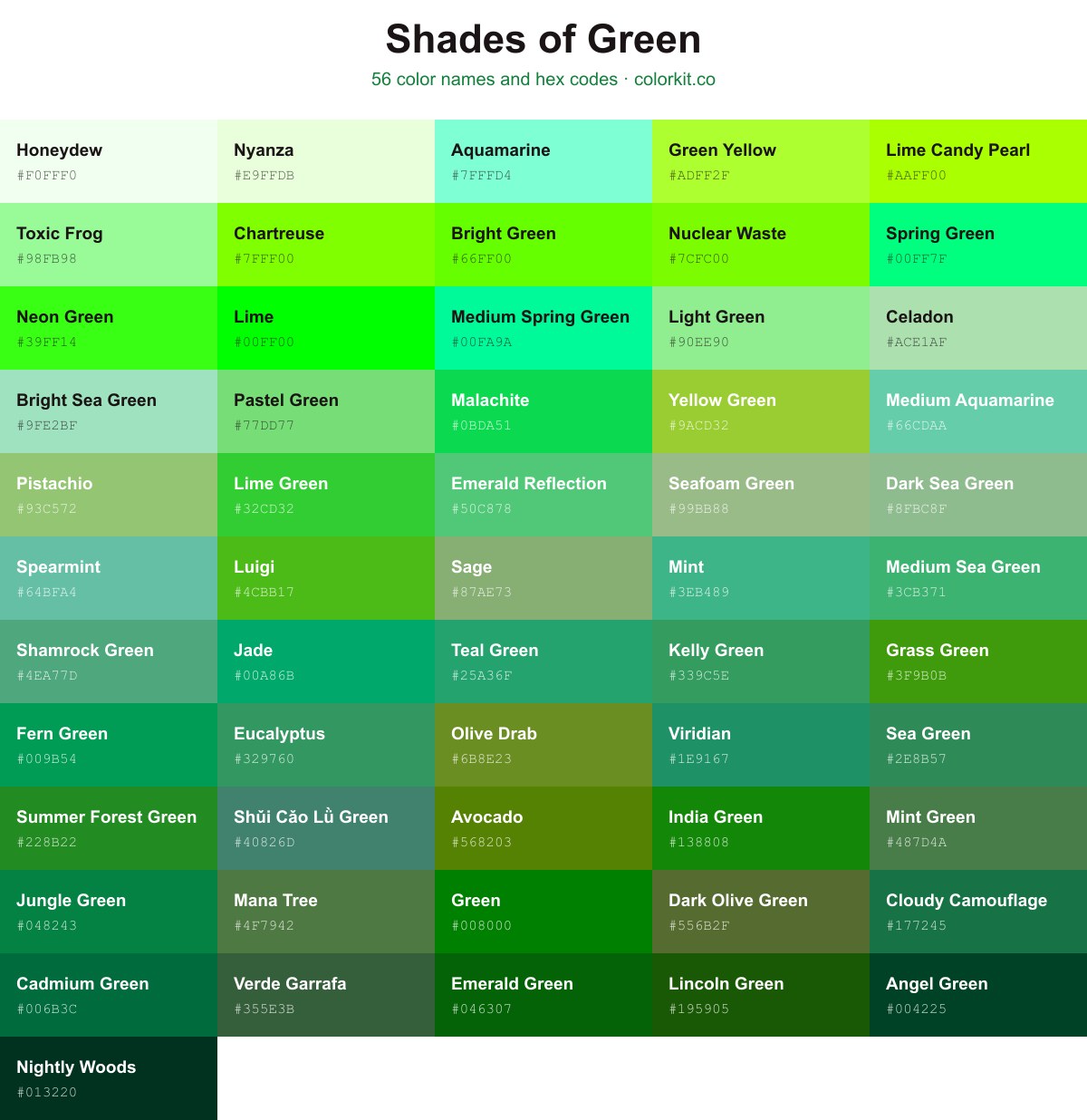
Green runs from the near-white Honeydew #f0fff0 through mid greens like Green #008000 and Viridian #1e9167 down to the deep, almost-black Nightly Woods #013220. This guide collects 56 named shades, each with its hex code. Click any swatch to copy the code, or open its RGB, CMYK, and HSL values and the palette generator.
Eucalyptus is a refreshing and grounded shade of medium green that captures the cooling, botanical essence of its namesake. This balanced hue sits comfortably between earthy forest greens and vibrant mint tones, making it a versatile choice for designs that require a touch of natural vitality without overwhelming the palette. Its organic quality provides a sense of calm and clarity, making it an excellent option for branding, interior accents, or digital interfaces that aim to evoke growth and serenity.
India Green is a vibrant, deeply saturated green hue that carries a distinct sense of vitality and patriotism. As a shade, it strikes a balance between lush forest tones and the bright, energized greens of spring foliage. In design, this color serves as an excellent anchor, offering a strong, earthy presence that pairs well with neutrals or provides a grounding element against lighter accents. Its rich, medium-dark intensity makes it a versatile choice for branding, digital graphics, or print layouts that require a bold yet professional aesthetic.
Avocado is a rich, earthy green that captures the organic essence of nature. Its deep, muddy undertones provide a sophisticated alternative to brighter, more vibrant greens, making it an excellent choice for designs that require a grounded and natural feel. Often associated with retro aesthetics and wholesome, plant-based palettes, this shade pairs beautifully with warm neutrals, creams, and terracotta tones to create balanced, inviting compositions.
Cloudy Camouflage is a deep, muted forest green that evokes the quiet intensity of a dense, fog-covered woodland. This sophisticated shade balances earthy undertones with a subtle, cool desaturation, making it an excellent choice for designs that require a grounded, natural feel without being overly vibrant. Its stabilizing presence works well as a primary hue or as a subdued accent in palettes that favor organic, timeless aesthetics.
Lincoln Green is a deep, rich forest hue that evokes the classic aesthetic of traditional woodland landscapes. This dark, saturated shade of green carries an earthy, grounded quality, making it an excellent choice for designs that require a sophisticated sense of nature or heritage. Its balance of darkness and vibrancy offers enough visual weight to serve as a strong primary color, while remaining versatile enough to function as a grounding background or accent in both digital and print media.
Bright Sea Green is a refreshing, light-toned hue that sits comfortably between soft mint and aquatic turquoise. With its luminous and airy quality, this shade evokes feelings of tranquility and calm, much like shallow tropical waters on a clear day. For designers and artists, it serves as an excellent accent color that brings a clean, modern, and soothing aesthetic to branding projects, digital interfaces, or nature-inspired illustrations without overwhelming the palette.
Wet Ash is a muted, soft gray-green that carries the cool, damp feeling of a misty morning. Its desaturated quality makes it an incredibly versatile neutral, offering just enough hint of organic color to feel grounded and natural without overpowering a palette. Because of its subtle earthy undertones, it works beautifully as a sophisticated backdrop in interior design, or as a calming accent color in branding projects that require a sense of quiet stability and understated elegance.
Angel Green is a deep, forest-inspired hue that evokes a sense of timeless sophistication and grounded calm. This dark, saturated shade sits comfortably within the spectrum of traditional hunter greens, offering a quiet intensity that works exceptionally well as a grounding element in design palettes. Because of its dark, moody undertones, it serves as an excellent alternative to black for text or lines, while providing a richer, more organic contrast when paired with lighter neutrals or metallic accents like gold and bronze. In artistic compositions, it provides a stable, foliage-like base that feels both elegant and authoritative.
Mana Tree is a deep, earthy green that evokes the quiet strength of an ancient, moss-covered forest. This balanced shade carries a touch of cool undertone, making it a sophisticated choice for designs that require a grounded, organic feel. Because it sits comfortably between a true forest green and a muted olive, it works exceptionally well as a neutral anchor in palettes involving rich browns, soft creams, or vibrant teals. Whether you are aiming for a classic look or an earthy, natural aesthetic, Mana Tree provides a reliable and timeless foundation for your creative work.
Shǔi Cǎo Lǜ Green is a sophisticated, muted teal-leaning shade that evokes the serenity of aquatic plants and lush, shaded riverbeds. This balanced green carries a cool, desaturated undertone, making it an excellent choice for designs that require a grounded, organic feel without being overly vibrant or jarring. Because of its subtle complexity, it pairs beautifully with warm neutrals, earthy terracotta, or crisp off-whites, providing a versatile, calming anchor for both digital palettes and print media.
Lime Candy Pearl is a vibrant, electric chartreuse that captures the energy of fresh citrus zest. This high-visibility green sits right on the edge of the yellow-green spectrum, offering an intense, luminous quality that demands attention. Because of its saturated, acidic undertones, it works exceptionally well as a bold accent color in modern digital design or as a striking highlight in contemporary illustration. Its punchy, playful nature makes it a perfect choice for projects that require a sense of urgency, excitement, or a neon-inspired aesthetic.
Medium Spring Green is a vibrant, high-energy hue that sits right at the intersection of lush botanical tones and electric, digital brightness. With its vivid saturation and slight blue undertone, this color feels both organic and modern, making it an excellent choice for interface accents, nature-inspired branding, or bold graphic illustrations. Because it commands attention without being aggressive, it pairs beautifully with neutral greys or contrasting deep purples, offering designers a versatile tool to add a refreshing pop of life to any palette.
Light Green is a bright, refreshing shade that captures the essence of early spring foliage. This soft, invigorating color sits comfortably on the palette as a versatile choice for designs needing a touch of nature or a sense of renewal. Its clean, airy quality makes it particularly effective in user interfaces and digital illustrations where you want to evoke feelings of growth, vitality, and tranquility without overwhelming the viewer. Because of its balanced saturation, Light Green pairs seamlessly with darker earth tones or crisp whites, acting as a gentle bridge between neutral elements and bolder accent colors.
Honeydew is a faint, luminous shade of off-white with a subtle, cooling green undertone. Reminiscent of the pale interior of a ripe melon, this light, airy hue brings a sense of refreshing clarity and minimalist calm to any design palette. As a near-neutral, it offers a sophisticated alternative to stark white, providing just enough chromatic depth to soften architectural details or serve as an unobtrusive, breathable background for more vibrant colors.
Verde Garrafa is a deep, sophisticated shade of forest green that evokes the timeless quality of vintage glass. This rich, moody hue carries a strong connection to the natural world, suggesting the dense foliage of an ancient woodland or the muted depth of mossy earth. Because of its dark, neutral undertones, it serves as an excellent anchor color for design projects that require a sense of stability and classic elegance without appearing overly bright or aggressive. Designers often favor this shade for its ability to provide a subtle, grounding backdrop that complements warmer earth tones or adds a touch of organic refinement to modern color palettes.
Green is a vibrant, classic shade of pure pigment often associated with nature, growth, and renewal. As a primary color in the additive RGB color model, this bold hue serves as the foundational standard for the green family. Its balanced, saturated appearance makes it a versatile choice for designs needing to evoke a sense of stability, organic vitality, or ecological consciousness. Because of its high visibility and recognizable character, this hex code is a staple for branding, web design, and digital art projects that require a crisp, unambiguous touch of color.
Emerald Reflection is a vibrant, mid-tone green that captures the refreshing essence of a lush, sunlit garden. This lively shade balances yellow and blue undertones to create a crisp, energetic hue that feels both organic and modern. Its high luminosity makes it an excellent choice for designs that require a pop of natural vitality, working beautifully as a primary accent color or a grounding element in digital illustrations and branding projects. Because of its clean, balanced appearance, it pairs effortlessly with both earthy neutrals and bold, contrasting primaries.
Luigi is a vibrant, high-energy shade of green that captures the essence of fresh, thriving vegetation. With its bright, punchy saturation, this hue leans slightly towards a neon quality, making it an excellent choice for adding a bold pop of color to digital interfaces, illustrative graphics, or branding projects that need to feel lively and approachable. Its clarity and brightness ensure it stands out effectively against neutral backgrounds, providing a playful yet distinct visual statement.
Nightly Woods is a deep, near-black shade of forest green that evokes the quiet solitude of an ancient woodland after sunset. This rich, moody hue acts as a sophisticated alternative to pure black, offering a subtle organic undertone that brings depth and grounding to any design. Because of its extreme saturation, it works exceptionally well as a dark neutral for text, borders, or dramatic backgrounds where you want to maintain a connection to nature while keeping an elegant, professional aesthetic.
Spring Green is a vivid, energetic hue that perfectly bridges the gap between green and cyan. Its high saturation and luminosity make it an excellent choice for designs that require a touch of youthful freshness or a modern, digital aesthetic. Because it sits right at the intersection of a calming earth tone and a sharp, electric pop, it works well as an accent color for user interfaces, dynamic illustrations, or any creative project looking to evoke the feeling of new growth and vitality.
Toxic Frog is a playful, high-energy shade of pale green that strikes a balance between minty freshness and a subtle neon edge. This vibrant pastel hue carries a slightly whimsical quality, making it an excellent choice for designs that need to feel lively and approachable without overwhelming the viewer. Because it sits on the lighter end of the spectrum, it works effectively as a soft accent color or a cheerful background, providing a distinct, eye-catching brightness that pairs well with deeper forest greens or crisp, neutral greys.
Medium Sea Green is a vibrant, mid-tone shade that balances the coolness of ocean blues with the natural warmth of foliage. This versatile green sits comfortably between a deep emerald and a lighter spring grass, making it an excellent choice for designs that require a sense of freshness, vitality, and organic stability. Whether used as a primary brand color or as a lively accent in a digital interface, Medium Sea Green conveys a sense of calm reliability and balanced energy that works well across both modern and traditional applications.
Dark Sea Green is a muted, cooling shade that captures the essence of sea foam and tranquil landscapes. With a soft, grayish-green undertone, this color offers a balanced aesthetic that feels grounded yet refreshing. It is a versatile choice for designers looking to introduce a calming, nature-inspired element into their palettes without relying on overly vibrant or saturated greens. Its understated elegance makes it particularly effective in branding, interior design, and digital interfaces where a sense of organic harmony is desired.
Nuclear Waste is a high-intensity, electrified shade of green that demands attention. With its high saturation and luminous undertones, this color vibrates with a synthetic energy, making it an excellent choice for designs that require a bold, modern, or slightly edgy aesthetic. While its name might suggest caution, its visual impact is undeniable, serving as a powerful accent color in digital interfaces, poster design, or any creative project where high visibility is the primary goal. It sits firmly on the chartreuse spectrum, bridging the gap between yellow and green to create a uniquely piercing, eye-catching effect.
Olive Drab is a muted, earthy green that bridges the gap between deep forest tones and brownish, botanical hues. This versatile shade carries a grounded, utilitarian quality, often associated with nature and stability. Because of its desaturated, olive-leaning profile, it pairs exceptionally well with warm neutrals, deep charcoals, or vibrant accents like terracotta and gold, making it an excellent choice for designs that require a sophisticated yet understated organic feel.
Sea Green is a rich, medium-toned shade of green that bridges the gap between the vibrancy of nature and the depth of the ocean. Balancing cool blue undertones with earthy, organic roots, this color evokes a sense of tranquility, renewal, and natural sophistication. For designers and artists, it serves as a versatile anchor that pairs effortlessly with warm neutrals, crisp whites, or deeper teals, making it an excellent choice for branding and design projects that require a grounded yet refreshing aesthetic.
Medium Aquamarine is a bright, refreshing blue-green shade that bridges the gap between the vibrancy of spring leaves and the cooling clarity of shallow tropical waters. This balanced hue captures a sense of tranquility and renewal, making it an excellent choice for designs that require a touch of modern serenity. Its clean, cool undertones pair beautifully with warm neutrals or deep teals, providing a versatile option for interface accents, branding, and artistic illustrations that aim to evoke a crisp, natural aesthetic.
Lime Green is a vibrant, high-energy hue that demands attention. As a bright and saturated shade, it evokes a sense of freshness, vitality, and natural growth. Its intensity makes it an excellent choice for accentuating digital interfaces, marketing materials, or artistic projects that require a bold, modern, and lively aesthetic. Because of its strong presence, Lime Green works best when balanced against neutral tones or used sparingly to create visual interest.
Summer Forest Green is a rich, vibrant shade that captures the essence of a dense, sun-drenched woodland in mid-July. This classic, saturated green brings a sense of vitality and groundedness to design projects, serving as a powerful anchor for palettes inspired by nature or organic growth. Because it balances deep forest undertones with the brightness of new foliage, it works exceptionally well for branding, illustrations, and digital layouts that require a strong, dependable pop of natural color.
Green Yellow is a high-energy, vibrant hue that sits precisely at the intersection of crisp lime and sunny chartreuse. This electric shade brings an immediate sense of optimism and natural vitality to any design project, making it an excellent choice for accents that require high visibility and a fresh, modern feel. Because it leans heavily into its yellow undertones, it feels particularly luminous and organic, effectively bridging the gap between bold acidity and earthy softness. Designers often utilize this color to inject a playful, energetic spark into logos, illustrations, and UI elements that need to stand out.
Lime is a high-energy, vibrant shade of pure green that commands immediate attention. As a bright and saturated color, it serves as a powerful accent choice in design, capable of injecting a sense of freshness, excitement, and modern contrast into any palette. Because of its high visibility, Lime works best when used sparingly to highlight key elements or to create a bold, energetic statement in digital and print compositions.
Chartreuse is a vibrant, high-energy color that sits perfectly between yellow and green. This electric, neon-leaning hue demands attention and brings an unmistakable sense of liveliness to any design palette. Because of its intensity, it works exceptionally well as an accent color for digital interfaces, modern branding, or artistic projects that require a bold, nature-inspired pop of brightness. Its unique character balances the refreshing quality of green with the cheerful optimism of yellow, making it a standout choice for those looking to add dynamic movement and visual excitement to their work.
Yellow Green is a vibrant, energetic hue that bridges the gap between the primary brightness of yellow and the calming natural tones of green. Its lively, chartreuse-leaning appearance makes it an excellent choice for designs that need to evoke a sense of freshness, growth, or modern creativity. Because of its high visibility and optimistic character, this shade works particularly well as an accent color to add a pop of zest to otherwise neutral palettes or to draw the eye toward specific UI elements. Whether used in branding or digital illustration, Yellow Green brings a bold, spring-like quality that feels both contemporary and organic.
Dark Olive Green is a sophisticated, earthy hue that evokes the richness of natural foliage and dense forest floors. With its deep, muted undertones, this color serves as an excellent neutral foundation, offering a grounded and organic feel to design projects. It pairs beautifully with warm browns, soft creams, and vibrant oranges, making it a versatile choice for palettes that require a balance between understated elegance and grounded, natural depth.
Aquamarine is a vibrant, luminous shade that perfectly balances the calming qualities of blue with the refreshing energy of green. As a bright and airy pastel, it evokes imagery of tropical waters and sea glass, making it an excellent choice for designs that require a touch of modern serenity. Its high saturation brings a cheerful clarity to any palette, working harmoniously as an accent color or a statement shade when paired with neutral tones or deep, contrasting hues.
Viridian is a sophisticated, cool-toned green that strikes a perfect balance between deep forest hues and vibrant sea glass. With its distinct bluish undertone, this color brings a sense of calm and natural elegance to any design. It functions as a powerful bridge between cooler blues and warmer emeralds, making it an excellent choice for branding, interior accents, or illustration work where a grounded yet refreshing aesthetic is needed.
Teal Green is a vibrant, balanced hue that sits harmoniously between the deep calm of blue-toned teals and the organic freshness of a classic spring green. Its mid-tone saturation makes it an excellent choice for designs that require a pop of life without being overwhelming. Designers often favor this shade for branding and UI elements that need to feel both reliable and modern, as it maintains a clean, crisp presence when paired with neutral whites or contrasting warm accents.
Spearmint is a crisp, refreshing shade of green that bridges the gap between cool mint and soft seafoam. Its medium-light saturation gives it an uplifting, clean energy, making it an excellent choice for designs that require a touch of modern serenity or organic balance. Because of its balanced undertones, Spearmint pairs beautifully with sandy neutrals, deep charcoals, or crisp whites, offering versatility for both digital interfaces and print applications. It evokes a sense of renewal and vitality, perfect for projects aiming for a gentle, approachable aesthetic.
Smoke is a gentle, muted green that captures the cool, airy essence of a hazy morning. With its soft gray undertones and subtle desaturation, this shade offers a sophisticated neutrality that feels both grounded and ethereal. Its understated elegance makes it an excellent choice for designs that require a calming, breathable background or a muted accent that harmonizes effortlessly with warmer tones. As a versatile member of the green family, Smoke provides a modern, organic touch without overwhelming the senses.
Shamrock Green is a vibrant, mid-tone green that balances the freshness of spring vegetation with a sturdy, grounded quality. This hue carries a soft, slightly muted undertone, preventing it from appearing too neon or jarring. Its balanced saturation makes it an excellent choice for designs that require a touch of nature-inspired energy without overwhelming the visual composition. In digital and print media, it serves as a versatile accent that pairs harmoniously with warm neutrals, creams, and deeper forest greens.
Seafoam Green is a gentle, muted shade that captures the calming essence of coastal waters. This soft, desaturated green carries a slightly earthy undertone, making it a versatile choice for designs that require a sense of tranquility and balance. In artistic applications, it functions beautifully as a sophisticated neutral, offering a refreshing alternative to traditional grays or creams while remaining subtle enough not to overwhelm more vibrant color palettes.
Sage is a soft, muted green that captures the natural, earthy essence of dried herbs. This versatile shade carries subtle gray undertones, making it a sophisticated choice for designs that require a sense of calm, balance, and organic warmth. Because of its understated presence, Sage works beautifully as a grounding neutral in modern palettes, pairing effortlessly with crisp whites, warm woods, and deeper forest greens.
Pistachio is a soft, muted shade of green that perfectly balances freshness with a gentle, understated aesthetic. This light herbal tone evokes feelings of organic simplicity and natural vitality, making it an excellent choice for designs that require a touch of life without overwhelming the senses. Its slightly desaturated quality gives it a sophisticated, retro-inspired versatility, allowing it to pair beautifully with warm neutrals, creams, and earthy brown tones in both print and digital projects.
Pewter is a muted, desaturated green that evokes the steady reliability of aged metal with an earthy, organic undertone. This sophisticated shade balances cool gray notes with a soft, natural green, making it an excellent choice for designs that require a grounded, neutral backdrop. Its subtle quality allows it to harmonize seamlessly with both vibrant jewel tones and warmer, more rustic color palettes, providing a refined and versatile option for modern design projects.
Pastel Green is a soft, refreshing shade that evokes the feeling of fresh spring leaves and gentle meadows. As a muted and desaturated tone, it brings a sense of calm and natural serenity to any design project. It is particularly effective as a background color or when used to add a subtle, organic touch without overwhelming more vibrant elements in a palette. Its light, airy quality makes it an excellent choice for designs that aim to feel clean, peaceful, and welcoming.
Neon Green is a high-voltage, electrifying hue that demands immediate attention. This vibrant, saturated shade sits at the intersection of intensity and playfulness, making it a powerful tool for visual hierarchy and bold accents. Because of its extreme luminosity and high contrast, Neon Green functions best as a pop of color against dark or neutral backgrounds, where it can simulate the glowing effect of modern digital displays or street-style aesthetics. Use it sparingly to inject energy into your designs or to create striking, futuristic focal points.
Mint Green is a grounded, earthy shade that bridges the gap between vibrant foliage and muted sage. With its balanced undertones, this color offers a calm, organic feel that works exceptionally well in branding, interior design, and nature-inspired digital projects. It provides a sophisticated alternative to brighter greens, adding a sense of stability and fresh renewal to any palette.
Mint is a refreshing, cool-toned green that strikes a perfect balance between vibrancy and softness. Reminiscent of fresh botanical leaves and crisp herbs, this shade carries a clean, modern quality that feels both invigorating and soothing. Designers often favor Mint for its ability to add a pop of brightness to a palette without overwhelming the senses, making it an excellent choice for branding, interior accents, and digital illustrations that require a touch of nature-inspired serenity.
Malachite is a vibrant, electric shade of green that captures the intensity of lush, tropical foliage. Reminiscent of the semi-precious stone for which it is named, this color strikes a balance between organic depth and modern brilliance. Designers often turn to this pigment when looking to inject high energy and a sense of natural vitality into digital interfaces, branding, or illustration projects. Its bright, saturated quality makes it an excellent choice for accent elements that need to pop against neutral backgrounds or pair with complementary warm tones.
Kelly Green is a vibrant, saturated shade that captures the essence of lush spring foliage and classic collegiate athletic wear. This energetic hue strikes a balance between yellow and blue undertones, giving it a lively, cheerful character that feels both organic and bold. For designers, it serves as an excellent accent color that demands attention without overwhelming a composition. Its medium-dark intensity ensures readability against white text, making it a reliable choice for branding, graphic design, and illustration projects that require a touch of natural, optimistic vitality.
Jungle Green is a vibrant, deep shade that evokes the lush, dense foliage found in tropical rainforests. Its saturation provides a strong, natural energy, making it an excellent choice for designs that require a bold yet grounded connection to the environment. This color balances intensity with organic warmth, serving as a versatile anchor for both modern branding and nature-inspired art projects.
Jade is a vibrant and balanced green that captures the essence of its namesake gemstone. It sits comfortably between cool blue-green and warm emerald, offering a saturated, lively appearance that feels both organic and refined. This hue is versatile enough to add a sophisticated pop of color to digital interfaces, branding materials, or artistic projects, evoking feelings of renewal, harmony, and natural elegance.
Grass Green is a vibrant, organic shade that captures the essence of a sun-drenched lawn in mid-summer. This energetic green sits right at the intersection of nature and vitality, making it an excellent choice for designs that need to evoke feelings of growth, freshness, and renewal. Because of its medium-to-high saturation, it provides a bold pop of color without feeling overly neon, allowing it to work harmoniously in both natural-themed palettes and modern, high-contrast graphic interfaces. Whether you are using it to represent an eco-friendly brand or simply want to add a lively, optimistic element to your composition, Grass Green offers a crisp, grounded aesthetic that feels instantly familiar and inviting.
Fern Green is a vibrant, organic shade that captures the essence of lush foliage in mid-summer. It sits comfortably in the middle of the green spectrum, offering a balanced, saturated hue that feels both grounding and lively. Because of its strong connection to nature, this color works exceptionally well in branding, interior design, and digital art where a sense of vitality, freshness, or eco-conscious growth is desired. It pairs beautifully with earthy neutrals or can act as a bold, energetic accent when contrasted against warm, complementary tones.
Emerald Green is a deep, rich shade of green that evokes the natural vibrancy of lush forests and precious gemstones. This saturated hue carries a strong, grounding energy, making it an excellent choice for designs that require a sense of balance and organic sophistication. Its bold intensity works particularly well as an accent color for branding or illustrations, providing a striking contrast against lighter palettes or pairing harmoniously with earthy, neutral tones.
Celadon is a soft, pale shade of mint green that evokes a sense of tranquility and natural harmony. With its subtle grey-blue undertones, this delicate hue mimics the smooth, translucent appearance of traditional East Asian ceramics. Its gentle and airy quality makes it an ideal choice for creating calming palettes or adding a soothing, muted accent to designs that require a touch of organic elegance without overpowering the visual space.
Cadmium Green is a rich, medium-dark shade that carries the classic, earthy elegance of a deep forest canopy. Its balanced undertones make it a versatile choice for designs that require a touch of natural stability without being overly muted. Whether used as a bold primary hue or as a grounding accent, this color brings a professional, sophisticated quality to branding, illustrations, and digital layouts alike.
Bright Green is a high-visibility, electric shade that commands attention with its intense, neon-like luminosity. This vibrant hue sits at the intersection of lime and chartreuse, delivering a crisp, energetic aesthetic that feels modern and urgent. In design projects, Bright Green works best as a sharp accent color to inject excitement into a composition, or as a bold statement piece in digital interfaces where high contrast and readability are essential. Because of its saturated nature, it pairs exceptionally well with dark grays, deep blacks, or clean whites to create a contemporary, eye-catching visual impact.
Bright Green
How many shades of green are there?
A screen can display millions of distinct greens, since each of the 256 levels of green in the RGB model combines with different red and blue values. This guide narrows that down to 56 named shades you can reference by name and hex code. They span from pale Honeydew #f0fff0 to deep Nightly Woods #013220.
What are the most popular shades of green?
Some of the most recognized named greens include Green #008000, Lime Green #32cd32, Light Green #90ee90, Spearmint #64bfa4, Viridian #1e9167, and Grass Green #3f9b0b. Each one has a copyable hex code on this page. Click a swatch to grab the code or open its full color values.
What is the darkest shade of green?
The darkest green on this page is Nightly Woods #013220, a deep forest green that reads as nearly black. Verde Garrafa #355e3b is another dark, muted green, and Avocado #568203 sits a step lighter with more yellow in it. All three suit backgrounds and high-contrast text.
What is the lightest shade of green?
The lightest green here is Honeydew #f0fff0, a near-white tint with the faintest green cast. Light Green #90ee90 is the next step up, a soft pastel that still works as a background or subtle fill. Both pale greens pair well with darker text.
What colors make green?
In paint, green is a secondary color: mix blue and yellow. On screens, green is one of the three primaries in the RGB model, shown at full strength as #00ff00. In CMYK printing, green is produced by combining cyan and yellow.
Found a green you like? Click it to open the full color page, then send it to the palette generator to build a scheme around it, or drop it into the color picker to fine-tune the exact tone. If you’d rather start from a finished scheme, browse our green color palettes.