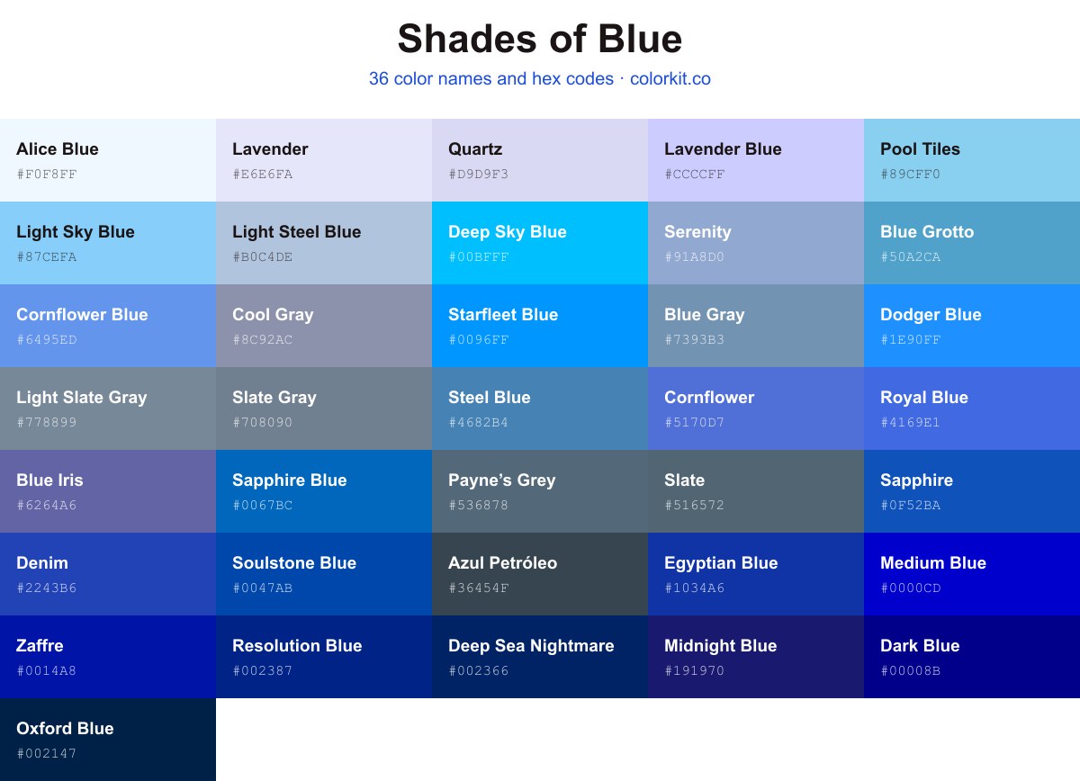
This guide collects 36 named shades of blue with hex codes, running from pale Alice Blue #f0f8ff and Light Sky Blue #87cefa to mid-tone Sapphire #0f52ba and near-black Oxford Blue #002147. Every shade lists its hex value, and clicking a swatch copies the code or opens its RGB, CMYK, and HSL values along with the palette generator.
Slate is a sophisticated, muted blue-grey that bridges the gap between cool professionalism and organic tranquility. Its understated character makes it a versatile choice for designers looking to introduce depth without overwhelming a palette. Whether used as a grounding neutral for web interfaces or as a subtle accent in minimalist art, this shade provides a calm, timeless quality reminiscent of weathered stone and twilight skies.
Steel Gray is a sophisticated, cool-toned neutral that sits comfortably at the intersection of slate and silver. With its distinct bluish undertones, this shade offers a more dynamic alternative to standard grays, providing a clean, industrial edge that feels both modern and grounded. Designers favor Steel Gray for its ability to maintain neutrality while introducing a subtle, atmospheric depth, making it an excellent choice for balancing vibrant palettes or creating sleek, monochromatic designs that require a touch of cool composure.
Resolution Blue is a deep, authoritative shade of navy that commands attention with its intense, saturated pigment. This color sits firmly on the darker end of the blue spectrum, offering a sense of stability, sophistication, and timeless elegance. Its strong, resolute character makes it an excellent choice for branding, corporate design, or any project that requires a grounded and professional aesthetic. When paired with brighter colors, it acts as a stabilizing anchor, providing a rich, dark backdrop that allows accents to pop with clarity and purpose.
Payne’s Grey is a sophisticated, muted blue-grey that bridges the gap between deep charcoal and slate blue. Reminiscent of a stormy sky just before the rain falls, this cool, desaturated shade offers a more nuanced alternative to pure black. For artists and designers, it serves as an excellent mixing pigment, providing depth and atmosphere to shadows without the harshness of a standard dark grey. Its understated presence makes it a versatile choice for minimalist palettes or as a grounding neutral in complex, colorful compositions.
Slate Gray is a sophisticated, mid-toned neutral that balances the coolness of blue with the grounded nature of gray. Reminiscent of weathered stone and overcast skies, this color offers a steady, reliable quality that makes it an excellent choice for modern interfaces, minimalist branding, and architectural accents. Because it leans slightly blue, it brings a calming, professional atmosphere to any palette, acting as a versatile bridge between deep charcoals and softer, lighter grays.
Light Slate Gray is a balanced, cool-toned neutral that sits comfortably between blue and gray. With its soft, desaturated appearance, this shade offers a sophisticated alternative to pure grays, bringing a calming and professional aesthetic to any design project. Designers often favor it for its versatility, as it provides a subtle, steel-like foundation that works beautifully in both modern minimalist interfaces and more traditional graphic layouts.
Midnight Blue is a deep, rich shade that captures the essence of the sky just after sunset. It sits on the cusp of black, offering a strong blue undertone that adds sophistication and gravitas to any palette. This elegant hue is a favorite for designers looking for a high-contrast neutral that feels more atmospheric and nuanced than standard black.
Cool Gray is a sophisticated, muted tone that bridges the gap between traditional gray and soft, atmospheric blue. With its subtle periwinkle undertones, this color offers a clean, calm presence that works exceptionally well as a neutral anchor in modern design palettes. It brings a sense of understated elegance to minimalist projects and serves as a versatile background color that complements deeper navy blues and crisp, cool whites without ever feeling stark or clinical.
Blue Gray is a sophisticated, muted shade that bridges the gap between the cool tranquility of blue and the grounded neutrality of gray. This versatile hue offers a calming, atmospheric quality that works exceptionally well in both modern and minimalist design palettes. Because of its balanced undertones, Blue Gray serves as an excellent foundational color, providing just enough depth to create visual interest without overwhelming a composition. Its subtle, understated character makes it a favorite for creating serene environments or adding a touch of elegant professionalism to digital interfaces and print media.
Oxford Blue is a deeply saturated, authoritative shade of dark blue that commands attention through its rich, almost ink-like intensity. As a near-black navy, it provides a sophisticated and timeless foundation for designs that require a sense of elegance, stability, and tradition. Because of its dark, neutral quality, this color serves as an excellent alternative to black, offering a softer and more nuanced contrast when paired with metallics, crisp whites, or vibrant accent colors.
Starfleet Blue is a vibrant, energetic shade of azure that commands attention without overwhelming the viewer. This bright, electric tone strikes a careful balance between the depth of traditional blue and the luminosity of a clear, midday sky. Because of its clean, high-saturation profile, it serves as an excellent accent color for digital interfaces or modern graphic design projects looking to convey clarity, innovation, and a forward-thinking aesthetic.
Pool Tiles is a bright, airy shade of baby blue that evokes the refreshing clarity of sun-drenched water. With its high luminosity and cool undertones, this color brings a clean, tranquil aesthetic to any design project. Designers often favor this hue for its ability to create a sense of openness and calm, making it an excellent choice for modern interfaces, minimalist branding, or illustrative accents where a touch of serenity is needed.
Sapphire is a rich, deep blue that embodies elegance and authority. Its strong saturation evokes the timeless beauty of its gemstone namesake, making it a sophisticated choice for designs requiring a sense of stability and luxury. Because it balances a classic royal tone with a modern, clean intensity, Sapphire works exceptionally well as a primary accent or a grounding element in color palettes that aim to convey trust, intelligence, and depth.
Deep Sky Blue is a vibrant, electric shade of cyan that captures the intensity of a clear, high-altitude sky at midday. With its strong saturation and high brightness, this color exudes a feeling of energy, clarity, and boundless possibility. It serves as an excellent accent for digital interfaces and modern designs, where it functions effectively to draw the eye without overwhelming the overall palette. Whether used to evoke a sense of refreshing water or to inject a playful pop of color into a composition, Deep Sky Blue remains a crisp and striking choice for any creative project.
Royal Blue is a vibrant, saturated shade that evokes a sense of authority, confidence, and classic elegance. Positioned comfortably between a standard medium blue and a deep azure, this color carries a bright intensity that makes it an excellent choice for designs requiring a strong focal point. Because of its commanding presence, it pairs beautifully with clean whites for a nautical aesthetic or metallic gold accents for a touch of luxury. Whether used in branding to establish trust or in digital art to add depth and energy, Royal Blue remains a timeless staple in any creative palette.
Soulstone Blue is a deep, saturated cobalt that commands attention without overpowering a composition. With its strong, authoritative presence, this shade bridges the gap between traditional navy and vibrant royal blue. Designers often turn to this color for its balance of professional stability and creative energy, making it an excellent choice for logos, accent elements, or bold background applications where a sense of clarity and depth is desired.
Alice Blue is a whisper-light shade that sits on the delicate boundary between a pale sky blue and a crisp, clean white. This serene color carries a subtle, cool undertone, making it an excellent choice for designs that require a sense of airiness, tranquility, and understated elegance. Because of its high luminosity, it serves as a versatile neutral for web interfaces and graphic design projects, providing a gentle alternative to stark white without overwhelming the palette.
Cornflower Blue is a captivating medium-light shade of blue that strikes a perfect balance between cool tranquility and vibrant energy. Named after the petals of the Centaurea cyanus flower, this color carries a slight violet undertone that sets it apart from standard sky blues. In digital design, it serves as an excellent choice for interfaces requiring clarity and a welcoming aesthetic, often providing a soft, reliable contrast against both white and dark backgrounds. Its balanced hue makes it a versatile tool for evoking feelings of calm and inspiration in creative projects.
Medium Blue is a vibrant, saturated hue that sits confidently between the deep richness of navy and the brighter, electric energy of standard blues. This color commands attention without being overwhelming, making it an excellent choice for designs that require a strong, stable, and professional focal point. Artists and designers often rely on this shade to provide visual weight and depth, as its clarity ensures it remains distinct and readable against both light and dark backgrounds. Because of its balanced intensity, Medium Blue works seamlessly in digital interfaces, branding materials, and fine art pieces that need a bold, trustworthy presence.
Steel Blue is a sophisticated, mid-tone blue with a subtle grey undertone that evokes the cool stability of tempered metal. It balances the calming properties of a traditional blue with a muted, grounded quality, making it a versatile choice for modern design palettes. Because of its understated character, it works exceptionally well as a neutral anchor in both digital interfaces and interior spaces, providing a professional yet approachable aesthetic that pairs seamlessly with warmer earth tones or crisp whites.
Deep Sea Nightmare is a powerful, saturated shade of blue that evokes the vast and mysterious depths of the ocean at midnight. This dark, intense pigment commands attention, offering a somber and sophisticated alternative to standard navy. Its deep undertones provide excellent contrast when paired with bright whites, metallics, or soft pastels, making it an ideal choice for creating dramatic, high-impact visuals in both digital design and print media.
Light Steel Blue is a soft, calming shade that bridges the gap between delicate sky tones and the cool, industrial feel of steel. This muted, grayish-blue hue brings a sense of serenity and elegance to designs without overwhelming the viewer. Because of its balanced, airy quality, it serves as an excellent neutral backdrop, often used by designers to create clean interfaces, sophisticated interiors, or minimalist art that needs a touch of gentle color.
Azul Petróleo is a sophisticated, muted blue-grey that bridges the gap between the calm depth of the ocean and the sharp, industrial edge of charcoal. With its dark, desaturated undertones, this color offers a grounded alternative to traditional navy, providing a sense of quiet stability and modern elegance. It serves as an excellent neutral anchor in design palettes, pairing seamlessly with vibrant accents or working harmoniously within monochromatic schemes to add weight and refined contrast.
Light Sky Blue is a soft, airy shade that perfectly captures the serene clarity of a clear, sunny day. This gentle blue possesses a crisp, refreshing quality that brings a sense of calm and openness to any design palette. Because of its light, ethereal nature, it pairs beautifully with white, cream, and soft pastels, or it can serve as a delicate accent against deeper, contrasting blues. Artists and designers often turn to this shade when they need to evoke feelings of tranquility, youthfulness, and light-filled spaces.
Dodger Blue is a vibrant, electric shade of blue that commands attention without being overly aggressive. As a bright and saturated hue, it brings a sense of energy and confidence to any design palette. Designers often favor this color for its high visibility and clean, modern appearance, making it an excellent choice for digital interfaces, athletic branding, and call-to-action buttons. Its versatility allows it to pair seamlessly with both neutral tones and contrasting warm colors, ensuring it stands out effectively across various creative projects.
Dark Blue is a deep, commanding shade that exudes authority and stability. Often associated with the depths of the ocean or the night sky just after sunset, this rich hue provides a sophisticated alternative to black, making it an excellent choice for grounding a design palette. Because it is highly saturated and cool-toned, it works beautifully as a primary color for corporate branding or as a bold accent to create high-contrast, professional visuals.
Zaffre is a deep, intense blue that commands attention with its saturation and strength. This shade leans heavily into the darker side of the spectrum, offering a rich, pigment-heavy quality that evokes the historical use of cobalt glass and ground ore. It is an excellent choice for designs that require a bold, authoritative anchor, providing a sense of depth and mystery without relying on darker, muddy undertones. Whether used as a primary accent or a sophisticated background, Zaffre adds a clean, powerful vibrancy that feels both classic and distinctly modern.
Ultramarine is a deep, intense blue with a powerful presence that commands attention. This highly saturated pigment offers a rich and vivid quality, making it a classic choice for artists and designers looking to add striking depth to their work. Whether used as a primary accent or as a bold background, this shade provides a sophisticated and timeless energy that anchors any visual palette.
Serenity is a soft, muted cornflower blue that evokes a sense of calm and gentle clarity. With its balanced undertones of cool gray and sky blue, this shade offers a sophisticated neutrality that works exceptionally well in modern palettes. Designers often reach for this color to create airy, peaceful compositions, as it provides a stable, unobtrusive backdrop that pairs beautifully with both crisp whites and deeper, slate-toned blues. Whether used as a primary accent or a subtle fill, Serenity brings a composed, tranquil quality to any creative project.
Sapphire Blue is a rich, vibrant shade that commands attention with its intense, saturated depth. Reminiscent of the precious gemstone it is named for, this bold blue carries a classic elegance that feels both reliable and sophisticated. Designers often turn to this hue to add a sense of stability and professional strength to a composition, as it stands out effectively without ever feeling overwhelming. Whether used as a primary accent or a unifying background element, Sapphire Blue provides a clean, energetic contrast that pairs beautifully with lighter neutrals or metallic silver tones.
Egyptian Blue is a rich, deep shade that carries a significant historical legacy, originating as one of the first synthetic pigments created by ancient civilizations. This vibrant hue balances intensity with a cool, calm undertone, making it a sophisticated choice for designers and artists looking to evoke a sense of timelessness and luxury. Its deep saturation works beautifully as a primary color for branding or as a strong accent, providing a bold visual anchor that feels both grounded and distinct.
Denim is a robust and dependable medium blue that evokes the timeless, utilitarian quality of classic indigo-dyed fabrics. This hex color balances a deep, saturated pigment with a clean, cool undertone, making it a versatile choice for designs that require a sense of reliability and grounded strength. Its saturated nature allows it to serve effectively as a strong primary hue or as a stabilizing accent against lighter, more airy palettes.
Cornflower is a vibrant, medium-toned blue that evokes the clarity of a bright summer sky. Balanced and clean, this hue offers a friendly yet professional aesthetic that works beautifully in both digital interfaces and print design. Because it sits comfortably between deeper navy blues and lighter sky tones, Cornflower serves as an excellent anchor color for modern color palettes, providing a reliable sense of calm and trustworthiness without feeling too heavy or corporate.
Blue Grotto is a vibrant, mid-tone blue that captures the refreshing clarity of coastal waters. This spirited hue balances bright energy with a calm, aquatic undertone, making it an excellent choice for designs that require a sense of movement and depth. It works beautifully as a primary color for digital interfaces or as an accent in illustrations where a clean, modern aesthetic is desired. Because of its steady, reliable presence, Blue Grotto pairs effortlessly with both warm neutrals and crisp whites, grounding any palette with its balanced, oceanic character.
Blue Iris is a sophisticated, mid-tone shade that strikes a balance between deep violet and classic blue. This cool, slightly muted hue evokes a sense of tranquility and creative introspection, making it a versatile choice for modern design projects. Because it carries both the calming properties of blue and the subtle richness of purple, Blue Iris works beautifully as a standout accent color or as a grounded element in a larger, balanced palette. It brings a refined, artistic touch to digital interfaces, branding, and illustration alike.
Blue Iris
How many shades of blue are there?
Screens can display millions of distinct blues, since the RGB model allows 256 levels each of red, green, and blue. This guide narrows that down to 36 named shades worth knowing, ranging from the palest tints like Alice Blue #f0f8ff to deep, almost-black tones like Oxford Blue #002147.
What are the most popular shades of blue?
Royal Blue #4169e1, Sapphire #0f52ba, Slate Gray #708090, Light Sky Blue #87cefa, and Alice Blue #f0f8ff are among the most recognized named blues on this page. Royal Blue and Sapphire give you saturated, mid-tone options, while Light Sky Blue and Alice Blue cover the soft, pale end. Click any swatch to copy its hex code.
What is the darkest shade of blue?
Oxford Blue #002147 is the darkest blue on this page, a deep navy that reads almost black at small sizes. Deep Sea Nightmare #002366 and Zaffre #0014a8 are close behind for dark, intense blues. All three work well as backgrounds or as text against light backdrops.
What is the lightest shade of blue?
Alice Blue #f0f8ff is the lightest blue here, a near-white tint with a faint cool cast. Lavender Blue #ccccff and Light Sky Blue #87cefa are also pale options that stay readable as background fills. These soft blues suit large surfaces where a darker shade would feel heavy.
What colors make blue?
Blue is a primary color in both the RGB (screen) and RYB (paint) models, so you can’t mix it from the other primaries in either system. In CMYK printing, blue is produced by combining cyan and magenta. On screen, pure blue is #0000ff, or rgb(0, 0, 255).
Found a blue you like? Click it to open the full color page, then send it to the palette generator to build a scheme around it, or drop it into the color picker to fine-tune the exact tone. If you’d rather start from a finished scheme, browse our blue color palettes.