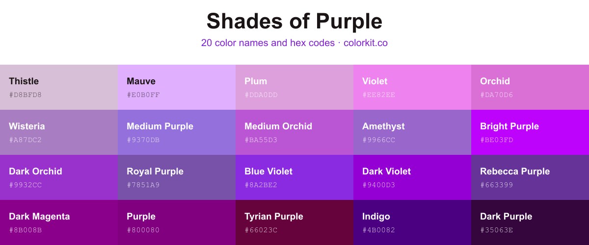
This guide collects 20 named shades of purple with hex codes, spanning the full range from the pale gray-purple of Thistle (#d8bfd8) and soft Mauve (#e0b0ff) down to deep Indigo (#4b0082) and near-black Dark Purple (#35063e). Each shade lists its hex code, and clicking a swatch copies that code or opens its RGB, CMYK, and HSL values along with the palette generator.
20 shades of purple with their names and hex codes
Royal Purple is a rich, vibrant hue that strikes a sophisticated balance between deep violet and warm indigo. As a mid-tone purple, it carries a sense of luxury and creativity, making it an excellent choice for designs that require a bold, regal presence without feeling overly dark. Because of its versatility, artists and designers frequently utilize Royal Purple as an accent to provide visual interest or as a primary shade to evoke feelings of inspiration and elegance.
Amethyst is a vibrant and balanced shade of violet that bridges the gap between deep purple and soft lavender. This medium-toned hue carries a sophisticated, gemstone-inspired quality, making it an excellent choice for designs that require a touch of elegance without feeling overly dark or heavy. Its warm undertones provide a natural, inviting feel, allowing it to pair beautifully with gold accents, crisp whites, or deep charcoal grays in both digital and print media.
Purple Haze is a muted, desaturated shade of violet that balances cool blue undertones with a gentle grey warmth. Its dusty, sophisticated appearance evokes a sense of calm and nostalgic mystery, making it an excellent choice for creating subtle contrast without overwhelming a color palette. Designers often use this shade to introduce a touch of vintage elegance or to provide a soft, grounding element in minimalist compositions. Because of its balanced saturation, it pairs beautifully with creams, warm beiges, and deeper, more vibrant plums.
K S U Purple is a deep, authoritative violet that balances rich saturation with a cool, grounded undertone. As a sophisticated shade, it commands attention without overwhelming, making it an excellent choice for branding, athletic apparel, and bold graphic design elements. Its velvety depth provides a strong contrast when paired with crisp whites, warm golds, or bright creams, offering a classic collegiate feel that feels both traditional and energetic.
Rebecca Purple is a rich, deep shade of violet that bridges the gap between traditional purple and a more sophisticated, modern plum. This distinct hue strikes a balance between intensity and calmness, making it a versatile choice for designers looking to add elegance to their interfaces or branding. Its saturated undertones offer a sense of luxury and creativity, ensuring it stands out without overwhelming the surrounding design elements.
Purple is a bold, foundational hue that commands attention and evokes a sense of creativity, luxury, and wisdom. As a classic secondary color, it bridges the energy of red with the calm stability of blue, offering a rich and balanced aesthetic for any design project. This particular shade serves as a vibrant, saturated anchor, making it an excellent choice for branding, digital art, and interior accents that require a touch of sophistication and depth.
Dark Orchid is a vibrant, saturated shade of purple that balances the boldness of magenta with the depth of a traditional violet. This striking hue carries an air of elegance and creativity, making it an excellent choice for accentuating designs that require a touch of modern sophistication. Its intense pigment works beautifully against neutral palettes, providing a dramatic pop of color that feels both luxurious and playful. Whether used in branding, digital art, or print media, Dark Orchid serves as a captivating focal point that draws the eye and exudes personality.
Medium Slate Blue is a vibrant, balanced purple that leans heavily into cool, periwinkle undertones. It strikes a unique middle ground between a deep violet and a soft, airy blue, making it an excellent choice for designs that require a touch of modern sophistication without feeling too dark or moody. Because of its versatility, this shade works particularly well as an accent color for user interfaces, illustrations, or branding projects that need to feel creative yet stable and reliable.
Dark Slate Blue is a sophisticated and moody shade that bridges the gap between deep purple and muted indigo. This elegant color carries a grounded, professional weight, making it an excellent choice for designs that require stability without the starkness of pure black or navy. Its cool, desaturated undertones provide a versatile backdrop for digital interfaces, branding, or artistic compositions that aim to evoke a sense of calm authority and contemplative depth.
Medium Orchid is a vibrant, mid-tone purple that strikes a sophisticated balance between intensity and elegance. With its distinct cool-toned undertones and slight pinkish vibrancy, this shade offers a lively, contemporary alternative to traditional royal purples. It functions beautifully as a bold accent color in modern design palettes, providing enough saturation to stand out without overpowering adjacent hues. Artists and designers often favor Medium Orchid for its versatility, as it pairs harmoniously with soft neutrals, crisp whites, or complementary greens for a striking, balanced composition.
Plum is a delicate, pale shade of purple that evokes a sense of softness and sophisticated whimsy. This muted violet hue sits gently between lavender and a traditional deep plum, offering a versatile, desaturated tone that feels both airy and grounded. In design, it serves as a wonderful choice for creating a calming atmosphere, pairing beautifully with warm neutrals, earthy greens, or darker, contrasting shades of purple for a refined, monochromatic palette.
Dark Violet is a deep, intense hue that captures the majestic and mysterious essence of the violet spectrum. With its high saturation and cool undertones, this color serves as a bold choice for designs that aim to evoke luxury, creativity, and spiritual depth. It acts as a powerful accent, providing a striking contrast when paired with lighter tones, while maintaining a sophisticated presence that demands attention without overwhelming the viewer.
Slate Blue is a sophisticated and muted shade that bridges the gap between deep purple and cool grey-blue. Its balanced composition offers a grounded alternative to brighter, more vibrant violets, making it an excellent choice for designs that require a touch of elegance without being overwhelming. Designers often turn to this color to evoke a sense of calm, stability, and professional refinement in branding, user interfaces, or digital illustration.
Blue Violet is a vibrant, electric shade that sits comfortably between the deep mystery of purple and the coolness of blue. With its high saturation and energetic undertone, this color brings a sense of creativity and sophistication to any design project. It is bold enough to serve as a striking accent but balanced enough to work well in sophisticated color palettes, making it a versatile choice for digital art, branding, and modern graphic design.
Violet is a bright, cheerful shade that sits at the intersection of purple and pink, offering a playful yet sophisticated hue for any design palette. With its high-energy, light-hearted vibration, this color is often used to evoke feelings of whimsy, creativity, and modern charm. Designers frequently utilize this specific violet to add a pop of color that feels both balanced and inviting, making it an excellent choice for accentuating digital interfaces, branding materials, and artistic illustrations where a touch of warmth is needed.
Lavender Blue is a soft, calming shade that bridges the gap between delicate lilac and cool periwinkle. This pale, pastel violet hue evokes a sense of gentle tranquility, making it an excellent choice for designs that require a soothing, ethereal quality. Its light saturation provides a subtle touch of color without overpowering a composition, allowing it to function effectively as both a serene background or a soft, complementary accent in a variety of creative projects.
Indigo is a deep, sophisticated pigment that sits right at the intersection of blue and violet. As a member of the purple color family, it carries a sense of mystery and intensity that makes it an excellent choice for adding depth to a design palette. This dark, rich hue is highly versatile, acting as a grounded alternative to brighter violets while offering more complexity than a standard navy. Whether used as a bold primary accent or a stabilizing background, Indigo brings an air of elegance and timeless creativity to any artistic project.
Thistle is a soft, muted shade of pale purple that evokes the gentle, dusty appearance of the wildflower for which it is named. This delicate hue balances cool undertones with a subtle, earthy warmth, making it an excellent choice for designs that require a touch of softness without overwhelming the palette. As a light, desaturated pastel, it works beautifully as a neutral backdrop or a calming accent, pairing effortlessly with deeper violets, crisp greys, or muted greens to create a sophisticated and harmonious aesthetic.
Orchid is a vibrant, medium-light shade of magenta-purple that feels both playful and sophisticated. Sitting right between pink and purple on the color wheel, this hex code brings a distinctive energy to any palette without being overwhelming. Designers often turn to Orchid when they need a touch of floral elegance or a pop of saturation that feels natural rather than neon. It balances beautifully with soft neutrals like cream or charcoal, yet provides enough visual interest to stand as a bold accent color in modern branding and digital illustrations.
Medium Purple is a vibrant, balanced violet hue that sits comfortably between blue and red. This saturated shade offers a playful yet sophisticated energy, making it an excellent choice for designs that need to feel creative and approachable without becoming too overwhelming. Because of its moderate intensity, Medium Purple works beautifully as an accent color for interfaces, branding, and illustrations, providing enough visual interest to stand out while remaining versatile enough to pair with both neutral palettes and bolder complementary colors.
Lavender is a soft, pale shade of violet that brings a sense of calm and gentle elegance to any palette. Often associated with relaxation and grace, this delicate hue serves as a beautiful neutral alternative to stark white or grey. Because of its light, airy quality, it works exceptionally well in designs that require a touch of serenity, sophistication, or a subtle floral aesthetic.
Dark Magenta is a deep, rich hue that sits at the intersection of purple and red. It possesses a regal intensity, making it an excellent choice for adding depth, drama, and a sense of sophistication to design projects. Because of its darker saturation, it works beautifully as a high-contrast accent or as a grounding base color when paired with lighter, complementary shades. Its bold nature brings a refined, moody elegance to both digital interfaces and print graphics.
Wisteria is a soft, muted violet that captures the delicate essence of blooming spring flowers. This gentle shade strikes a balance between cool blue undertones and warm lavender hues, offering a sophisticated and calming presence in any design. Its balanced saturation makes it an excellent choice for backgrounds or accent elements where you want to introduce a touch of elegance without overwhelming the composition. As a versatile pastel, Wisteria pairs beautifully with crisp whites, soft greys, or deeper, more saturated purples to create a harmonious and visually soothing palette.
Quartz is a delicate, pale shade of lavender that evokes the cool, ethereal clarity of its namesake gemstone. With its soft, desaturated undertone and crisp, airy quality, this color offers a sophisticated alternative to stark white or grey. In design, Quartz acts as a calming neutral, providing a gentle touch of color that feels serene and modern without overwhelming the surrounding palette. Its subtle purple infusion adds just enough warmth to keep it from feeling clinical, making it an excellent choice for backgrounds or minimalist compositions that require a touch of quiet elegance.
Periwinkle is a captivating, vibrant shade that perfectly balances the calming qualities of blue with the whimsical warmth of violet. This bright, electric hue brings a modern energy to any palette, making it an excellent choice for designs that need to feel both imaginative and approachable. Because of its unique saturation, it stands out against neutral backgrounds and adds a lively, playful contrast when paired with deeper, cooler tones. Whether used as a primary accent or a secondary highlight, this color offers a refreshing pop that feels creative, intentional, and undeniably distinct.
Pastel Purple is a muted, desaturated shade that balances the sophistication of lavender with a soft, greyish undertone. This delicate hue evokes a sense of tranquility and gentle elegance, making it an excellent choice for designs that require a calming, understated touch. Its dusty quality allows it to pair harmoniously with both neutral palettes and more vibrant, contrasting colors, offering a versatile option for branding, illustration, and interior design projects that aim for a dreamy or nostalgic aesthetic.
Mauve is a gentle, delicate shade of purple that balances the calming influence of blue with the warmth of pink. As a soft pastel, it brings a sense of elegance and sophistication to any palette without being overwhelming. Designers often turn to this muted, airy hue to create designs that feel nostalgic, romantic, or serene. Because of its desaturated quality, it serves as a subtle, sophisticated neutral that pairs beautifully with darker charcoals, crisp whites, or other complementary pastels.
Lilac is a gentle, sophisticated hue that bridges the gap between delicate lavender and soft violet. With its light, airy quality and subtle cool undertones, this pastel purple evokes a sense of tranquility, nostalgia, and springtime freshness. It serves as an excellent accent color for modern, minimalist palettes, providing a soothing contrast when paired with slate greys, crisp whites, or muted earth tones. For designers and artists, Lilac offers a versatile way to introduce color without overwhelming a composition, making it a perfect choice for branding, interior design accents, and soft, ethereal illustrations.
Light Violet is a soft, dreamlike pastel that bridges the gap between delicate lavender and airy lilac. With its gentle, desaturated undertones, this color radiates a sense of tranquility and whimsy, making it an excellent choice for designs that require a touch of elegance without being overwhelming. Its airy quality works beautifully in digital illustrations, minimalist UI layouts, or as a calming accent in interior palettes, providing a subtle, sophisticated vibrancy that feels both modern and nostalgic.
Dark Purple is a deep, sophisticated shade that anchors any palette with its intense, royal presence. With strong red and blue undertones, this color creates a feeling of luxury and mystery, making it an excellent choice for backgrounds that need to feel moody or premium. Because it is so saturated, it works beautifully as a high-contrast accent color when paired with lighter pastels or crisp whites, bringing a sense of depth and gravitas to creative designs.
Bright Purple is a high-energy, electric violet hue that commands attention wherever it is applied. With its intense saturation and cool undertones, this vivid shade bridges the gap between deep royal purple and vibrant magenta. Designers and artists often lean on this color to add a bold, modern, or futuristic accent to their work, as it radiates a sense of creativity and playfulness. Its luminosity makes it an excellent choice for digital interfaces, illustrative highlights, or anywhere a striking pop of color is needed to disrupt a palette.
Bright Purple
How many shades of purple are there?
A screen can display millions of distinct purple values, since each one is a different mix of red and blue light. This guide narrows that down to 20 named shades you can actually reference and use. They run from light tints like Thistle (#d8bfd8) through mid-tones like Orchid (#da70d6) to dark values like Dark Purple (#35063e).
What are the most popular shades of purple?
The most widely used named purples include Purple (#800080), Indigo (#4b0082), Violet (#ee82ee), Blue Violet (#8a2be2), Medium Purple (#9370db), and Dark Orchid (#9932cc). These cover warm red-leaning purples and cooler blue-leaning violets. Click any swatch on this page to copy its hex code or open its full color values.
What is the darkest shade of purple?
The darkest shade on this page is Dark Purple (#35063e), a deep purple that reads almost black. Indigo (#4b0082) and Dark Magenta (#8b008b) are the next darkest, both heavy, low-brightness purples that work well for backgrounds and high-contrast text.
What is the lightest shade of purple?
The lightest shade here is Thistle (#d8bfd8), a soft gray-purple tint. Mauve (#e0b0ff) and Violet (#ee82ee) are also light and bright. These pale purples suit backgrounds, pastels, and subtle accents where a darker shade would overwhelm the design.
What colors make purple?
Purple is a secondary color made by mixing red and blue. Adding more red gives a warmer red-purple, while adding more blue gives a cooler violet. On a screen, purple is produced when red and blue light combine.
Found a purple you like? Click it to open the full color page, then send it to the palette generator to build a scheme around it, or drop it into the color picker to fine-tune the exact tone. If you’d rather start from a finished scheme, browse our purple color palettes.