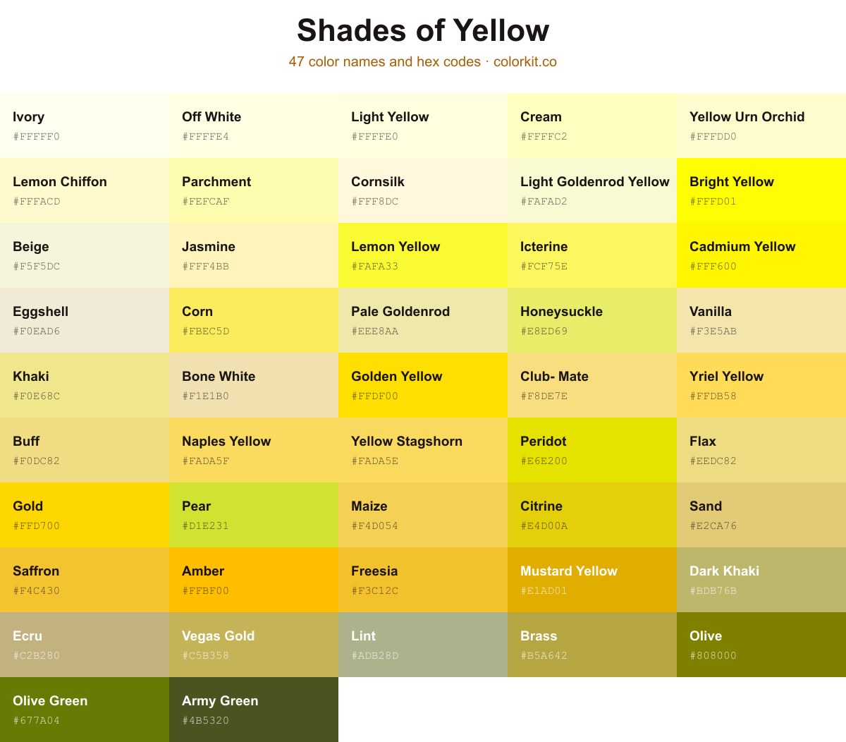
Yellow runs from the near-white of Ivory (#fffff0) and Cornsilk (#fff8dc) through pure Cadmium Yellow (#fff600) and golden Saffron (#f4c430), down to muted, olive-leaning tones like Dark Khaki (#bdb76b) and Army Green (#4b5320). Each of the 47 shades below lists its hex code. Click a swatch to copy the code or to open its RGB, CMYK, and HSL values and the palette generator.
47 shades of yellow with their names and hex codes
Corn is a bright, optimistic shade of yellow that captures the cheerful essence of a summer harvest. Evocative of sun-ripened crops and warm afternoons, this vibrant hue brings a natural, energetic feel to any design palette. As a warm yellow, Corn offers a friendly and approachable personality, making it an excellent choice for adding a touch of radiance and vitality to your creative projects.
Dark Tan is a muted, earthy shade that bridges the gap between deep yellow and soft brown. Its desaturated warmth provides a grounded and sophisticated alternative to brighter, more vibrant yellows. This color evokes a sense of natural stability and organic comfort, making it an excellent choice for backgrounds or palettes that require an understated, professional foundation. Because of its subtle undertones, Dark Tan pairs seamlessly with both cool neutrals and richer, complementary tones.
Olive is a deep, earthy yellow that balances the brightness of sunshine with the grounding stability of a dark, natural green. This sophisticated hue often evokes a sense of tranquility and vintage charm, making it a versatile choice for designs that require a touch of organic warmth. Because of its muted undertones, Olive pairs seamlessly with both neutral palettes and vibrant accent colors, offering an understated elegance that works well in branding, interior design, and digital art projects seeking a grounded, professional feel.
Mouse Nose is a warm, pale yellow that captures the gentle, subtle tones often found in nature. With its soft, creamy undertones, this shade offers a delicate balance between a muted gold and a light beige, making it an excellent choice for designs that require a comforting, approachable aesthetic. Its understated brightness provides a neutral foundation that pairs well with deeper earth tones or crisp whites, offering versatility for projects ranging from branding and illustration to interior color palettes.
Yellow Stagshorn is a bright, warm yellow that evokes the energetic glow of early summer sunshine. This cheerful hue strikes a perfect balance between a soft butter yellow and a vibrant golden tone, making it an excellent choice for adding a touch of optimism to any design palette. Designers often use this shade to create focal points or to introduce a sense of friendliness and warmth without overwhelming more subtle colors. Whether used as an accent or a primary element, Yellow Stagshorn brings a lively, organic feel that feels both welcoming and modern.
Ecru is a sophisticated, grayish-pale yellow that evokes the natural, unbleached texture of linen and silk. Sitting quietly between beige and cream, this muted neutral brings a sense of calm organic warmth to any palette. Its subtle, desaturated character makes it a versatile choice for designers seeking an understated background or a grounding accent that complements richer, bolder yellows and earthy tones.
Lemon Yellow is a vibrant, high-energy hue that mimics the bright, zesty skin of a fresh lemon. This electric shade of yellow radiates positivity and clarity, making it an excellent choice for designs that need to grab attention or evoke a sense of optimism. Because of its high saturation and luminous quality, it works beautifully as an accent color in digital art and web interfaces, cutting through neutral palettes to create a sharp, modern visual impact.
Club-Mate is a luminous, soft yellow with a distinct golden undertone that feels both energetic and comforting. Reminiscent of morning sunlight filtering through a sheer curtain, this shade balances brightness with a gentle, creamy quality that makes it highly versatile in digital design. It lacks the sharp, acidic bite of neon yellows, opting instead for a warm, welcoming glow that works beautifully as an accent color for UI elements or as a vibrant background that promotes creativity and optimism.
Cornsilk is a delicate, pale yellow hue that evokes the soft, creamy tones of dried corn husks. As a very light shade of yellow, it offers an airy and understated warmth, making it an excellent neutral alternative to stark white or beige. Its subtle richness brings a gentle luminosity to design palettes, providing a soothing backdrop that works seamlessly in web design, minimalist interiors, and soft-focus illustrations without overpowering other elements.
Yellow Urn Orchid is a soft, buttery shade of cream that evokes the gentle warmth of early morning light. Its pale, creamy undertone offers a delicate luminosity without being overpowering, making it an excellent choice for artists and designers looking to introduce a subtle touch of sunshine into a palette. Because of its light reflectance, this hue serves as an ideal neutral background, pairing beautifully with deeper earth tones or providing a calm, airy contrast to bolder, more saturated colors in a design scheme.
Old Lace is a delicate, warm-toned off-white that carries a subtle, vintage charm. Reminiscent of aged linens and antique fabrics, this muted shade serves as an elegant, versatile alternative to pure white. In design, it provides a gentle backdrop that offers softness without overwhelming more vibrant elements, making it an excellent choice for creating a cozy, sophisticated atmosphere in both digital and physical spaces.
Wheat is a soft, warm beige with a distinct golden undertone that reflects the natural appearance of harvested grain. As a versatile neutral, it sits comfortably within the yellow spectrum, offering a gentle luminosity that is neither too bright nor too muted. Its organic quality makes it an excellent choice for designs that require a grounded, earthy palette, as it pairs beautifully with deep greens, terracotta, or crisp whites. Whether used as a primary backdrop or a subtle accent, Wheat brings a sense of calm sophistication to any creative project.
Moccasin is a soft, pale yellow that captures the warmth of sunlight filtering through parchment. This gentle hue sits comfortably between beige and cream, offering a subtle, earthy richness that feels both nostalgic and grounded. Its understated nature makes it an excellent neutral for designers looking to introduce a touch of warmth without overwhelming a color palette. Because of its muted, sandy undertone, Moccasin works beautifully as a sophisticated backdrop in minimalist designs or as a calming accent alongside deeper, more vibrant earth tones.
Dark Goldenrod is a sophisticated, earthy shade of yellow that captures the warmth of autumn and the rich texture of natural gold. With a depth that prevents it from feeling too bright or overwhelming, this color serves as an excellent bridge between neutral browns and vibrant yellows. In design, it functions well as a bold accent, offering a vintage yet timeless aesthetic that pairs beautifully with deep greens, navy blues, or creamy off-whites. Its inherent stability makes it a versatile choice for creating high-contrast layouts or adding a touch of rustic luxury to digital and print compositions.
Lemon Chiffon is a delicate, pale yellow that evokes the lightness of airy confections and soft morning sunlight. Its subtle saturation makes it an excellent choice for backgrounds or web interfaces where readability is key, as it provides a gentle warmth without overwhelming the viewer. Because of its soft, buttery undertones, this shade works beautifully when paired with crisp whites, muted grays, or darker, grounding neutrals to create a balanced and inviting palette. Designers often turn to Lemon Chiffon to add a touch of sweetness to minimalist projects or to soften the harshness of stark digital layouts.
Papaya Whip is a soft, warm pastel shade that bridges the gap between a gentle cream and a pale, sun-kissed yellow. Evoking the smooth, tropical tones of its namesake fruit, this color brings a light and airy quality to design palettes. Because of its low saturation and high brightness, it serves as an excellent neutral backdrop, offering a subtle warmth without overwhelming the viewer. Artists and designers often turn to this inviting hue to create a sense of comfort, cleanliness, and organic sweetness in both digital interfaces and print projects.
Khaki is a gentle, muted shade of yellow that evokes a sense of natural warmth and grounded sophistication. With its subtle earthy undertones, this versatile hue acts as a perfect neutral base, bridging the gap between soft beige and vibrant gold. Designers and artists often turn to Khaki when they need a color that provides structure and calm without overpowering a palette, making it an ideal choice for creating organic, balanced, and timeless visual compositions.
Pale Goldenrod is a soft, muted yellow with a slight greenish undertone that evokes the warmth of late summer sunshine. This desaturated shade offers a gentle, sophisticated alternative to brighter, more aggressive yellows, making it an excellent choice for backgrounds or accent elements where subtlety is key. Because of its light, airy quality, it pairs beautifully with earth tones, cool blues, or deep grays, providing a balanced and readable option for web design and artistic compositions alike.
Gold is a radiant, high-energy hue that embodies richness, success, and warmth. As a bright and metallic shade of yellow, it commands attention and adds a sense of luxury or timeless quality to any design palette. Whether used as a subtle accent or a bold statement, this color evokes feelings of prestige and optimism, making it an essential tool for projects that require a touch of elegance or vibrant emphasis.
Floral White is a delicate, pale shade that sits comfortably between a crisp white and a soft, creamy yellow. This subtle off-white hue carries a gentle warmth, making it an excellent choice for designs that require a clean, neutral backdrop without the harshness of a pure, stark white. Its understated elegance provides a soothing visual quality, perfect for soft palettes where you want to evoke a sense of lightness and airy sophistication.
Goldenrod is a rich, saturated shade of yellow that captures the warmth of late summer sunshine and the earthy tones of its namesake wildflower. Sitting firmly between vibrant yellow and subtle orange on the color wheel, this hue offers a sophisticated, organic feel that brings depth and stability to a palette. For designers, Goldenrod acts as an excellent accent color that feels both approachable and vintage, making it a reliable choice for adding a touch of natural, golden elegance to web and print projects alike.
Beige is a versatile, neutral tone that sits delicately between the warmth of yellow and the crispness of white. Reminiscent of unbleached wool or warm sand, this off-white shade offers a calming, sophisticated base that works effortlessly in both digital and print design. Its subtle, earthy character provides a comfortable foundation, allowing more vibrant accent colors to stand out without feeling overwhelmed. As a classic staple in design palettes, Beige brings a touch of organic elegance and timeless simplicity to any project.
Dark Khaki is a sophisticated, muted yellow-brown shade that evokes a sense of grounded stability and natural warmth. Because it sits at the intersection of earthy tan and soft olive, this color offers a neutral, versatile foundation for design projects that require a touch of organic elegance without being overly bold. Its subtle, desaturated undertones make it an excellent choice for backgrounds or accents that need to feel established, reliable, and approachable. Whether used in interior palettes or digital branding, Dark Khaki brings a calm, mature presence to any composition.
Yriel Yellow is a radiant, golden-hued shade that brings a warm and sun-drenched energy to any design palette. With its optimistic and vibrant undertones, this color strikes a perfect balance between a soft, buttery yellow and a bolder mustard. It serves as an excellent accent for projects needing a touch of cheerfulness or a nostalgic, vintage feel without becoming overwhelming. Whether used as a primary pop of color or as a subtle highlight, Yriel Yellow offers a welcoming, approachable brightness that instantly draws the eye.
Light Goldenrod Yellow is a soft, warm pastel shade that evokes the gentle glow of morning sunlight. This muted, creamy yellow sits delicately between a pale lemon and a rich butter tone, making it an excellent choice for designs that require a bright, airy aesthetic without the intensity of a primary yellow. Its subtle luminosity provides a calming and cheerful backdrop, frequently used in web design and digital art to add a touch of warmth and approachability to interfaces or illustrations.
Vegas Gold is a sophisticated, muted shade of yellow that captures the essence of classic opulence. Sitting comfortably between a deep tan and a rich metallic gold, this hue offers a warmth that feels grounded rather than flashy. For designers and artists, it serves as an excellent choice when a project requires a touch of luxury that is subtle and refined. It pairs particularly well with dark neutrals, deep navies, or charcoal grays, providing a steady, reliable highlight that avoids the overwhelming brightness of lighter yellows.
Vanilla is a soft, creamy shade that perfectly captures the warm, comforting essence of its namesake. This pale yellow sits comfortably in the neutral spectrum, offering just enough saturation to bring warmth to a palette without overwhelming it. It acts as an excellent bridge between stark whites and more vibrant, golden yellows, making it a versatile choice for backgrounds, high-key illustrations, or any design that requires a gentle, welcoming glow. Its subtle, buttery undertone provides a sense of calm and understated elegance, reminiscent of vintage parchment or freshly churned butter.
Sand is a warm, muted yellow that mimics the sun-drenched texture of coastal shorelines. This versatile, golden-beige hue bridges the gap between soft neutrals and vibrant yellows, offering a sophisticated, earthy quality that works well in both minimalist and organic design palettes. Its understated brightness brings a sense of calm and natural warmth to any project, making it an excellent choice for backgrounds or accent details where a gentle, inviting glow is desired.
Saffron is a rich, golden-yellow hue that captures the essence of the exotic spice from which it takes its name. This warm, vibrant color exudes a sense of luxury and energy, making it an excellent choice for designs that require a touch of radiance or an earthy, organic feel. Because it sits comfortably between a bright lemon yellow and a deep ochre, Saffron offers a sophisticated versatility that works beautifully as both an accent color and a bold statement, bringing a grounded, sun-drenched quality to any palette.
Peridot is a vibrant, high-energy yellow with a subtle chartreuse undertone that mimics the natural brilliance of its gemstone namesake. This saturated hue acts as a bridge between sunny yellow and electric lime, offering a fresh, organic aesthetic that works exceptionally well in both digital interfaces and print design. Its inherent warmth makes it an excellent choice for accenting neutral palettes or creating high-contrast focal points that demand attention without sacrificing readability.
Pearl is a soft, warm neutral with delicate undertones that bridge the gap between creamy white and muted yellow. This elegant shade carries a subtle luminosity reminiscent of fine silk or polished limestone, offering a sophisticated alternative to stark, bright whites. Its understated character makes it an incredibly versatile choice for designers looking to create inviting, airy spaces or clean, minimalist color palettes. Because of its gentle golden warmth, Pearl provides a calming, organic feel that harmonizes beautifully with natural textures like wood, stone, and linen.
Pear is a vibrant and energetic shade of yellow that captures the crisp, lively essence of fresh fruit. This bright hue sits at the intersection of yellow and lime, bringing a zesty, modern quality to designs that require a bold pop of color. Because of its high visibility and cheerful disposition, Pear works exceptionally well as an accent color for branding, digital illustrations, or interior design elements that need to feel both playful and contemporary. It pairs beautifully with cool neutrals like slate gray or deep charcoal, as well as earthy browns, grounding its intensity while allowing its natural warmth to shine.
Parchment is a soft, warm, and highly luminous shade of yellow that evokes the gentle aesthetic of antique paper. With its high brightness and subtle golden undertones, this hue offers an inviting and organic feel, making it an excellent choice for backgrounds where readability and a vintage touch are desired. It sits lightly on the screen, providing enough pigment to suggest age and texture without overwhelming the viewer. This versatile neutral works beautifully as a sophisticated alternative to stark whites, adding a touch of warmth to branding, illustration, and digital layouts that require a clean yet classic foundation.
Olive Green is an earthy, rich shade that leans heavily into its yellow undertones, evoking the natural vibrancy of sun-drenched foliage. This deeply saturated hue strikes a sophisticated balance between a muted organic tone and a bold, energized yellow-green. Because of its grounded, nature-inspired quality, it serves as an excellent anchor color for designs that require warmth and organic stability without feeling overly bright or neon. Whether used as a primary brand color or a subtle accent, it adds a layer of depth and maturity to a palette.
Naples Yellow is a warm, soft, and buttery hue that bridges the gap between classic yellow and a creamy, earthy pastel. Historically derived from lead antimonate, this pigment has been a staple in the palettes of Old Master painters for centuries, prized for its ability to mimic the gentle radiance of morning sunlight or soft, filtered indoor lighting. Its muted saturation makes it an incredibly versatile choice for design, offering a sophisticated alternative to brighter, more aggressive yellows. Whether used as a subtle accent or as a unifying neutral in a color scheme, Naples Yellow adds a sense of timeless elegance, warmth, and nostalgic comfort to any visual project.
Mustard Yellow is a warm, earthy tone that bridges the gap between vibrant yellow and organic gold. This saturated hue carries a retro, mid-century modern aesthetic, making it an excellent choice for designs that need to feel approachable, grounded, and slightly nostalgic. Its muted intensity pairs beautifully with deep navies, charcoal grays, or rich forest greens, offering a sophisticated alternative to brighter, more neon shades of yellow. Whether used as a bold accent or a primary brand color, Mustard Yellow brings a distinct sense of character and warmth to any creative project.
Mimosa is a gentle, creamy shade of yellow that evokes the soft glow of early morning light. With its muted, neutral undertones, this color brings a sense of calm sophistication to any design project, bridging the gap between bright yellow and warm beige. Mimosa offers a subtle, inviting aesthetic that works exceptionally well as a backdrop or an accent, providing a balanced warmth that isn’t overpowering. It is a versatile hue for artists and designers looking to add a touch of comfort and elegance to their palettes.
Maize is a warm, vibrant shade of yellow that captures the cheerful essence of harvested corn. This hue radiates a natural, golden energy, making it an excellent choice for designs that need a touch of sunshine or a friendly, approachable aesthetic. Its balance of luminosity and depth allows it to stand out as a primary accent or blend harmoniously within an earthy, harvest-inspired palette. Whether used in branding or illustration, Maize brings a sense of optimism and organic vitality to any project.
Lint is a soft, muted olive-yellow that captures the essence of weathered organic matter and vintage textiles. This subtle shade offers a sophisticated, earthy quality, making it an ideal choice for designs requiring a calm, grounded neutral. Its desaturated nature allows it to work harmoniously in palettes that need a bridge between warm, sun-faded tones and natural, dusty greens. Designers often use Lint to bring a sense of aged character and gentle tranquility to their work without overwhelming the visual space.
Jasmine is a soft, warm pastel yellow that evokes the delicate petals of its namesake flower. This light, creamy hue carries a gentle luminosity, making it an excellent choice for designs that require a subtle, inviting touch rather than an aggressive burst of color. In a palette, it acts as a calming neutral that pairs beautifully with earthy tones, soft grays, or richer, bolder yellows to create a balanced, sun-drenched aesthetic. Its ethereal quality brings a sense of serenity and lightness to any creative project.
Icterine is a bright, warm shade of yellow that captures the cheerful essence of late afternoon sunlight. Reminiscent of canary feathers or the vibrant hue of a ripe lemon, this color brings an immediate sense of optimism and energy to any design project. Its high visibility makes it an excellent choice for accent pieces that need to stand out, while its natural, organic undertone helps it feel approachable rather than harsh. When used in digital or print compositions, Icterine adds a playful, spirited touch that feels both classic and inviting.
Honeysuckle is a cheerful, high-energy yellow that feels like the first warm days of late spring. This bright, optimistic shade carries a hint of lime, giving it a zesty quality that prevents it from feeling too soft or muted. Because of its vibrant intensity, it works exceptionally well as an accent color for designs needing a touch of spontaneity, or as a primary hue when the goal is to evoke feelings of radiance, growth, and positivity. Its balanced saturation makes it a versatile choice for bringing a fresh, modern energy to digital or print palettes.
Golden Yellow is a radiant and cheerful hue that captures the essence of sunshine and warmth. This vibrant, saturated yellow sits perfectly on the spectrum between a primary yellow and a deeper gold, offering a balanced luminosity that commands attention without being overwhelming. Designers often rely on this shade to inject energy and positivity into their projects, making it an excellent choice for branding, accents, and illustrations that need to evoke feelings of optimism, joy, and luxury. Its high visibility ensures it stands out against neutral palettes while harmonizing beautifully with deep blues, rich browns, and sophisticated blacks.
Freesia is a vibrant, saturated yellow that captures the cheerful intensity of late spring blossoms. This warm shade balances high energy with a touch of organic softness, making it an excellent choice for designs that require a bold, attention-grabbing accent. Its golden undertones provide a sunny, optimistic quality that works beautifully in both digital interfaces and print media, offering a sense of warmth and clarity without becoming overwhelming.
Flax is a soft, muted yellow that captures the natural, sun-bleached hue of dried flax stalks. This delicate shade sits comfortably between a pale cream and a light goldenrod, offering a gentle warmth without the intense saturation of brighter yellows. Designers often turn to this earthy tone when seeking a sophisticated, understated neutral that provides a sense of calm and organic simplicity in their projects. Because of its subtle, pastel-like quality, it pairs beautifully with deep greens, terracotta, and warm wood tones, making it an excellent choice for palettes aiming for a natural or rustic aesthetic.
Eggshell is a soft, warm neutral that straddles the line between white and a very pale, muted yellow. Reminiscent of a delicate seashell or weathered parchment, this off-white shade carries an organic, understated elegance. Designers favor Eggshell for its ability to soften harsh lighting and provide a subtle, non-intrusive backdrop that complements bolder, saturated palettes without competing for attention. It serves as an excellent anchor color for creating clean, airy, and sophisticated compositions.
Desert is a warm, muted gold that evokes the sun-baked sands and arid landscapes of high-noon terrain. This shade balances a sophisticated earthiness with a subtle, radiant glow, making it an excellent choice for designs that require a grounded yet elevated touch. Its complex undertones bridge the gap between golden ochre and soft beige, offering a versatile neutral that feels both organic and refined in any palette.
Cream is a delicate, pale yellow that captures the softness of early morning light. This inviting shade sits comfortably between a bright yellow and white, offering a neutral warmth that feels gentle on the eyes. It is an excellent choice for designs that require a subtle, airy backdrop without the starkness of pure white. Because of its light saturation, Cream pairs beautifully with soft pastels, muted earth tones, or as a softening contrast against bolder, more vibrant colors in a palette.
Citrine is a bright, energetic yellow that captures the vivid warmth of a summer afternoon. This hue balances a touch of golden depth with a sharp, lemony clarity, making it an excellent choice for adding a cheerful, optimistic accent to any palette. Because of its high visibility and vibrant undertones, Citrine works particularly well when used to highlight key visual elements or to bring a sense of organic energy to clean, modern designs.
Champagne is a soft, muted tone that sits elegantly between light yellow and beige. With its warm, desaturated undertones, this shade captures the essence of refined neutrality, offering a sophisticated alternative to stark whites or deeper golds. Its versatility makes it an excellent choice for designers looking to create a calming, luxurious aesthetic without overpowering a palette. Whether used as a primary backdrop or a subtle accent, Champagne brings a delicate, sun-kissed warmth to any composition.
Camel is a warm, earthy shade of yellow that evokes the natural, rustic tones found in the desert landscape. With its golden-brown undertones and muted saturation, this sophisticated neutral bridges the gap between deep ochre and soft tan. Artists and designers often rely on Camel to provide a grounding element in palettes, offering a sense of stability and warmth that feels both timeless and grounded. It pairs beautifully with rich creams, deep chocolates, or contrasting teals, making it a versatile choice for everything from textile design to branding.
Cadmium Yellow is a vibrant, high-energy hue that captures the intensity of pure, saturated sunlight. This distinct shade of yellow is opaque and remarkably bold, making it an essential choice for artists and designers looking to add a focal point or a sense of optimism to their projects. Its brightness demands attention without feeling overwhelming, providing a clean, sunny aesthetic that works beautifully in both digital interfaces and print applications.
Buff is a soft, warm neutral that sits comfortably between light yellow and beige. With its muted, desaturated quality, this shade feels organic and grounded, making it an excellent choice for designs that require a gentle touch without the intensity of a bright primary yellow. It evokes a sense of natural materials, like unbleached linen or parchment, providing a sophisticated and earthy undertone that pairs beautifully with deep greens, slate grays, or rich browns.
Bright Yellow is a vibrant and high-energy hue that commands immediate attention. With its intense saturation and warm undertones, this shade mimics the brilliance of pure sunlight, making it an excellent choice for designs that require a bold, optimistic pop of color. It radiates positivity and clarity, serving as a powerful accent that cuts through visual clutter and brings a sense of joyful urgency to any composition.
Brass is a sophisticated, earthy shade of yellow that captures the muted luster of polished metal. With its subtle greenish undertones and warm, golden core, this color offers an understated elegance that feels both vintage and timeless. It serves as an excellent grounded neutral for designers looking to introduce metallic warmth into a palette without the high reflectivity of bright gold, making it a versatile choice for adding depth and a touch of organic richness to any composition.
Bone White is a soft, desaturated shade of yellow that captures the essence of aged parchment or weathered limestone. Its muted, warm undertones make it a versatile choice for designers seeking a sophisticated neutral that feels organic rather than stark. This color bridges the gap between classic cream and subtle yellow, providing a gentle luminosity that works exceptionally well as a background element or a grounding accent in minimalist palettes.
Army Green is a deep, earthy olive tone that bridges the gap between muted yellow and rich, dark green. Evoking the structured and rugged feel of military aesthetics, this shade offers a grounded, utilitarian vibe that works exceptionally well as a neutral anchor in a design palette. Its yellow undertones provide warmth, preventing it from appearing too sterile, making it a versatile choice for designs that need to balance authority with natural, organic appeal.
Amber is a vibrant, golden-yellow hue that strikes a perfect balance between the warmth of the sun and the richness of organic resin. With its deep, saturated pigment, this color carries a sense of timeless energy and comfort, making it an excellent choice for designs that require a touch of optimistic nostalgia. Because it sits comfortably between yellow and orange on the color wheel, Amber provides a grounded, luminous focal point that feels both inviting and authoritative in any creative project.
Amber
How many shades of yellow are there?
Displays can render millions of distinct yellow values, so on a screen the exact count is effectively unlimited. This guide collects 47 named shades of yellow to keep them practical to browse and use. They span from pale, near-white tones like Ivory (#fffff0) to deep, olive-leaning ones like Army Green (#4b5320).
What are the most popular shades of yellow?
Cadmium Yellow (#fff600), Saffron (#f4c430), Maize (#f4d054), Dark Khaki (#bdb76b), Cornsilk (#fff8dc), and Ivory (#fffff0) are among the most recognizable named yellows on this page. The brighter end (Cadmium Yellow and Saffron) reads as classic yellow, while Cornsilk and Ivory work as soft, off-white backgrounds. Click any swatch to copy its hex code.
What is the darkest shade of yellow?
Army Green (#4b5320) is the darkest shade on this page, a deep olive that sits at the dim, desaturated edge of yellow. Dark Khaki (#bdb76b) and Lint (#adb28d) are the next-darkest, both muted and greenish. These tones come from low brightness rather than pure hue, which is why they look earthy rather than bright.
What is the lightest shade of yellow?
Ivory (#fffff0) is the lightest shade on this page, a barely-there yellow that reads as warm white. Yellow Urn Orchid (#fffdd0) and Cornsilk (#fff8dc) are close behind, both pale and soft. These near-white yellows are common picks for page backgrounds and low-contrast surfaces.
What colors make yellow?
In the RYB (paint) and CMY (print) models, yellow is a primary color, so it can’t be mixed from the other primaries. On a screen, yellow is made by combining red and green light, which produces #ffff00 in RGB. So the answer depends on the medium: mixed light on screens, but a base color in paint and print.
Found a yellow you like? Click it to open the full color page, then send it to the palette generator to build a scheme around it, or drop it into the color picker to fine-tune the exact tone. If you’d rather start from a finished scheme, browse our yellow color palettes.