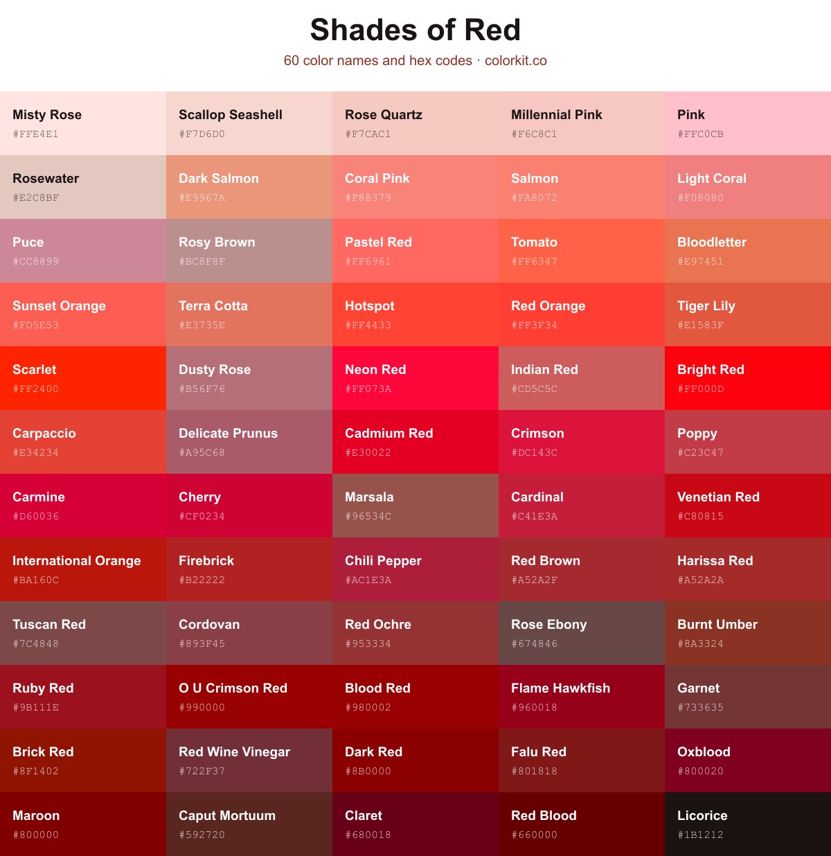
Red runs from soft rose tints all the way to deep, near-black burgundies. This guide gathers 60 shades of red, each with its name and hex code. Click any swatch to copy the code, or open it on ColorKit for the RGB, CMYK, and HSL values and to build a palette around it.
Cinnabar is a deep, rich red with a dramatic, almost earthy intensity. This shade carries a sophisticated weight, reminiscent of historical pigments and natural minerals. Because of its dark, moody undertones, it serves as an excellent anchor color for palettes that require a touch of elegance or warmth. Designers often choose this hue to add visual depth to illustrations or to create a bold, grounded statement in branding and interior compositions.
Chestnut is a rich, earthy red that evokes the warmth of autumn forests and rustic textures. This grounded hue balances the intensity of deep crimson with the soft, stabilizing influence of brown, making it an excellent choice for designs that require a touch of natural sophistication. Its muted saturation provides a cozy, organic feel that works exceptionally well as a warm neutral in branding, interior palettes, or illustrative works that aim to convey heritage and reliability.
Claret is a deeply rich and sophisticated shade of red that evokes the timeless elegance of fine wine. With its dark, saturated undertones and subtle cool bias, it commands attention without being overwhelming. This authoritative hue brings a sense of luxury and classic refinement to any design palette, making it an excellent choice for projects that require a touch of drama, depth, or traditional prestige. Whether used as a primary accent or a grounding background element, Claret adds a layer of maturity and intensity to modern and vintage aesthetics alike.
Rose Red is a vibrant and bold hue that captures the essence of a blooming garden. This captivating shade of red carries a distinct pinkish undertone, making it feel lively, energetic, and deeply romantic. It commands attention without being overwhelming, offering a balanced warmth that works beautifully as a statement color in branding, illustration, and digital design projects. Its natural, floral quality brings a sophisticated depth to color palettes, especially when contrasted with cooler tones or soft neutrals.
Red Ochre is a deep, earthy red that channels the raw, grounded energy of natural pigments found in the soil. This muted, brick-like shade carries a sophisticated warmth, making it a versatile choice for designs that require a touch of history or organic richness. Its stable, reassuring presence works exceptionally well as an accent color in branding, interior design palettes, and illustrative work, grounding more vibrant hues without feeling too heavy.
Coffee Pot is a muted, brownish-grey hue that embodies the comforting and grounded essence of a well-loved kitchen staple. As a soft shade within the red color family, it offers a sophisticated neutrality, making it an excellent choice for backgrounds or textural elements that require warmth without overpowering the surrounding palette. Its subtle, earthy undertones provide a sense of stability and calm, pairing beautifully with deeper burgundies or creamy off-whites to create a timeless, inviting aesthetic.
Delicate Prunus is a muted, dusty rose shade that bridges the gap between deep pink and subtle mauve. Its tempered saturation gives it an understated elegance, making it an excellent choice for designs that require warmth without the intensity of a primary red. This color evokes a sense of natural, earthy softness, reminiscent of dried botanicals, and pairs beautifully with slate grays, creamy neutrals, or deep forest greens to create a sophisticated, organic palette.
Rose Ebony is a deep, muted reddish-brown with strong earthy undertones that evoke the feeling of aged timber or dried rose petals. Its dark, desaturated nature provides a sophisticated alternative to more vibrant reds, making it an excellent choice for grounding palettes that require warmth without intensity. Designers often use this shade to add a sense of stability and vintage elegance to branding, interior accents, or textile patterns where a subtle, organic touch is desired.
Falu Red is a deep, rich shade that evokes the traditional, earthy pigment historically used to paint wooden cottages and barns across the Swedish countryside. This muted, brownish-red carries a sense of heritage and grounded stability, making it an excellent choice for designs that require warmth without the intensity of a primary red. Its subdued saturation allows it to work harmoniously in palettes that lean toward rustic, classic, or industrial aesthetics, providing a reliable, sophisticated anchor for both digital and print media.
Caput Mortuum is a deep, earthy shade of reddish-brown that carries an ancient, historical weight. Historically known as a pigment derived from oxidized iron, this dark, muted tone provides a sense of grounding and permanence. Its sophisticated, brownish undertone makes it an excellent choice for designs that require a vintage aesthetic or a touch of organic, rustic warmth. In a color palette, Caput Mortuum pairs effectively with soft creams, muted golds, and slate greys to create a grounded and balanced composition.
Garnet is a rich, deep red that balances warmth with a sense of grounded stability. Reminiscent of the semi-precious gemstone from which it draws its name, this color carries an earthy, brownish undertone that differentiates it from brighter, more vibrant reds. Designers and artists often favor Garnet for its sophisticated, moody quality, making it an excellent choice for creating depth in color palettes or adding a touch of classic, vintage elegance to compositions. Its muted nature provides a refined alternative to primary reds, offering a professional and timeless aesthetic.
Blood Red is a deep, intense crimson shade that evokes a sense of urgency, power, and raw emotion. As a darker, more saturated variation of red, it commands immediate attention without the brightness of more standard hues. Its moody and sophisticated undertones make it an excellent choice for designs that require a touch of dramatic flair or a bold, striking accent. Whether used in high-contrast graphics, illustrative art, or branding that demands gravity, Blood Red provides a timeless and forceful visual impact.
Wenge is a deep, muted brown with subtle gray undertones, creating a refined, earthy appearance. It works well as a grounding neutral alongside warmer shades, including rich reds.
Flame Hawkfish is a bold, deep red that captures the intensity of a marine sunset. It sits firmly within the spectrum of darker reds, possessing a subtle, brownish-maroon undertone that gives it a grounded, sophisticated feel. Designers often gravitate toward this shade when they need a punch of color that avoids the neon brightness of primary reds, making it an excellent choice for accent elements or branding that requires a sense of authority and warmth. Its rich, saturated quality allows it to pair beautifully with soft creams or stark, cool grays, balancing its natural heat with elegant contrast.
Maroon is a deep, rich shade of red that commands attention without overwhelming the senses. It evokes feelings of sophistication and warmth, often associated with tradition, comfort, and luxury. Because of its dark, earthy undertones, this color acts as an excellent grounding element in design palettes, offering a grounded alternative to brighter, more vibrant reds. Whether used as a primary bold accent or a subtle background tone, Maroon brings a timeless sense of elegance to any creative project.
O U Crimson Red is a deep, saturated shade of red that commands attention with its intense, authoritative presence. This classic, bold hue carries a sense of tradition and strength, making it an excellent choice for designs that need to project confidence or academic prestige. Because of its dark undertones, it works particularly well as a primary accent to add weight and sophistication to a color palette without becoming overwhelming.
Oxblood is a deep, sophisticated shade of dark red that draws its name and rich, brownish undertones from the classic, dried-blood color of ox hide. This timeless hue exudes a sense of luxury, history, and grounded intensity, making it a popular choice for leather goods, refined interior design palettes, and bold fashion statements. Because it sits on the border between red and brown, Oxblood offers a muted, mature alternative to brighter crimson tones, providing an excellent depth for high-contrast designs or subtle, monochromatic compositions.
Chocoholic is a deep, earthy shade of reddish-brown that evokes the richness of dark cocoa. As a sophisticated alternative to standard browns, it brings a sense of warmth and grounded stability to any palette. This color feels both indulgent and reliable, making it an excellent choice for designs that require a touch of natural luxury or vintage-inspired depth. Whether used as a primary background color or an accent, Chocoholic offers a versatile, decadent quality that bridges the gap between vibrant red tones and neutral earth hues.
Red Blood is a deep, saturated shade that carries the intensity and somber weight of dried crimson. Its dark, almost moody undertones make it an excellent choice for designs that require a touch of drama, sophistication, or organic realism. Because of its low brightness and high saturation, this color anchors a palette well, providing a strong, grounded contrast when paired with lighter neutrals or metallic accents in digital and print compositions.
Hotspot is a vibrant and energetic shade of red that captures the intensity of a flickering flame. This high-energy hue commands attention, making it an excellent choice for accentuating key visual elements or creating a focal point in design projects. Its warm undertones provide a bold, urgent feel that works particularly well in digital graphics, branding, and interfaces where you want to evoke passion and immediate impact.
Cerise Red is a vivid, pink-leaning red with a lively and energetic character. The hex color #de3163 brings bold warmth to palettes, making it well suited for accents, branding, illustrations, and expressive designs.
Sunset Riders is a bold, saturated red with a subtle magenta undertone. Its vivid intensity brings energy and drama to branding, illustration, and other creative designs.
Terra Cotta is a warm, earthy red with distinct orange undertones that mimic the natural, baked clay found in pottery and brick. This inviting hue bridges the gap between vibrant red and softer, muted orange, making it a versatile choice for designs that need to feel grounded and organic. Because of its sun-drenched appearance, it works exceptionally well in interior design palettes, branding that emphasizes authenticity, and artwork that requires a touch of rustic sophistication. Its natural warmth adds a layer of comfort and historical depth to any composition.
Bloodletter is a warm, terracotta-leaning red that balances rustic earthiness with a distinct, striking energy. This medium-toned shade avoids the typical brightness of primary reds, opting instead for a muted, slightly burnt quality that feels both organic and urgent. Designers often gravitate toward this hue when they need a color that feels grounded yet passionate, making it an excellent choice for accent elements, branding that requires a human touch, or illustrations seeking a vintage aesthetic.
Aerospace Orange is a high-visibility, intense shade of red-orange that commands immediate attention. This vibrant hue is historically significant, famously utilized by the U.S. Air Force and NASA to increase the visibility of aircraft, equipment, and astronaut flight suits against the contrasting backdrops of the sky or terrain. Designers and artists often incorporate this energetic color to create powerful focal points or to evoke a sense of urgency, adventure, and technical innovation within their work.
Ruby Dust is a vibrant, saturated shade that captures the intense energy of a polished gemstone. It carries a cool, slightly pink-leaning undertone that separates it from standard primary reds, making it a compelling choice for designs that need to feel both luxurious and energetic. This striking hue works exceptionally well as an accent color in branding or digital interfaces, offering a bold visual statement without overwhelming the surrounding palette.
Misty Rose is a delicate, pale shade of pink with warm, peach-colored undertones. It evokes a sense of softness and tranquility, reminiscent of the subtle hue that appears on rose petals at the first light of dawn. This versatile pastel brings a gentle, romantic quality to any design, making it an excellent choice for backgrounds or accent elements that require a sophisticated, airy touch. As a light member of the red family, it pairs beautifully with neutral greys, soft greens, and darker, muted tones to create balanced and inviting color palettes.
Salmon is a warm, softly balanced red with noticeable pink and orange undertones. Its gentle brightness gives designs a friendly, approachable feel, making it well suited to illustrations, accents, and inviting color palettes.
Razzmatazz is a vivid pinkish-red with a bold, energetic character. Its rich intensity adds warmth and drama to designs, making it well suited to accents, highlights, and expressive artwork.
Red Wine Vinegar is a sophisticated, deeply saturated shade that bridges the gap between classic burgundy and warm, dark brown. Reminiscent of its namesake, this color carries an earthy complexity, making it an excellent choice for adding depth and moodiness to a palette. Its dark, cool-toned character provides a grounding effect in design, offering a richer, more nuanced alternative to standard reds without the brightness of crimson or the excessive orange undertones of rust.
Scallop Seashell is a soft, delicate pastel that evokes the muted, sandy pinks found on a sun-bleached shoreline. This light, warm shade sits gently within the red spectrum, offering a subtle and soothing presence that feels both organic and airy. Because of its desaturated, earthy undertone, Scallop Seashell serves as an excellent neutral alternative to stark white or cream, providing a touch of warmth without overwhelming a color palette. It pairs beautifully with deeper terra cottas, dusty roses, or muted sage greens for a sophisticated, nature-inspired aesthetic.
Tomato is a vibrant, warm red-orange that captures the energetic spirit of a vine-ripened fruit. This bold hue sits comfortably between red and orange, offering a playful yet punchy aesthetic that instantly draws the eye. Its high saturation makes it an excellent choice for accents, call-to-action buttons, or any design element that needs to convey excitement and friendliness without being overly aggressive. Because of its organic inspiration, Tomato brings a touch of natural liveliness to digital interfaces and print projects alike.
Licorice is an exceptionally dark, rich shade that sits at the very edge of black with a subtle, underlying warmth. Because of its deep red undertones, it feels more organic and grounded than a standard, neutral black, making it an excellent choice for modern typography or high-contrast backgrounds. Designers often favor this hue when they need a soft, sophisticated alternative to pure black that adds visual depth without appearing flat or harsh.
Crimson is a deep, rich, and intense shade of red that commands attention with its slight blue undertone. Often associated with passion, power, and prestige, this classic color carries a sense of sophistication that makes it a popular choice in both print and digital design. Its vibrant saturation creates a bold impact, serving as an excellent accent color or a striking focal point when you want to evoke warmth and energy without leaning too far into orange or pink territory.
Indian Red is a muted, earthy shade of red that balances warmth with a subtle, brownish-gray undertone. Unlike the vibrant or fiery reds commonly found in palettes, this color offers a sophisticated, dusty quality that feels grounded and vintage. It is an excellent choice for designs that require a sense of stability, comfort, or historical elegance, making it particularly effective in branding, textile design, and interior color schemes where a softer, less aggressive red is desired.
Light Coral is a soft, warm hue that bridges the gap between pink and orange, offering a gentle yet vibrant energy to any palette. As a lighter, more muted shade of red, it evokes feelings of comfort and summer sunsets without being overwhelming. Designers often turn to this inviting color to add a touch of whimsy and approachability to branding, web interfaces, and illustrations. Because of its balanced saturation, it pairs beautifully with cooler teals and blues or harmonizes naturally with earthy neutrals.
Dark Salmon is a warm, muted pink-orange hue that brings a gentle, earthy sophistication to design palettes. Sitting comfortably between the brightness of coral and the subtlety of dusty rose, it evokes a sense of comfort and natural elegance. Because of its balanced, desaturated nature, this shade works beautifully as a soft accent in web design, branding, or illustration, offering a refined alternative to more vibrant red or orange tones without overwhelming the viewer.
Cardinal is a deep, vibrant red that commands immediate attention, reminiscent of the distinct plumage of the bird for which it is named. This rich hue balances intensity with a subtle, velvety depth, making it a powerful choice for branding, accents, and graphic design projects that require a bold focal point. Its classic, sophisticated nature evokes warmth and energy without the sharp brightness of a primary red, allowing it to stand out elegantly against both neutral backgrounds and darker palettes.
Pink is a quintessential pale shade that sits comfortably between white and true red. As a delicate, soft hue, it evokes feelings of playfulness, tenderness, and sweetness. In design, this classic pastel offers a balanced warmth that can soften rigid layouts or add a touch of romantic charm to branding and illustrations. Its high brightness and low saturation make it an ideal choice for backgrounds, accents, or any project that requires a gentle, approachable aesthetic.
Carpaccio is a vivid, warm red with strong coral undertones. Bold and energetic, it adds impact to palettes and works especially well as an accent color in branding, illustration, and interior design.
Coral is a warm, vivid reddish-orange that brings energy and brightness to a palette. Its lively appearance works well for accents, illustrations, and designs that call for a friendly, tropical feel.
Orange Red is a vivid, warm shade that blends the energy of red with the brightness of orange. The hex color #ff4500 creates a bold, attention-grabbing effect, making it well suited for accents, highlights, and expressive designs.
Dark Red is a deep, rich shade with strong visual weight and a bold, dramatic character. The hex color #8b0000 works well for adding warmth, intensity, and contrast to designs and artwork.
Rosy Brown is a muted, earthy shade that bridges the gap between sophisticated neutrals and warm, reddish-brown tones. Reminiscent of weathered wood and dusty rose petals, this color provides a calming, organic feel that works exceptionally well in interior design and digital palettes requiring a grounded, understated accent. Its balanced undertones make it a versatile choice for creating subtle contrast or establishing a cozy, natural atmosphere.
Firebrick is a deep, warm red with earthy undertones and a strong, grounded appearance. It brings richness and contrast to palettes, making it a versatile choice for accents, branding, and expressive artwork.
Venetian Red is a rich, saturated red with a warm, bold character. Its strong intensity makes it effective for accents, highlights, and designs that call for energy and visual impact.
Tuscan Red is a muted, earthy red with warm brown undertones. Its subdued character brings depth and understated warmth to palettes, making it well suited to interiors, branding, and artwork.
Tiger Lily is a warm, vivid red-orange with coral undertones. Its energetic hue adds brightness and character to palettes, making it well suited to expressive illustrations, bold accents, and inviting designs.
Sunset Orange is a vivid, warm red-orange with lively coral undertones. The hex color #fd5e53 brings energy and warmth to designs, making it well suited for accents, illustrations, branding, and engaging calls to action.
Scarlet is a vivid, highly saturated red with a noticeable orange undertone. Bold and energetic, #ff2400 brings warmth and intensity to designs, making it well suited for accents, highlights, and expressive artwork.
Ruby Red is a deep, sophisticated shade that captures the classic intensity of its namesake gemstone. With its rich, saturated undertones, this color commands attention without being overwhelming, making it an excellent choice for designs that require a bold, luxurious focal point. Whether used as a primary accent or a subtle background element, it brings a sense of timeless elegance and warmth to any creative project.
Rosewater is a delicate, muted blush that balances the warmth of a sunset with the soft, understated elegance of a pale neutral. This sophisticated shade falls within the light red color family, offering a gentle, almost translucent quality that evokes feelings of calm and subtle romance. Because of its dusty, desaturated undertone, Rosewater serves as an excellent foundational hue for minimalist palettes, providing just enough pigment to add interest without overwhelming a design. Its versatile nature makes it a perfect choice for clean, modern branding, interior accents, or as a softening agent when paired with bolder, more saturated colors.
Rose Quartz is a gentle, calming shade of pink that sits at the softer end of the red spectrum. Its delicate, dusty undertones make it a versatile choice for designs that require a touch of elegance without feeling overly vibrant. Because of its muted and warm quality, it pairs beautifully with neutral palettes, slate grays, and deep navy tones, often evoking a sense of tranquility and romantic sophistication in both digital and print media.
Red Orange is a vivid, warm shade that blends the intensity of red with the lively energy of orange. Its bold appearance makes it well suited to attention-grabbing accents, expressive illustrations, and energetic visual designs.
Red Brown is a warm, earthy shade that combines rich red with subtle brown undertones. Its deep, grounded appearance adds warmth and character to palettes, making it a versatile choice for natural, rustic, and autumn-inspired designs.
Raspberry is a rich, vivid red with strong pink and berry undertones. Its bold, energetic character makes it well suited to expressive accents, lively branding, and designs that call for warmth and intensity.
Poppy is a warm, moderately deep red with subtle crimson and coral undertones. Its lively character brings energy and visual warmth to palettes, making it well suited for accents, illustrations, and expressive designs.
Pastel Red is a soft, warm hue that balances the energy of a classic red with a gentle, approachable lightness. Its desaturated quality makes it a versatile choice for designs that require a touch of vibrancy without overwhelming the viewer. This shade works particularly well in UI design, branding, and illustrative work where you want to evoke feelings of friendliness, comfort, or playful optimism. By sitting between a bright salmon and a muted coral, Pastel Red provides a sophisticated alternative to bolder, more aggressive tones.
Neon Red is a vivid, high-energy red with a bright, electric appearance. The hex color #ff073a creates strong visual impact, making it well suited for bold accents, highlights, and designs that call for an attention-grabbing burst of color.
Millennial Pink is a soft, warm pink with a delicate red undertone. Its light, soothing appearance works well in gentle palettes, modern branding, and understated illustrations.
Marsala is a muted, earthy red with warm brown undertones. Its rich, balanced character adds depth and warmth to palettes, making it a versatile choice for refined designs and natural-inspired artwork.
Mahogany is a rich, warm red with strong orange and earthy brown undertones. Its bold, grounded appearance brings depth and warmth to palettes, making it well suited to expressive designs and natural-inspired artwork.
Dusty Rose is a muted red with soft pink and mauve undertones. Its gentle, refined appearance brings warmth and subtle elegance to palettes, making it a versatile choice for both contemporary and vintage-inspired designs.
International Orange is a bold, saturated red with a subtle orange undertone. Its deep, warm character brings energy and intensity to designs, making it a striking choice for accents, branding, and expressive artwork.
Cordovan is a deep, muted red with rich brown undertones. Its warm, refined character brings depth and understated elegance to palettes, making it well suited to branding, fashion, interiors, and illustrative work.
Coral Pink is a warm, lively pink-red with soft coral undertones. Its bright, approachable character adds energy and warmth to palettes, making it suitable for expressive accents, illustrations, and welcoming designs.
Chili Pepper is a deep, vivid red with a rich, slightly cool character. The hex color #ac1e3a adds bold energy to palettes and works well for accents, branding, and expressive artwork.
Cherry is a vivid, highly saturated red with a subtle magenta undertone. Its bold intensity adds energy and contrast to palettes, making it well suited for striking accents and expressive designs.
Cerise is a rich, vivid red with pronounced pink and magenta undertones. The bold, saturated hue brings energy and sophistication to designs, making it well suited to striking accents, fashion-inspired palettes, and expressive artwork.
Carmine is a vivid, highly saturated red with a subtle crimson-magenta undertone. Its bold appearance brings energy and intensity to designs, making it well suited for accents, branding, and expressive artwork.
Cadmium Red is a vivid, intense red with a slight crimson undertone. Bold and energetic, it brings strong contrast and visual impact to illustrations, branding, and accent elements.
Burnt Umber is a deep, warm reddish brown with earthy character. Its muted intensity adds richness and depth to palettes, making it a versatile choice for natural, rustic, and autumn-inspired designs.
Burnt Sienna is a deep, earthy red that evokes the warmth of autumn leaves and aged terra cotta pottery. It brings a grounded, rustic quality to designs, bridging the gap between rich brown tones and vibrant sunset reds. This hue acts as an excellent accent for palettes requiring a touch of organic sophistication and timeless, natural character.
Bright Red is a vivid, energetic red with a subtle cool undertone. Its intense appearance makes it well suited to bold accents, highlights, and attention-grabbing designs.
Brick Red is a deep, warm red with subtle orange undertones. Its earthy intensity brings a bold, grounded character to palettes and works well for accents, rustic designs, and rich visual compositions.
Harissa Red is a deep, warm red with earthy undertones. Its rich, grounded appearance brings warmth and contrast to palettes, making it a strong choice for accents, illustrations, and bold design elements.
Harissa Red
How many shades of red are there?
On a screen there are millions of distinct reds, because each one mixes a strong red channel with small amounts of green and blue. What most people want is the named shades, and this guide collects 60 of the most useful, from pale tints like misty rose to near-black deep reds like oxblood and licorice.
What are the most popular shades of red?
The most widely used named reds are crimson (#dc143c), scarlet (#ff2400), maroon (#800000), firebrick (#b22222), cardinal (#c41e3a), and tomato (#ff6347). Crimson and scarlet read as classic bright reds, while maroon and oxblood give a darker, more formal feel.
What is the darkest shade of red?
The darkest named reds are licorice (#1b1212), red blood (#660000), and oxblood (#800020), followed by dark red (#8b0000) and maroon (#800000). These near-black reds hold up well for text, backgrounds, and high-contrast accents.
What is the lightest shade of red?
The lightest reds blend into pink: misty rose (#ffe4e1), rosewater (#e2c8bf), rose quartz (#f7cac1), and pink (#ffc0cb). These soft tints suit backgrounds, pastel palettes, and gentle, romantic designs.
What colors make red?
Red is a primary color, so in the RGB (screen) and RYB (paint) models you can’t mix it from the other primaries. In the CMYK model used for print, red is made by combining magenta and yellow ink. On screen, pure red is just the red channel at full strength: #ff0000, or rgb(255, 0, 0).
Found a red you like? Click it to open the full color page, then send it to the palette generator to build a scheme around it, or drop it into the color picker to fine-tune the exact tone. If you’d rather start from a finished scheme, browse our red color palettes.