
Colors don’t just make things look pretty. They shape how we see and feel about the world around us. For designers, understanding color is like having a secret weapon. The right colors can make a brand unforgettable or turn a dull room into a cozy haven.
Think about how you feel when you see a bright red sports car or walk into a calm blue bedroom. Colors trigger emotions and memories without us even realizing it. That’s why designers spend so much time picking the perfect palette for their projects.
In this post we’ll go over all about color meanings and when to use certain colors in your designs.
The Quick Version
Colors guide mood and decisions. Use the color wheel to help you pick colors that work well together. Warm colors energize, cool colors calm, and neutrals offer balance. Use red for power, yellow for optimism, blue for trust, green for growth or nature, purple for luxury or creativity, and orange for enthusiasm.
Color Theory Basics
Before we dive into how colors make us feel, let’s talk about how they work together. Color theory is the backbone of good design. It’s not just about picking colors you like – it’s about choosing colors that work well together and send the right message.
The Color Wheel: Your Design Compass
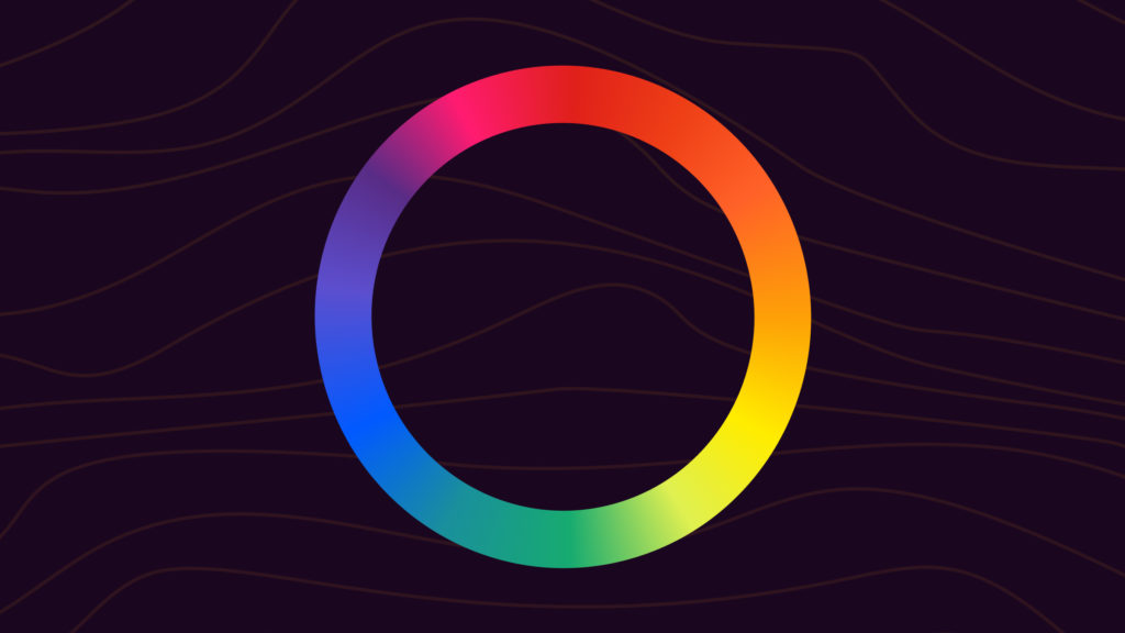
The color wheel is like a map for designers. It shows how colors relate to each other. Here’s what you need to know about the RYB (red, yellow, blue) color wheel:
- Primary colors: Red, blue, and yellow. These are the building blocks of all other colors.
- Secondary colors: Green, orange, and purple. You get these by mixing primary colors.
- Tertiary colors: These sit between primary and secondary colors on the wheel. Think yellow-green or red-orange.
Understanding the color wheel helps you create color schemes that look good together. It’s not about rules, but about knowing how to create harmony or contrast in your designs.
Note: If you’re designing for print, you’ll be using the CYMK color wheel (cyan, yellow, magenta, and “key” – black). If you’re designing for digital displays, you’ll instead be using a color wheel of light, with Red, Green, and Blue, expressed either as a hex code or an RGB value.
Warm vs. Cool Colors
Colors aren’t just about looks – they can change how a room feels or how people react to your design.
Warm colors like red, yellow, and orange feel lively and energetic. They can make a space feel cozy or exciting. They can also help make people feel alert and attentive. Think of a bright, cheery kitchen or a bold logo that grabs your attention.
Cool colors like blue, green, and purple feel calm and relaxing. They can make a room feel bigger or more peaceful. Imagine a serene spa or a trustworthy bank logo.
Neutral colors like black, white, gray, and brown are the unsung heroes of design. They balance out other colors and can make them pop. A little black can make bright colors look even brighter, while white can make a design feel clean and open.
The Psychology of Color and The Meaning of Different Colors
Now, let’s explore the meaning of colors and how they typically affect our emotions and behavior. (These aren’t firm rules – culture and personal experiences can change the associations we have with specific colors.)
Understanding these common associations can help you make smart design choices.
Red: The Color of Passion and Power

Red is a powerhouse color. It gets your heart pumping and grabs your attention fast. That’s why it’s often used for:
- Warning signs and stop lights
- Sale tags in stores
- Sports team logos
Brands like Coca-Cola use red to look bold and exciting. But be careful – too much red can be overwhelming. In most cases, it works best as an accent color to add energy to your design.
Yellow: Sunshine in Color Form

Yellow is the color of happiness and optimism. It’s bright and cheery, like a sunny day. Yellow can:
- Make people feel welcome
- Grab attention (think yellow highlighters)
- Boost creativity
McDonald’s golden arches are a perfect example of using yellow to look friendly and appetizing. But like red, a little yellow goes a long way. Too much can be hard on the eyes.
Blue: Trust and Tranquility

Blue is one of the most popular colors in the world, and for good reason. It’s calming and trustworthy, plus there are many different types of blue to choose from. Blue can:
- Make a space feel bigger and more open
- Help people focus (that’s why it’s used in offices)
- Create a sense of stability and reliability
Many banks and tech companies use blue in their logos. It helps them look professional and dependable. Dark blue can look formal, while light blue feels fresh and airy.
Green: Nature’s Neutral

Green is a versatile color that connects us to nature. It can represent:
- Growth and new beginnings
- Health and wellness
- Environmental friendliness
Whole Foods uses green in its branding to reinforce its image as a healthy, eco-friendly store. In design, green can create a balance between warm and cool colors, making it great for creating harmonious color schemes.
Purple: Royal and Imaginative

Purple has long been associated with royalty and luxury. It can also represent:
- Creativity and imagination
- Mystery and spirituality
- Uniqueness and individuality
Brands like Cadbury use purple to stand out and add a suggestion of luxury. In design, a touch of purple can add sophistication or whimsy, depending on the shade you choose.
Orange: Energy and Enthusiasm

Orange is a fun, energetic color that grabs attention without being as intense as red. It represents:
- Creativity and adventure
- Youth and playfulness
- Affordability (think of Home Depot)
Nickelodeon uses orange in its branding to appeal to kids and look fun. In design, orange can add a pop of energy or create a warm, inviting atmosphere.
Neutral Colors: The Unsung Heroes of Design
Neutral colors might seem boring, but they’re crucial in design. They provide balance and let other colors shine. Here’s how to use them effectively:
Black: Elegance and Power

Black is strong and sophisticated. It can:
- Make other colors look brighter
- Create drama and contrast
- Convey luxury and exclusivity
Many high-end brands use black in their logos and packaging, often paired with silver or gold. In interior design, a black accent wall can add depth to a room. Just be careful not to overuse it, as too much black can feel heavy or intimidating.
White: Clean and Open

White is all about simplicity and clarity. It:
- Makes spaces feel bigger and more open
- Creates a clean, fresh look
- Lets other colors stand out
Apple uses white extensively in its product design and marketing to create a sleek, modern look. In web design, white space (or negative space) is crucial for readability and focus. Off-white can be used if white would be too harsh or stark for a design or room.
Gray: Balance

Gray is the ultimate neutral. It’s calm and balanced, making it perfect for:
- Professional settings
- Backgrounds that don’t compete with other elements
- Creating a sense of calm and focus
Many modern offices use gray to create a focused atmosphere without being too sterile. In design, gray can help tone down bright colors or add sophistication to a color scheme.
Brown: Warmth and Reliability

Brown is earthy and natural. It can:
- Create a sense of comfort and stability
- Add warmth to a design
- Complement bright colors beautifully
Coffee shops often use brown in their decor to feel cozy and inviting, and to invoke the rich brown of coffee beans. In fashion, brown is a versatile neutral that pairs well with many colors.
Beige and Tan: Subtle Sophistication

These light neutrals are understated and elegant. They:
- Create a warm, welcoming backdrop
- Work well with both cool and warm colors
- Add a touch of sophistication without being flashy
Luxury hotels often use beige and tan to create an upscale yet comfortable atmosphere. In fashion, these colors are timeless and versatile.
Putting Color to Work in Design
Now that we understand what different colors mean, let’s talk about how to use them effectively in various design contexts.
Branding: Color as Identity
Your brand’s colors should reflect its personality, values, and what it wants to achieve. For example:
- A fitness brand might use energetic orange to motivate customers
- An eco-friendly company could choose calming green to reinforce its connection to nature
- A tech startup might opt for trustworthy blue to build credibility
Remember, consistency is key in branding. Use your chosen colors across all platforms to create a strong, recognizable identity.
Web Design: Guiding the User’s Eye
Colors on websites do more than just look good – they help users navigate and understand content. Here are some tips:
- Use blue for clickable links – it’s a web standard that users expect
- Choose a background color that’s easy on the eyes for long reading sessions (usually, white or off-white)
- Use bright, contrasting colors for important buttons or call-to-action elements: orange or yellow can pop well
Remember to consider accessibility. Make sure there’s enough contrast between text and background colors for easy reading. Avoid using jet black text: instead, opt for a dark gray for less eye-strain.
Interior Design: Setting the Mood
Colors can transform how a room feels. Here’s how to use them effectively:
- In bedrooms, use cool blues or soft greens to create a relaxing atmosphere for better sleep
- For kitchens, warm yellows or rich reds can stimulate appetite and conversation
- In home offices, consider calming blues or energizing greens to boost focus and productivity
Don’t be afraid to mix colors, but stick to a cohesive palette to create a harmonious feel throughout your space.
Art: Expressing Emotion Through Color
Artists use color as a powerful tool for expression. They might:
- Use bold reds and oranges to convey passion or anger in a painting
- Choose soft blues and greens to create a peaceful landscape
- Mix warm and cool colors to create visual tension or balance in a composition
Understanding color theory can help you appreciate art more deeply and even improve your own creative projects.
Color Combinations That Work
Some color pairs just click. Here are some classic combinations and why they work:
- Black and White: This high-contrast duo is timeless and versatile. It’s perfect for creating bold, dramatic designs or providing a clean backdrop for other colors.
- Blue and Orange: These complementary colors sit opposite each other on the color wheel. The warm orange pops against cool blue, creating an eye-catching contrast that’s both energetic and balanced. You’ll often see a blue and orange palette used in movies.
- Green and Purple: This rich combination can look regal or natural, depending on the shades you choose. It’s great for designs that need to feel both luxurious and organic, e.g. a high-end health brand.
- Yellow and Gray: This modern pairing balances cheerful yellow with calm, neutral gray. It’s perfect for designs that need to feel both professional and approachable.
- Red and Blue: This classic combo is strong and patriotic in many cultures. Use it for designs that need to feel bold and trustworthy at the same time.
Most colors also work well alongside either white or black, whichever gives better contrast.
Pro Tips for Using Color
- Start with a neutral base: This gives you a clean slate to work with. Add pops of color to create interest without overwhelming the design.
- Follow the 60-30-10 rule: Use your main color for 60% of the design, a secondary color for 30%, and an accent color for 10%. This creates a balanced, harmonious look.
- Know your audience: Different age groups and cultures may respond differently to colors. Research your target audience’s color preferences.
- Test your colors: Look at your design in different lights and on various screens. Colors can appear differently depending on the display or lighting conditions.
- Embrace black and white: These neutrals can make your other colors stand out and add sophistication to your design.
- Use color to guide attention: Bright or contrasting colors can draw the eye to important elements in your design.
- Consider color psychology: Think about the emotions and associations you want to evoke with your design, and choose colors accordingly.
Color Mistakes to Avoid
Even experienced designers can sometimes slip up with color. Here are some common pitfalls to watch out for:
- Color overload: Using too many colors can make your design look chaotic. Stick to a limited and coherent palette for a more cohesive look: try this color palette inspiration.
- Clashing colors: Some color combinations can be jarring or hard to look at, or simply don’t work well together. Use the color wheel to guide your choices.
- Ignoring accessibility: Make sure your color choices work for people with color blindness or visual impairments. Tools like our color contrast checker or WebAIM’s contrast checker can help.
- Forgetting cultural context: Colors can have different meanings in different cultures. Research your audience to avoid unintended messages.
- Inconsistent use of color: In branding especially, use colors consistently to build recognition and trust. Don’t switch around your colors without a good reason to do so.
- Neglecting lighting conditions: Remember that colors can look different under various lighting. Test your designs in the environment where they’ll be used.
- Following trends blindly: While it’s good to stay current, don’t use trendy colors just because they’re popular. Make sure they fit your brand and message.
Color Psychology History
The history of color psychology extends far beyond modern studies, rooted in ancient civilizations like Egypt, Greece, and China. These cultures assigned symbolic meanings to colors, often tied to their social or spiritual status, as seen in purple’s enduring connection to royalty.
Color theory was formalized in the 19th century, influenced by Johann Wolfgang von Goethe’s Theory of Colours, which explored the emotional resonance of hues. Goethe, alongside psychologist Carl Jung, believed colors spoke the “language of the subconscious,” shaping human behavior. Jung also connected color with spirituality, especially through chakras and alchemy, suggesting colors held transformative power.
Artists like Wassily Kandinsky further pushed color theory in the early 20th century, merging psychology with Theosophy (a religious movement), asserting that color could evoke deep spiritual and emotional responses in art. His studies laid groundwork for exploring the “secret language of color,” which now finds relevance in modern applications like cinematic color theory and color symbolism in movies.
FAQs
Still got questions about color meanings? Here’s what oyu need to know.
What do common colors generally mean?
Red often signals energy, urgency, and passion. Blue suggests trust, calm, and stability. Yellow conveys optimism and attention. Green implies growth, balance, and nature.
Purple hints at luxury and imagination. Orange feels friendly and active. Black suggests power or elegance, while white suggests clarity and simplicity.
Do color meanings change across cultures?
Yes, context and culture can shift meanings. For example, white symbolizes purity in many Western settings, but can be linked to mourning in parts of East Asia.
Red often means luck in China, but caution or danger in traffic signs worldwide. Always check cultural norms when color matters.
Why do many people find blue calming?
Blue is associated with clear skies and water, which people often link to safety and openness. That link can lower arousal and feel soothing.
Physiological studies suggest cooler hues can reduce heart rate slightly. Personal experience still shapes how calming it feels.
Is red always tied to danger or love?
No, but those links are common. Red grabs attention, so it shows up in warnings and sales tags. It can also signal warmth and attraction.
In sports, red can feel dominant. In health settings, heavy red can feel stressful, so designers often use it sparingly.
How do warm and cool colors affect mood?
Warm colors, like red, orange, and yellow, feel energetic and close. They can boost alertness and create a lively mood.
Cool colors, like blue, green, and violet, feel calmer and more distant. They can reduce stress and help focus.
What do black and white usually symbolize?
Black often suggests sophistication, authority, and formality. It can also signal grief or mystery.
White suggests simplicity, light, and a fresh start. It can feel sterile if overused, so balance matters.
Wrapping Up: The Power of Color
Colors are more than just pretty shades – they’re powerful tools that can make or break your design. By understanding color meanings, psychology, and how to use them effectively, you can create designs that not only look good but also connect with people on a deeper level.
Remember these key points:
- Know your color wheel – it’s your road map to great color combinations
- Think about the feelings and associations you want to evoke in your audience
- Use colors that work well together, but don’t be afraid to experiment
- Keep it simple – a focused color palette is much more effective than lots of clashing colors
Now that you’re armed with this knowledge, go forth and design! Whether you’re designing a logo, decorating a room, or creating a masterpiece, you have the power to use color to tell your story and make an impact.
nice one