Color is a quick and powerful way to deliver important information.
From the color of your logo to the theme of your website, your chosen color scheme will impact almost every single one of your marketing assets. You need to use consistent brand colors across all platforms in order to make your brand distinguishable, recognizable, and memorable.
So, how do you pick a color palette for your brand? We’re going to run through all the important steps and considerations.
The Quick Version
Choose brand colors that match your identity, values, and audience. Use color psychology and industry trends to guide choices, then explore palettes for inspiration. Pick a palette of colors that work together, test combinations for emotion, clarity, and contrast, and keep them consistent across all brand touchpoints.
How to Choose the Right Color Palette for Your Brand?
Establish a Brand Identity
Your brand colors are a direct reflection of your brand identity – so you need to be clear what that is!
To figure out your brand identity, try creating a list of adjectives that you feel accurately define your brand’s personality. Think about how you want your audience to perceive the brand, and the elements that will set it apart.
This brand identity spectrum will help you narrow down where your brand fits:
Trendy ↔️ Timeless
Trustworthy ↔️ rebellious
Prestigious ↔️ Affordable
Friendly ↔️ Formal
Youthful ↔️ Mature
Local ↔️ International
Rugged ↔️ Refined
You might also want to think about your ideal client or customer: who are you trying to attract to your brand? What color or style would resonate with them? Are they likely to be attracted to more neutral colors, pastel shades, or bold, bright options?
As you dig into this, think about creating a mood board for brand color palette inspiration: you might want to save fonts, textures, or other stylistic elements here, not just colors.
Explore the Meaning Behind Each Color
After identifying your brand personality, the next step is choosing colors that will allow it to shine through. As part of this process, you need to explore color psychology to understand the meaning conveyed by each color.
At the same time, color psychology (color theory) is not an exact science, and the specific feelings and emotions evoked can depend on combinations, not just individual colors.
For instance, green, when paired with blue, creates a soothing and calming effect – making the combination great for brands that want to put their audiences at ease. However, the same green, when combined with yellow and pink, screams ‘fun’, which is why it is common to find these as main colors in candy stores or toy shops.
So, the meaning of a color can vary, depending upon the other colors that it is paired with, as well as upon the cultural and contextual connotations. But some common meanings and associations are:
- Food Industry: Restaurants often go for yellow, orange, and red, since these colors trigger appetite. Food brands wanting to promote wellbeing, nutrition, or organic products, might opt for green. Dessert or sweet brands often go for pink or blue.
- Wellness and Health: Like we mentioned, most wellness brands go for blue, since the color denotes cleanliness, responsibility, and trustworthiness. Green is also a popular option, since it suggests nature and purity. Orange, meanwhile, is used by brands wanting to promote vitality or energy.
- Tech: Tech brands also go for blue, since it also signifies efficiency, intelligence, and trust. Orange can appear too, portraying optimism and friendliness, as is purple, owing to its connection to creativity and quality. Neutral colors like gray can work well for businesses with B2B clients.
- Beauty and Fashion: Black is the most common choice for these industries, since it is associated with elegance and glamor. Warm colors like pink, orange, and red are also used to communicate excitement and confidence.
Learn more about how colors effect emotion.
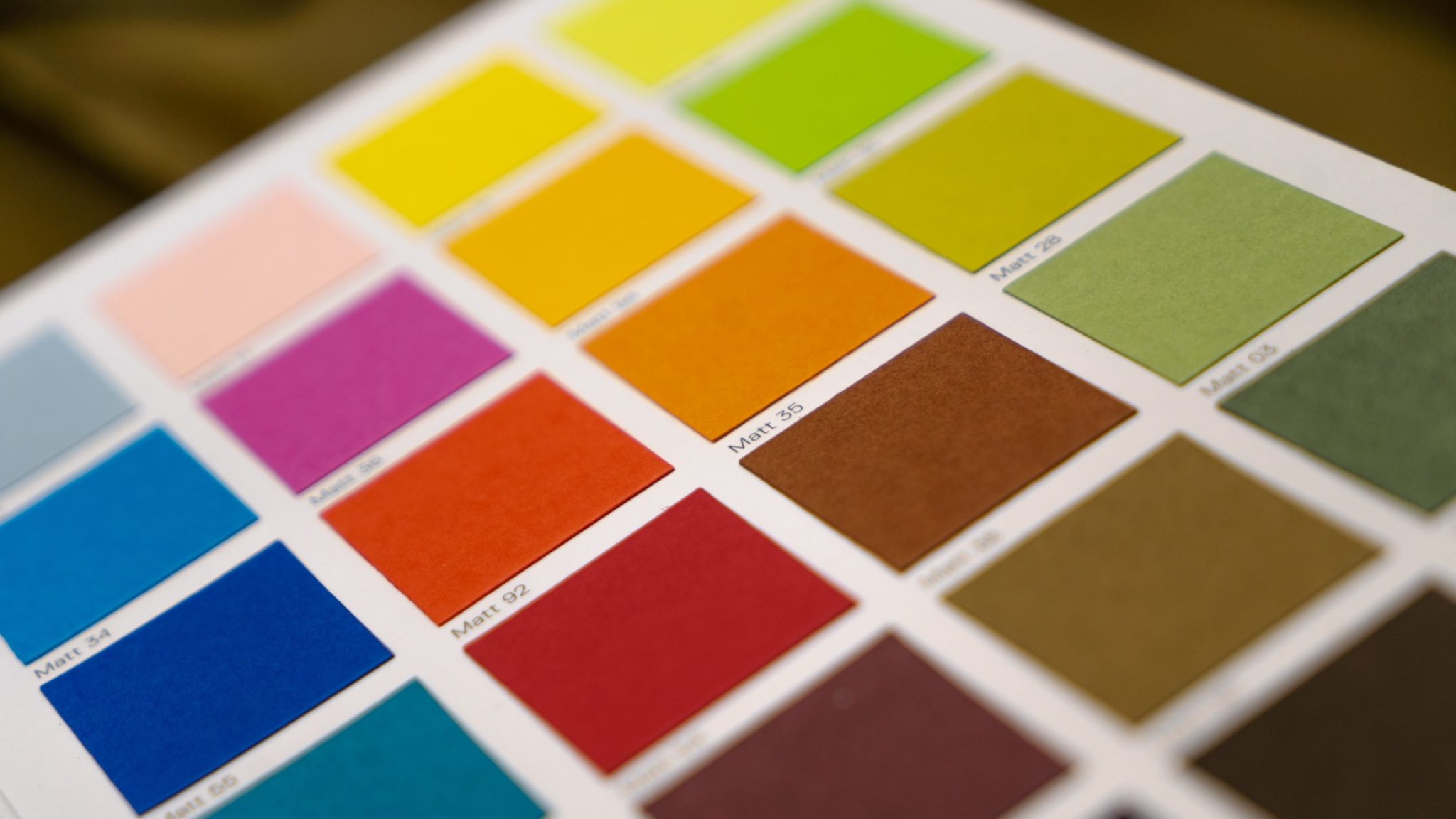
Look for Inspiration
As you weigh up different options for your brand’s color palette, take a look at what others in your industry are doing. This could involve browsing through your rivals’ palettes and trying to understand why they have chosen certain colors or combinations.
There are plenty of great websites to find curated inspiration for your main colors. Sites like Dribbble and CreativeMarket where designers share their work, often showcasing the latest trends.
Sites to get brand color inspiration:
You can also try our color palette generator that allows you to design palettes of up to eight different colors, and use the same for exploring the top color palettes according to your business, brand identity, and industry.
If you’re creating a website for your business, you might also take inspiration from the website template or design templates available, seeing what colors they offer.
Keep in mind your brand photography, too: you may want this to use similar colors to your brand color palette.
Test the Colors
After picking your colors, try them out together, perhaps with different versions. This is as easy as swapping colors out in your design file to create examples that you can quickly compare to each other.
This will help you ensure that the colors complement each other and convey your intended message together.
You should also test the palette to ensure that the color combinations are legible. This can easily be done using a color contrast checker. These tools help you to ensure your text is legible on specific color backgrounds.
Note: There’s no one perfect formula for choosing your brand colors. You might opt for complementary colors, neutrals with accent colors, or something else entirely for your brand color palette. What’s important is that your colors look good together and convey your brand essence and values.
Frequently Asked Questions
Got questions about creating your brand color palette? Here’s what you need to know.
What is a brand color palette?
A brand color palette is the set of colors your brand uses everywhere it shows up.
It usually includes:
- Primary colors that lead and appear most often (note these are not necessarily the same as “primary colors” on the color wheel)
- Secondary colors that support and extend the look
- Accent colors for highlights, calls to action, or special elements
The palette lives inside your brand guidelines and should be used across your logo, website, social media, packaging, ads, and even print materials. Your palette gives you a cohesive brand, wherever your customers or clients encounter it.
Why does my brand even need a defined color palette?
Color is one of the fastest ways people recognize a brand. It forms part of your brand essence. A clear palette helps you:
- Build instant recognition across channels
- Look consistent, even with many designers or partners
- Set the mood and personality of your brand
- Avoid random color choices that confuse your audience
Without a defined palette, every new design can drift in a different direction. That hurts trust and makes your brand look less professional, even if the content is good.
How many colors should be in a brand color palette?
Most brands do well with a focused, flexible set instead of a huge one. A common structure looks like this:
- 2 to 3 primary colors
- 3 to 5 secondary colors
- 1 to 2 accent colors for special use
- Neutrals like white, off-white, light gray, dark gray, and black
If you are a small brand or just getting started, you can keep it tighter, for example:
- 1 main brand color
- 1 supporting color
- 1 accent color
- A few neutrals
Too many colors cause confusion. The key is not the total number, it is clear rules for how often and where each one appears.
Conclusion
Choosing the color palette is one of the most important brand decisions you will make. It’s also one that is extremely difficult to reverse. This is why it is important to do it once … and do it right!
To learn more about color palettes or generate one for your brand, check our color palette generator.