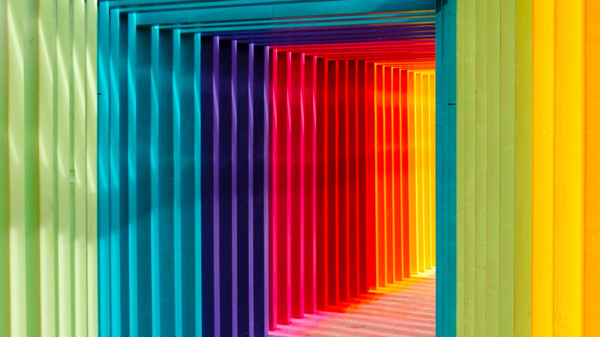
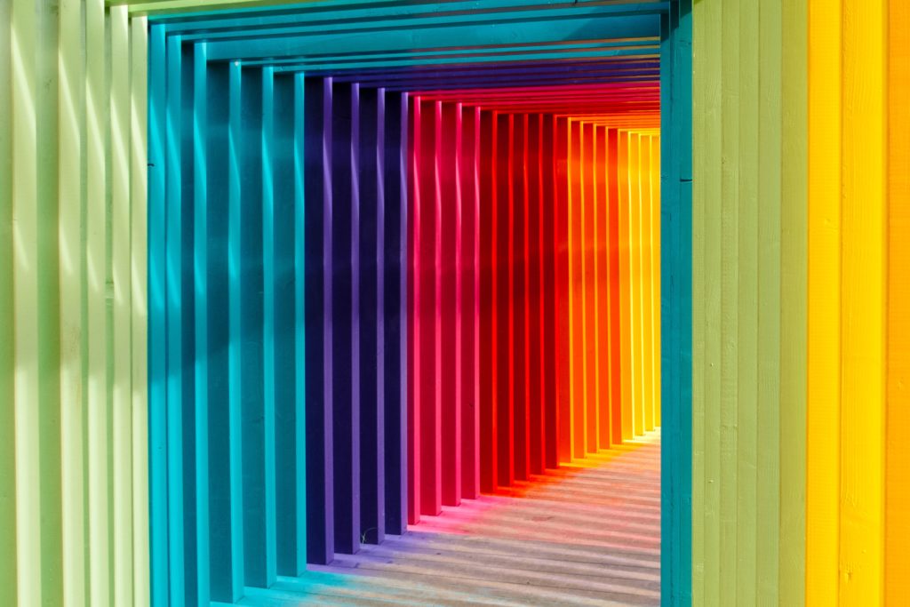
Color psychology is the study of how colors affect our emotions, mood, and behavior. Warm colors like red and orange tend to feel energizing, cool colors like blue and green tend to feel calm, and how light or saturated a color is shapes the feeling just as much as the hue itself.
Those reactions come from a blend of biology, culture, and personal memory, which is why color shapes everything from how a room feels to whether someone clicks a button. Below, we cover the emotions tied to each major color, then group colors by the mood they set.
How Do Colors Affect Us?
Colors are a powerful form of non-verbal communication. Many color-emotion links are also broadly shared. One study spanning 30 nations found that people everywhere pair colors with emotions in surprisingly similar ways, even though those associations are also shaped by culture and language. The effect matters in practice, too: research on marketing suggests up to 90% of a person’s snap judgment about a product can come down to color alone.
The effects can even be physical. Some studies have linked color and light exposure to small changes in arousal, alertness, and heart rate, though the results vary from study to study.
One thing that often gets missed: emotion is not driven by hue alone. In a widely cited study on color and emotion, how bright and how saturated a color was affected arousal as much as which hue it was. A dusty, muted red feels calm and grounded, while a bright, saturated red feels loud and urgent, even though both are “red.” That is why a shade or tint of a color can carry a completely different mood than the pure hue.
Leatrice Eiseman, a renowned color specialist, suggests these effects are closely tied to how colors behave in nature. Blue, for example, is the color of clear skies and calm water, which lines up with why it tends to feel calming, relaxing, and stable. With that in mind, let’s look at the meanings, emotions, and behaviors associated with each major color.
The Effects of Colors on Emotions and Behaviors
Colors are often split into two broad groups, warm and cool, based on color temperature and the feelings they tend to evoke. It is a useful convention rather than a strict rule. Beyond that grouping, individual colors carry their own widely recognized associations. Here is how each major color tends to affect our emotions, mood, and behavior.
Red
Red is the warmest color on the color wheel. It grabs instant attention and is known to evoke strong emotions that could be positive, such as love and passion, or negative, like anger and danger. In both cases, red is stimulating, energizing, and exciting. It also signifies strength, power, and courage.
Yellow
Yellow is the color of sunshine. It’s associated with positive energy, hope, cheerfulness, and happiness, and it is often linked with optimism, clarity, and creativity. Too much bright yellow can feel overwhelming, though, and may stir anxiety or agitation, so it usually works best as an accent.
Orange
Orange is a combination of red and yellow. The feelings and emotions it evokes are also a mix of the two colors. It radiates the warmth, excitement, and stimulation of red and the cheerfulness of yellow. It’s friendly, inviting, and encouraging and inspires courage, confidence, and vitality. Hence, it makes a great choice for call-to-action buttons for online businesses. When used correctly, the color orange can also give customers an impression of affordability.
Green
Green is the color of nature. It symbolizes growth, rebirth, healing, freshness, harmony, and stability. It’s also associated with self-reliance and security. It’s a good color choice for health and wellness businesses that want to promote their products as natural, safe, and environment friendly, as well as for those wanting to reflect security and growth.
Darker shades of green are linked to prestige and wealth and hence, are considered good choices for financial websites and sales presentations.
Blue
Blue is the most popular color in the world and the most common favorite across global surveys. And it’s not difficult to understand why. Blue reflects calmness and trust and makes people feel relaxed, safe, and secure.
Darker shades of blue read as more professional and trustworthy, which is why so many banks and tech companies use them, while lighter blues feel friendlier and more approachable.
Purple
Purple is the color of creativity, imagination, luxury, wealth, and royalty. But, it’s also known to add an element of mystery and fantasy to things. This is why purple is often used to promote beauty products and premium services.
Pink
Pink is playful, gentle, and calming. It is widely tied to romance, tenderness, and nurturing, and softer shades of pink can feel genuinely soothing. Brighter pinks and magentas read as fun, youthful, and bold, which is why beauty and lifestyle brands lean on them.
Brown
Brown feels earthy, warm, and dependable. It is linked with nature, stability, and comfort, and is a common choice for brands that want to seem honest, rustic, or organic. Like other shades of brown, it grounds a palette without demanding attention.
Black
Black signals sophistication, elegance, and authority, which is why it dominates luxury and high-end branding. It can also feel formal, powerful, or serious, and in many cultures it is the color of mourning. Used as an accent, black adds contrast and weight to any palette.
White
White suggests cleanliness, simplicity, and open space. In many Western cultures it stands for purity and peace, while in parts of East Asia it is associated with mourning. That split is a good reminder that color meanings are never one-size-fits-all.
Colors by Mood
Here are the main types of color by mood, including warm and cool colors, happy and sad colors, and calming and energizing colors. This is a quick way to find a color palette that matches the emotion you’re trying to elicit.
Warm Colors
The warm colors are associated with warmth, heat, fire, and sun. They are known to evoke a range of warm feelings and emotions ranging from optimism and excitement to anger and violence. Warm colors also grab attention and are used to demand action or reflect danger.
The colors that fall into this category are red, orange, and yellow.
Cool Colors
Cool colors, as the term implies, are known to have calming and relaxing effects. The colors that fall into this category include green, blue, and purple. Cool color tones are also referred to as cold colors.
Happy Colors
Bright and warm colors are known to evoke feelings of cheerfulness and optimism. They can uplift your mood and put you in great spirits.
The colors put into this category include red, orange, yellow, and shades of pink. Pink is also associated with tenderness, warmth, and romance.
Sad Colors
Dark, muted colors like black and grey are often called sad colors because they can feel dreary and heavy. In many cultures they are also the colors of mourning, reflecting grief and sorrow.
Calming Colors
Cool colors are calming, but some pastel colors and soft neutrals like white and beige can settle the mind too. In many Western cultures, white is tied to peace and calm, which adds to the effect.
Energizing Colors
Colors that stir your emotions, spark excitement, and make you feel alert and active are energizing colors. The ones known for this effect include bright red, emerald green, bright yellow, royal blue, magenta, and neon green. They need to be used with care, though, since at full strength they can be tiring on the eyes.
Colors and Emotions Are Interconnected, but the Effects Can Vary
There is no denying that colors and our feelings are correlated. However, this connection isn’t simple or one-directional. It is multifaceted, and the same color can land differently from one person or place to the next.
The effect a color has on the mind and body depends on where and how it is used, its shade and tone, cultural associations, and personal memories and experiences. That is why the 30-nation research above found broad, shared patterns and clear cultural differences at the same time.
Businesses all over the world use color psychology to their advantage, and you can too. Just test your colors with your own audience rather than relying on meaning alone, so the shades you pick relay the right message and inspire the response you want.
I just recently found this tool… and let me tell you it is a god sent. and this was really interesting. Loving the program
So glad you like it! Let us know if there are any improvements that we can make 🙂
Incredible