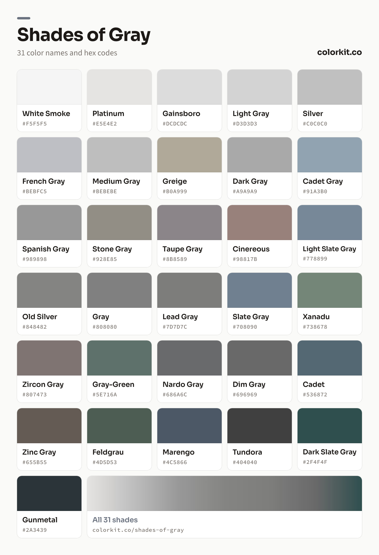
Gray runs from the near-white White Smoke (#f5f5f5) and Platinum (#e5e4e2) through classic Gray (#808080) and Slate Gray (#708090) down to the dark Tundora (#404040) and Gunmetal (#2a3439). This guide lists 31 named shades of gray (or grey) with their hex codes, sorted from lightest to darkest. Click any swatch to copy the code, or open it for the RGB, CMYK, and HSL values plus the palette generator. To mix gray in paint, see what colors make gray, or turn any hex into a full tint and shade scale with the color shades generator.
31 shades of gray with their names and hex codes, lightest to darkest
White Smoke is an incredibly subtle shade of gray that sits just a whisper away from pure white. With its barely-there warmth, this versatile neutral works beautifully as a background color, offering a softer alternative to stark white that’s easier on the eyes. Designers often reach for White Smoke when they want a clean, minimalist look without the harshness of pure white, making it a popular choice for interfaces, web backgrounds, and layered design elements where gentle contrast is key.
Platinum is a soft, silvery gray with a subtle warmth that sets it apart from cooler metallic tones. Its light, almost-white appearance evokes the luster of the precious metal it is named after, making it a refined choice for backgrounds, typography, and minimalist designs. Pair it with deeper grays for contrast or with jewel tones for an elegant touch.
Gainsboro is a soft, light gray that sits comfortably between white and mid-toned grays, with the hex code #dcdcdc. Its name comes from the town of Gainsboro in Tennessee, and it has been part of the web color palette since the early days of the internet. With its subtle warmth and gentle presence, Gainsboro works well as a background color, offering enough contrast to let text and imagery stand out without the starkness of pure white. Designers often reach for it when they want a clean, understated look that feels calm and balanced, whether in minimalist interfaces, print layouts, or as a neutral foundation in a broader color scheme.
Light Gray is a soft, neutral shade that sits just a few steps darker than pure white. With its hex code #d3d3d3, this versatile color offers a subtle hint of depth while maintaining an airy, understated quality. Designers often reach for Light Gray as a background or supporting color, as it pairs effortlessly with bolder hues and provides a clean canvas that never competes for attention. Whether used in minimalist layouts, typography, or interface design, Light Gray brings a calm, balanced feel to any palette.
Silver is a light, metallic gray that brings to mind polished metal and refined elegance. With its balanced mix of black and white, this neutral shade works beautifully alongside nearly any color, making it a versatile choice for backgrounds, typography, and accents alike. Its hex code is #c0c0c0, and it carries a cool, understated quality that can add a sense of sophistication and modernity to a design without overpowering other elements. Designers often reach for Silver when they want something sleek and calm, whether for minimalist layouts, tech-inspired themes, or subtle highlights.
French Gray is a soft, muted shade of gray with subtle cool undertones. Its hex code is #bebfc5, and its gentle blend of blue and violet hints gives it a slightly lighter, atmospheric quality compared to pure gray. This understated color works beautifully as a neutral backdrop, allowing bolder shades to take center stage while adding a touch of quiet sophistication. Designers often reach for French Gray in minimalist layouts, interior palettes, and typography, where its calm and balanced character brings a sense of refinement without overwhelming the eye.
Medium Gray is a balanced, neutral shade that sits comfortably in the middle of the gray spectrum. With its hex code #bebebe, this color offers an even mix of warmth and coolness, making it incredibly versatile in design work. It works well as a background or supporting color, allowing brighter hues to stand out while still providing enough contrast to keep layouts readable. Designers often reach for Medium Gray when they want a dependable neutral that feels neither too dark nor too light.
Greige is a soft, understated blend of gray and beige, sitting comfortably between the two with its warm, muted character. The hex code #b0a999 produces a gentle neutral that carries just enough warmth to feel inviting while remaining versatile enough for a wide range of design applications. This balanced hue works beautifully in interior design palettes, branding, and web design, pairing effortlessly with both cool and warm tones. Its subtle earthiness makes Greige a popular choice when a pure gray feels too stark but beige feels too warm.
Dark Gray is a balanced, medium-dark shade of gray with the hex code #a9a9a9. Sitting comfortably between light gray and charcoal, it offers just enough depth to feel grounded without drifting into near-black territory. This makes it a reliable neutral for designers who want something a bit more substantial than lighter grays, whether used for text, backgrounds, or UI elements. Its equal mix of red, green, and blue gives it a clean, neutral character with no color cast, so it pairs easily with virtually any palette. Dark Gray works especially well as a secondary tone, adding contrast and structure while letting brighter colors take center stage.
Cadet Gray is a soft, muted gray with a subtle blue undertone, giving it a calm and understated quality. Sitting comfortably between gray and blue on the spectrum, it brings a gentle coolness to designs without feeling stark or cold. This versatility makes it a reliable choice for backgrounds, typography, and accent elements alike. Cadet Gray pairs well with warm neutrals for balance or with deeper blues for a cohesive, tranquil palette. Whether used in web design, branding, or interior-inspired artwork, it offers a quiet sophistication that lets other colors shine while holding its own.
Spanish Gray is a balanced medium neutral that sits comfortably in the middle of the gray spectrum. With equal parts red, green, and blue, it offers a clean, dependable tone without leaning warm or cool. This makes it a versatile choice for designers who need a steady mid-tone for backgrounds, typography, or UI elements. Spanish Gray pairs well with both brighter accent colors and deeper shades, providing contrast without overwhelming a palette. Whether used in web design, print, or illustration, it delivers a calm, understated presence that lets other colors take the spotlight.
Stone Gray is a soft, muted gray with subtle warm undertones, thanks to its slightly higher red and green values (hex #928E85). It sits comfortably between lighter and darker neutrals, making it a versatile choice for backgrounds, typography, and pairing with bolder accent colors. Its earthy warmth keeps it from feeling cold or sterile, which makes it especially useful in natural, rustic, or understated design palettes. Whether used as a primary neutral or a supporting tone, Stone Gray brings a calm, grounded quality to any composition.
Taupe Gray is a soft, muted neutral with a gentle hint of warm purple undertones. Sitting comfortably between gray and brown, it offers a subtle sophistication that makes it a versatile choice for designers. Its low saturation and medium value allow it to work beautifully as a background color or as a calming accent alongside bolder hues. Taupe Gray pairs well with creams, dusty pinks, and deeper charcoal tones, making it a popular pick for interior palettes, branding, and understated digital designs.
Light Slate Gray is a cool, muted gray with a subtle blue undertone, evoking the quiet elegance of weathered stone. Its balanced blend of gray and soft blue makes it a versatile choice for designers, working beautifully as a calm background color or as a sophisticated accent in both digital and print projects. It pairs well with warmer neutrals and crisp whites, adding depth without overwhelming a palette. Whether used in web design, branding, or illustration, Light Slate Gray brings a sense of steadiness and understated refinement to any composition.
Cinereous is a soft, muted gray with warm undertones of brown and a touch of dusty rose. With its hex value of #98817b, this shade sits comfortably between gray and taupe, making it a versatile choice for designers seeking something neutral but not cold. Its gentle warmth lends itself well to natural, earthy palettes, and it pairs beautifully with creams, sage greens, and deeper browns. Cinereous works especially well in backgrounds, textiles, and branding where a calm, understated feel is desired without slipping into stark or industrial grays.
Old Silver is a soft, neutral gray with a subtle warm undertone, thanks to a slight lean toward yellow in its composition. This touch of warmth keeps the color from feeling flat or cold, giving it a quiet, weathered quality reminiscent of aged metal. With its balanced, mid-range value, Old Silver works well as a background or supporting neutral, offering a gentler alternative to true gray. It pairs naturally with both warm and cool palettes, making it a versatile choice for designs that call for understated sophistication.
Xanadu is a soft, muted gray-green that brings a touch of nature to the gray family. With its hex code #738678, this color sits comfortably between gray and green, offering a calm, earthy quality that feels both grounded and refreshing. Its subtle green undertones give it more warmth and depth than a pure gray, making it a versatile choice for designers seeking a neutral with character. Xanadu works beautifully in natural, organic palettes and pairs well with creams, browns, and deeper greens, making it a popular pick for interior design, branding, and projects that aim for a relaxed, understated feel.
Gray is the quintessential neutral, sitting exactly halfway between black and white on the color spectrum. With the hex code #808080, it offers a perfectly balanced tone that works as a dependable backdrop in nearly any design project. Designers often reach for gray when they want other colors to take center stage, as it pairs effortlessly with both warm and cool palettes. Whether used for typography, backgrounds, or subtle UI elements, Gray brings a sense of calm, sophistication, and timelessness to any composition.
Slate Gray is a muted, medium gray with subtle blue undertones, evoking the natural stone it’s named after. Its hex code is #708090, and the hint of blue gives it a cooler, calmer feel than a pure neutral gray. This makes it a versatile choice in design: it works well as a background color, pairs nicely with both warm and cool accents, and brings a grounded, sophisticated quality to palettes. Designers often reach for Slate Gray when they want something more interesting than flat gray but quieter than a true blue.
Lead Gray is a deep, understated neutral with the hex code #7d7d7c. Sitting just past the midpoint of the gray scale, it carries a nearly perfect balance of light and dark, with a barely perceptible warmth that keeps it from feeling sterile. This makes it a dependable choice for designers who need a solid mid-tone that won’t compete with bolder colors. Lead Gray works well for backgrounds, typography, and UI elements, and it pairs smoothly with both warm and cool palettes, making it a versatile staple in any design toolkit.
Zircon Gray is a soft, muted gray with a gentle warmth that sets it apart from cooler, more industrial grays. Its hex code, #807473, reveals a subtle pin of red and green beneath its surface, giving it a hint of earthy undertone that reads as almost neutral in most contexts. This makes it a versatile choice for designers looking for a gray that feels approachable rather than stark. It works beautifully as a background or secondary color, pairing well with creams, muted blues, and warm wood tones, while still holding its own against bolder accent colors.
Gray-Green is a muted, earthy tone that blends the neutrality of gray with the subtle warmth of green. With its hex code #5e716a, this color sits comfortably between the two, offering a soft, natural feel without leaning too strongly in either direction. It works well in designs that call for a calm, understated palette, and it pairs nicely with creams, warm browns, and deeper forest tones. Designers often reach for shades like this when they want color that feels organic and balanced without drawing too much attention to itself.
Nardo Gray is a cool, understated gray with a slight blue undertone, sitting right in the middle of the lightness spectrum. Its balanced mix of red, green, and blue gives it a neutral, almost sleek quality that reads as modern and refined. The name comes from the automotive world, where this shade gained popularity as a popular car paint color, adding to its association with clean, contemporary design. Designers often reach for Nardo Gray when they want a sophisticated neutral that pairs effortlessly with both bold accent colors and muted palettes, making it a versatile choice for everything from web interfaces to branding projects.
Dim Gray is a medium-dark neutral with a hex code of #696969. Sitting right at the midpoint between black and lighter grays, it offers a balanced, understated tone that works well as a background, text color, or supporting shade in a palette. Its equal red, green, and blue values (105, 105, 105) give it a perfectly neutral character with no color cast, making it a reliable choice when you need gray that won’t lean warm or cool. Designers often reach for Dim Gray when a softer alternative to black is needed, whether for typography, interfaces, or subtle contrast in layouts.
Cadet is a muted gray-blue that carries a calm, understated quality. With its balanced mix of cool blue undertones and steady gray, this shade sits comfortably between navy and slate, making it a versatile choice for designers seeking something subdued but not flat. Cadet works well in palettes that call for depth without heaviness, pairing nicely with softer neutrals or warm earth tones. Its quiet, composed character makes it a reliable option for backgrounds, typography, and accent elements alike.
Zinc Gray is a muted, earthy gray with subtle warm undertones, thanks to its gentle blend of brown within the hex value #655b55. This understated shade sits comfortably between true gray and taupe, making it a versatile choice for designers seeking a neutral that feels softer and more organic than cooler grays. Zinc Gray works beautifully as a background color, pairing well with both warm palettes and crisp accent hues, and it brings a quiet sophistication to everything from web interfaces to interior-inspired branding.
Feldgrau is a muted gray-green with a quiet, understated presence. Its name comes from German, literally meaning “field gray,” a nod to its longtime use in military uniforms. This particular shade balances cool gray tones with a subtle hint of green, giving it an earthy, natural feel that works well in designs aiming for calm and sophistication. Feldgrau pairs nicely with warm neutrals and deeper greens, making it a versatile choice for backgrounds, typography, or any palette that calls for a grounded, understated gray.
Marengo is a deep, muted blend of gray and blue that carries a calm, steady presence. With its cool undertones, this shade sits comfortably in the darker range of the gray family, making it a reliable choice for backgrounds, typography, and accents that need a touch of quiet sophistication. Marengo pairs beautifully with warmer neutrals and lighter grays, offering designers a versatile option for creating depth without overpowering a palette.
Dark Slate Gray is a deep, muted gray with subtle blue-green undertones, giving it a cool and grounded feel. Its hex code is #2f4f4f, and its darker character makes it a popular choice for backgrounds, text, and accent elements where a softer alternative to black is needed. Designers often reach for this shade when they want a color that feels calm, sophisticated, and versatile enough to pair with both vibrant and neutral palettes. Whether used in web design, branding, or illustration, Dark Slate Gray brings a quiet depth that works well across a wide range of projects.
Tundora is a deep, balanced gray with a hex code of #404040. Sitting at the midpoint between black and mid-gray, it offers a neutral tone that feels grounded without being heavy. Because it contains equal parts red, green, and blue, Tundora has no color cast, making it a reliable choice for designers who want a clean, versatile dark shade. It works beautifully as a background color, a text tone, or a soft alternative to pure black in minimalist palettes.
Gunmetal is a deep, smoky gray with a subtle blue undertone, reminiscent of the dark metal used in firearms and industrial machinery. Its muted, understated character makes it a versatile choice for designers seeking a neutral that feels both modern and grounded. This shade works beautifully as a background color, allowing brighter accents to stand out, or as a sophisticated alternative to black in text and interface elements. Pair Gunmetal with warm metallics or soft neutrals to create balanced, polished palettes.
Gunmetal
Light, cool, warm, and neutral grays
A gray with exactly equal red, green, and blue values is a pure neutral. Most named grays tip slightly toward blue, green, or brown, and that small cast decides whether a gray feels crisp or cozy next to the rest of a palette.
Light grays
White Smoke (#f5f5f5), Platinum (#e5e4e2), Gainsboro (#dcdcdc), Light Gray (#d3d3d3), Silver (#c0c0c0), and Medium Gray (#bebebe) are pale enough for page backgrounds, borders, dividers, and disabled buttons.
Cool grays
French Gray (#bebfc5), Cadet Gray (#91a3b0), Light Slate Gray (#778899), Slate Gray (#708090), Cadet (#536872), Marengo (#4c5866), and Gunmetal (#2a3439) lean blue. Xanadu (#738678), Gray-Green (#5e716a), Feldgrau (#4d5d53), and Dark Slate Gray (#2f4f4f) lean green. Cool grays look sharp in tech, finance, and dark mode interfaces.
Warm grays
Greige (#b0a999), Stone Gray (#928e85), Taupe Gray (#8b8589), Cinereous (#98817b), Zircon Gray (#807473), and Zinc Gray (#655b55) carry a beige, brown, or rosy cast. They feel softer and pair well with wood, cream, and earthy palettes.
Neutral mid and dark grays
Dark Gray (#a9a9a9), Spanish Gray (#989898), Old Silver (#848482), Gray (#808080), Lead Gray (#7d7d7c), Nardo Gray (#686a6c), Dim Gray (#696969), and Tundora (#404040) have almost no color cast. One CSS quirk worth knowing: the named color darkgray (#a9a9a9) is actually lighter than gray (#808080).
Is it gray or grey?
Both spellings are correct. Gray is the usual spelling in American English and grey in British English. CSS accepts both, so gray and grey are the same named color (#808080), and so are pairs like darkgray and darkgrey.
How many shades of gray are there?
On a screen there are 256 pure neutral grays, one for each level where red, green, and blue are equal, from #000000 to #ffffff. Counting tinted grays, there are thousands more. This guide collects 31 named shades of gray with set hex codes, from White Smoke (#f5f5f5) to Gunmetal (#2a3439). Most of the names and values follow Wikipedia’s list of shades of gray.
What is the lightest shade of gray?
White Smoke (#f5f5f5) is the lightest gray here, a soft off-white that is also a CSS named color. The next-lightest are Platinum (#e5e4e2) and Gainsboro (#dcdcdc).
What is the darkest shade of gray?
Gunmetal (#2a3439) is the darkest gray on this page, a blue-tinted charcoal. Close behind it are Tundora (#404040) and Dark Slate Gray (#2f4f4f). For grays that cross into black, see the guide to shades of black.
Where do some gray names come from?
A few gray names have real-world origins. Feldgrau, German for “field gray,” was the basic color of German military uniforms from 1907. Nardo Gray was introduced by Audi in 2013 for the RS7, and other car makers soon offered similar flat grays. Slate Gray is named for the color of the rock slate.
What is the hex code for gray?
The hex code for gray is #808080, the CSS named color gray (or grey), with an RGB value of rgb(128, 128, 128). It sits exactly halfway between black and white in each channel.
What colors make gray?
Mixing black and white makes a neutral gray, and the ratio sets how light or dark it gets. Mixing complementary colors, like blue and orange, gives a more colorful chromatic gray. The guide to what colors make gray covers both methods.
Found a gray you like? Click it to open the full color page, then send it to the palette generator to build a scheme around it, or drop it into the color picker to fine-tune the exact tone. If you’d rather start from a finished scheme, browse our gray color palettes.