
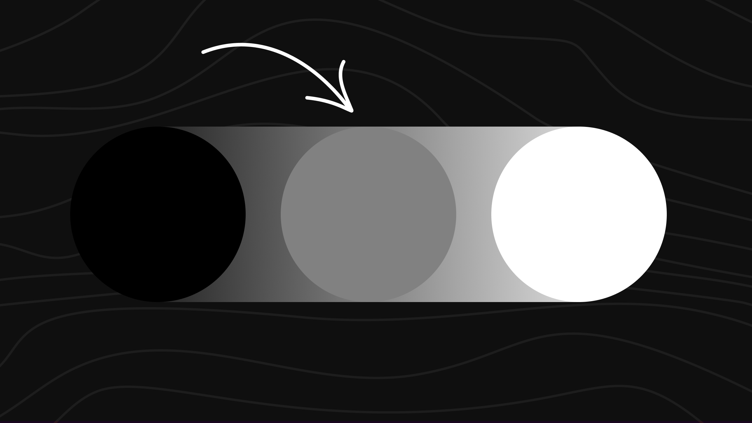
Gray covers everything between black and white. It’s the color of overcast skies, weathered stone, fresh concrete, smoke, and the dead pixel on a turned-off screen. And it’s one of the most useful colors a painter or designer can master, because real-world shadows are almost never pure black.
A pure gray comes from mixing black and white at the right ratio. But most of the time you actually want a chromatic gray – one with a subtle warm or cool undertone. Those come from mixing complementary colors together until they neutralize. This guide covers both routes.
The Quick Recipe
Black + white at any ratio gives you a neutral gray. More white = lighter, more black = darker. That’s the simplest route.
For a richer gray with character: mix two complementary colors (blue + orange, red + green, or yellow + purple) until they neutralize, then add white to reach your target lightness. The undertone you end up with depends on which complement dominates.
On a screen, neutral gray is #808080 – RGB(128, 128, 128). Lighter and darker grays scale up and down from there in equal red, green, and blue values.
Want to experiment with mix ratios before touching paint? The ColorKit color mixer lets you blend any two or three colors and see the result instantly.
What Makes Gray Special?
Gray sits at the calm center of the color world. It has no strong emotional pull of its own, which is what makes it so useful as a supporting color – it lets every other color in a piece do the talking. That same neutrality is why gray dominates modern interiors, tech branding, and most UI design systems.
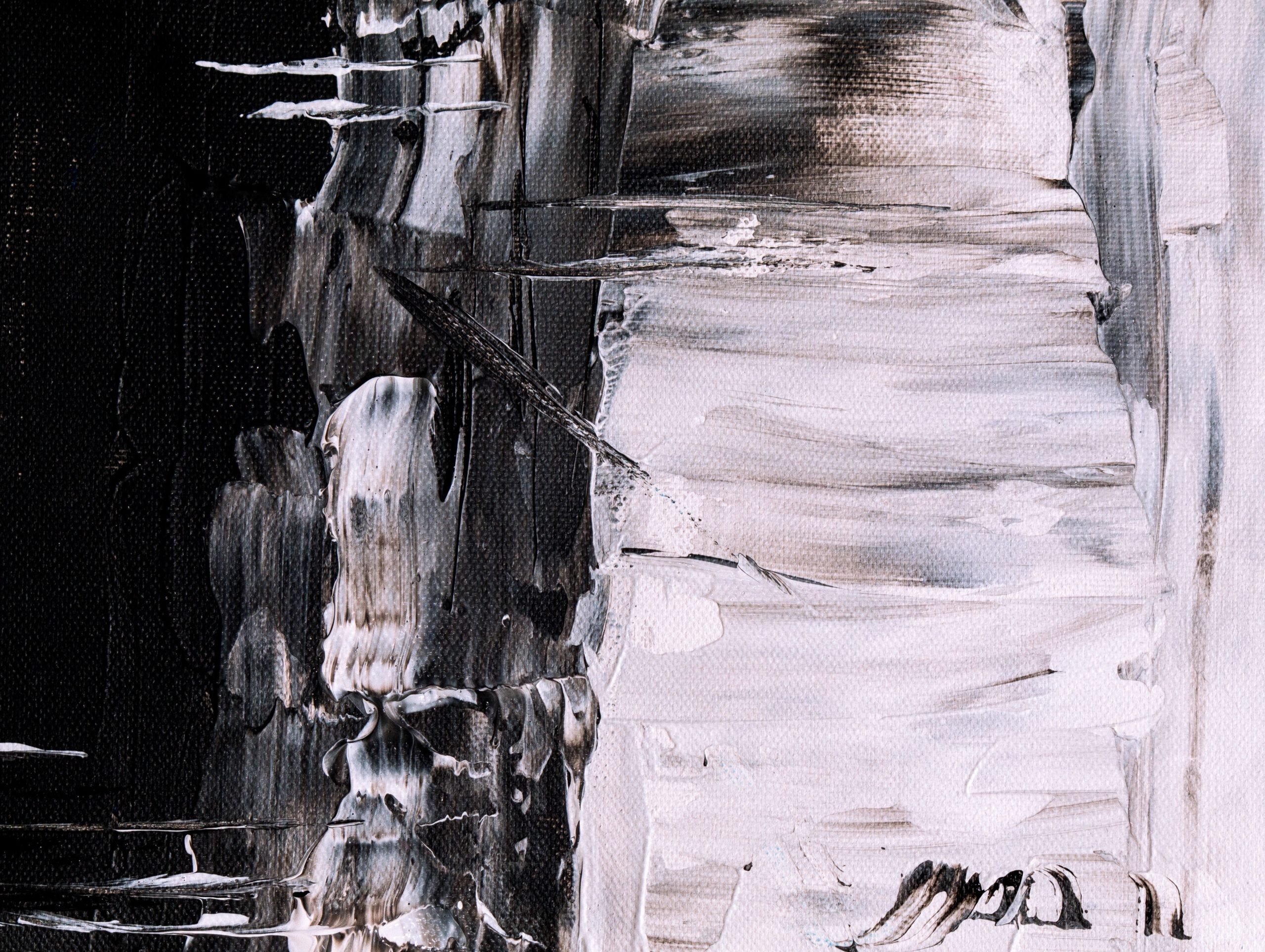
In painting, gray pulls double duty. Mixed grays (made from complements) give shadows life that a tube gray can’t match, because they share pigments with the surrounding colors. That’s why a portrait painted with chromatic shadows feels unified, while one painted with neutral gray shadows often looks flat.
Different gray shades carry different moods. Darker grays read as formal, serious, or moody. Lighter grays feel airy and contemporary. Cool grays recede; warm grays advance. The same color can change a room or a layout entirely depending on which direction you push it.
How to Make Gray: Three Methods
Method 1: Black + White (Achromatic Gray)
The simplest route. Combine black and white paint in any ratio – the more white, the lighter the gray. Equal parts gets you a true mid-gray; tip the ratio toward white for tints, toward black for shades.
This produces a clean neutral gray with no undertone. It’s the right choice when you want a flat, modern look or when you’re working in a digital tool. On canvas, some artists find it lifeless compared to mixed grays.
Method 2: Complementary Colors (Chromatic Gray)
Mix two complementary colors at roughly 1:1 and they cancel out into a near-neutral dark. Add white to lift it to your target lightness. The result has a subtle undertone of whichever pigment dominates, which gives the gray more visual depth than a pure black-and-white mix.
Common complement pairs that work:
- Ultramarine blue + burnt umber – the painter’s classic, leans slightly cool
- Ultramarine blue + burnt sienna – warmer, with a brown undertone
- Phthalo green + alizarin crimson – deep, with a green or red cast depending on ratio
- Cobalt blue + cadmium orange – bright complements, soft chromatic gray
- Yellow + purple – less common, but produces a slightly violet gray
Tip: If your mix is coming out brown instead of gray, you have too much warm pigment. Add a small touch more of the blue (or green). If it’s coming out greenish, add a touch more red.
Method 3: Three Primaries
Combine red, blue, and yellow at roughly equal ratios for a dark neutral, then add white to lift it. This is the same technique used to make black, just with white added at the end. The result is a chromatic gray with all three primaries contributing, which can read as more naturalistic than a two-color mix.
Named Gray Shades and Their Mix Recipes
Most named grays have a specific undertone and a traditional mix recipe. Here are the ones worth knowing, with the mix needed to reproduce each on canvas.
Neutral Gray (#808080)

The textbook gray: equal parts black and white. This is what shows up as #808080 in CSS – the dead-center neutral between black and white. It works as a baseline, but most artists find it lifeless on canvas and reach for a chromatic gray instead.
Cool Gray (#8A9A9D)

The painter’s go-to chromatic gray. Ultramarine and burnt umber are near-complements, so they neutralize into a near-black; a heavy dose of white lifts that to a soft, slightly blue gray. Use it for skies, distant objects, and anywhere you want gray that still breathes.
Warm Gray (#8B8589)

Burnt sienna carries the warmth, ultramarine pulls it back toward neutral, white sets the value. Warm grays read as friendlier and more advanced – useful for portrait shadows, interiors, and product backgrounds where cool gray would feel sterile.
Payne’s Gray (#536878)

A historical artist pigment named after watercolorist William Payne. Deeper than most grays, with a strong blue cast. Often used as a substitute for black in landscape painting because it adds atmosphere without flattening the image.
Davy’s Gray (#555555)

Originally made from powdered slate by colorman Henry Davy in the 1800s. A muted, slightly olive-cast gray that’s gentler than Payne’s and useful for understatement – fog, distant stone, weathered wood.
Charcoal Gray (#36454F)

Almost black, with enough white to keep it from going opaque. Sits between Payne’s gray and a true black. Charcoal works as a near-black accent that still reads as a color – popular in modern interiors and dark-mode UI.
Slate Gray (#708090)

A medium-cool gray with a clear blue lean, named for natural slate. #708090 is the CSS named color. Slate has more presence than neutral gray and reads as crisp, modern, and slightly industrial.
Dove Gray (#6D6D6D)

A soft mid-gray named for the breast feathers of mourning doves. Sits a step darker than neutral gray and a touch warmer than slate. Good as a calm background or secondary text color when pure neutral gray feels too harsh.
Warm Gray vs Cool Gray: When to Use Each
Like black, gray isn’t really one color. The undertone changes how it behaves next to other colors and how it feels in a piece.
Cool grays lean blue, green, or purple. They visually recede and feel crisp, modern, and clean. Used heavily in tech branding, dark-mode interfaces, and interiors that want a contemporary edge.
Warm grays lean red, brown, or yellow. They feel softer, more organic, and read as friendlier. Used in interiors aiming for cozy, in beauty and lifestyle branding, and in skin-tone shadows.
Inside a single design or painting, the same gray can serve completely different roles depending on what surrounds it. A cool gray next to a warm yellow reads as steely; the same gray next to a cool teal reads as warm by comparison.
Gray Mixing Cheat Sheet
| Goal | Mix | Result |
|---|---|---|
| True neutral gray | Black + white (any ratio) | Achromatic, flat |
| Painter’s gray | Ultramarine + burnt umber + white | Slightly cool, alive |
| Warm gray | Burnt sienna + ultramarine + white | Brown undertone |
| Payne’s gray | Ultramarine + alizarin + black | Deep, atmospheric |
| Slate / blue-gray | Ultramarine + burnt umber + lots of white | Crisp, modern |
| Olive / Davy’s | Black + white + yellow ochre | Muted, slightly green |
| Charcoal | Ultramarine + burnt umber, less white | Near-black |
| Avoiding brown | Add more blue to your mix | Pulls back to gray |
Common Gray Hex Codes
When you’re designing on a screen, you almost always want a specific gray for a specific job. Body text gray is different from divider gray, which is different from disabled-button gray. Here’s a quick reference.
| Name | Hex Code | RGB | Use Case |
|---|---|---|---|
| Gray (CSS) | #808080 | rgb(128, 128, 128) | Default neutral, mid-tone |
| Light Gray | #D3D3D3 | rgb(211, 211, 211) | Backgrounds, dividers |
| Dark Gray | #A9A9A9 | rgb(169, 169, 169) | Secondary text, disabled states |
| Dim Gray | #696969 | rgb(105, 105, 105) | Body text on light backgrounds |
| Silver | #C0C0C0 | rgb(192, 192, 192) | Metallic accents, premium feel |
| Gainsboro | #DCDCDC | rgb(220, 220, 220) | Soft backgrounds, hover states |
| Slate Gray | #708090 | rgb(112, 128, 144) | Cool, modern accents |
| Charcoal | #36454F | rgb(54, 69, 79) | Dark mode backgrounds, headings |
| Payne’s Gray | #536878 | rgb(83, 104, 120) | Editorial, atmospheric depth |
| Gunmetal | #818589 | rgb(129, 133, 137) | Industrial, automotive feel |
Accessibility note: Light grays on white backgrounds often fail WCAG contrast requirements. For body text on white, you usually need #595959 (60% gray) or darker to hit the 4.5:1 ratio. Always run gray text through a contrast checker before shipping.
Gray in Branding and Design
Gray dominates contemporary brand design. It signals neutrality, sophistication, and restraint, which is exactly what most tech and luxury brands want.
Apple built its entire visual identity on grays and near-blacks. The Space Gray finish was a tentpole product feature for years. Apple’s marketing uses cool grays for backgrounds, near-black for text, and reserves color almost exclusively for product accents.
Tesla, Mercedes, and most luxury automakers lean on gunmetal and silver grays. The colors signal precision and engineering – the opposite of bright primary colors, which read as toy-like.
Nike’s sportswear lines use heather gray and concrete gray as core neutrals. Gray hoodies and tees outsell colored ones in the athleisure category by a wide margin.
Modern interiors rode the gray wave through the 2010s – gray walls, gray sofas, gray kitchen cabinets. The trend has since softened toward warmer neutrals (greige, taupe, warm white), but gray remains the default safe choice.
Notion, Linear, and most modern SaaS products use a layered gray system: near-black for text, mid-gray for icons, light gray for borders, off-white for backgrounds. Strip the brand color away and the product still works because the gray scale carries the visual hierarchy.
Using Gray in Interior Design

If you’re picking a paint color, gray is one of the most forgiving choices on the wall. It plays well with almost anything you put next to it, doesn’t date fast, and shifts mood with the lighting. The catch is that gray is one of the hardest colors to pick – small undertone differences (cool vs warm, blue vs green vs purple cast) change a room completely.
A few practical guidelines:
- South-facing rooms handle cool grays well because warm light balances them. North-facing rooms can read icy with cool grays – go warm.
- Test in the actual room before committing. Paint a 2×2 patch and check it at three times of day. Grays shift dramatically with daylight.
- Pair warm gray with brass and wood; pair cool gray with chrome and white. Mixing metals across temperatures looks awkward.
- If a room feels cold, the gray is too cool. Add warm-toned accents (rugs, art, wood) before repainting.
Common Mistakes When Mixing Gray
Adding black too aggressively. A tiny amount of black changes a gray drastically. Add it in small increments and mix fully before adjudging.
Forgetting that gray on a palette looks different from gray on canvas or wall. Test the mix on the actual surface you’ll use it on before committing.
Stopping at the first gray you hit. The first neutral usually has a slight bias – brown, green, purple. Push it a step further toward true gray by adding a tiny bit of the missing complement.
Using pure neutral gray for shadows. On skin, fabric, or natural objects, neutral gray reads as dead. Use a chromatic gray that shares pigments with the lit areas – the painting will feel unified.
FAQs
What two colors make gray?
The simplest answer is black + white. For a more interesting chromatic gray, mix two complementary colors – ultramarine blue + burnt umber is the painter’s classic. Both routes produce gray; the complement mix has more visual depth.
What three colors make gray?
Combine the three primaries (red, blue, yellow) at roughly equal ratios. They cancel each other into a dark neutral. Add white to lift to your target lightness. This is the same recipe used to make black, just with white added at the end.
How do you make gray without black paint?
Mix any pair of complementary colors – blue + orange, red + green, or yellow + purple – until they neutralize, then add white. You’ll get a gray with a subtle undertone of whichever pigment dominates. Many painters prefer this route because the result has more life than black + white.
How do you get a warm gray?
Add a small amount of red, burnt sienna, or yellow ochre to your gray mix. Or start the mix with a warm-leaning complement pair, like burnt sienna + ultramarine blue. The undertone should be subtle – if you can clearly see brown or red, you’ve added too much.
How do you get a cool gray?
Add a touch of blue or green to your gray mix. Ultramarine + burnt umber + heavy white is the standard cool-gray recipe. Phthalo blue produces an even cooler, more vibrant result.
Why does my gray keep turning brown?
You have too much red, orange, or yellow pigment in the mix. Add a small amount of blue (or green) to pull it back toward neutral. Mix gradually and stop the moment the brown cast disappears.
What’s the hex code for true gray?
#808080 – RGB(128, 128, 128). It’s the exact midpoint between black (#000000) and white (#FFFFFF), which is why CSS uses it as the default gray color keyword.
Is there a difference between gray and grey?
Spelling only. Gray is the American spelling, grey is the British spelling. They refer to the exact same color. CSS recognizes both gray and grey as identical named colors.
What color is replacing gray in interiors?
Warm neutrals – greige, taupe, warm whites, and soft browns – are taking over from cool grays in interiors. The shift started around 2022 as designers moved away from the stark Scandinavian gray look toward warmer, more organic palettes.
What’s the best gray for body text on a website?
For body text on a white background, you generally want a gray no lighter than #595959 to hit WCAG AA contrast requirements. Many designers use #333333 or #1a1a1a for the most comfortable read. Pure black (#000000) often feels harsh on screen.
Wrapping Up
Gray rewards patience. Tiny pigment shifts change the result completely, so mix gradually, test on the final surface, and stop the moment you hit the tone you wanted. The named grays in this guide cover most use cases, but the real skill is reading the undertone in front of you and nudging the mix toward neutral.
Try mixes hands-on with the ColorKit color mixer, or browse the related guides on making black and making brown – the two colors most often confused with a failed gray.