
#D79A7A Hex Color
Online color picker to view shades, tints, color codes, and complementary colors
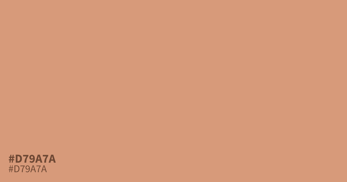
This muted, pastel orange feels approachable and friendly. Because it is highly unsaturated, #d79a7a works well as a grounding background color that avoids the harshness of pure hues. Black text maintains high contrast against this shade, making it a functional choice for web interfaces. If you are mixing gray to find a complementary neutral, this color pairs perfectly with cool slate tones.
Questions about #d79a7a
What is #d79a7a in RGB, HSL and CMYK?
In RGB, #d79a7a is rgb(215, 154, 122), in HSL hsl(21, 54%, 66%) and in CMYK 0%, 28%, 43%, 16%. Browse more shades of orange with names and hex codes.
Does #d79a7a work well for web interfaces?
This muted pastel orange is an excellent choice for web backgrounds because its low saturation minimizes eye strain while maintaining a friendly, approachable aesthetic. It provides enough contrast for black or dark charcoal text to remain perfectly legible for most users.
What colors complement #d79a7a?
Because this shade is a warm, muted orange, it pairs beautifully with cool slate or soft blue-gray tones that provide a balanced, grounded contrast. Using these cooler neutrals helps to highlight the unique warmth of #d79a7a without overwhelming your overall design.
Is #d79a7a readable on white or black?
#d79a7a has a 2.38:1 contrast ratio on white and 8.79:1 on black. WCAG asks for 4.5:1 for body text and 3:1 for large text, so on white it is too faint for text and on black it works for body text. Try other pairs in the contrast checker.