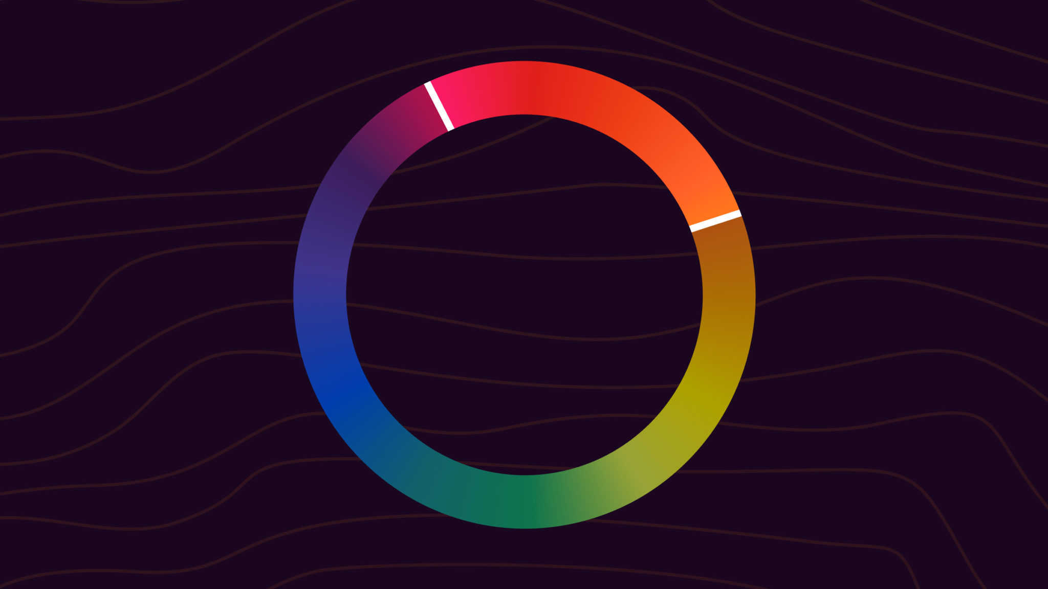
An analogous color scheme uses three to five colors that sit next to each other on the color wheel. Common examples are blue, blue-green, and green, or yellow, yellow-orange, and orange. Because the colors share an underlying hue, they blend smoothly and feel naturally cohesive without any single color fighting for attention.

It’s the color scheme of sunsets, autumn leaves, and forest canopies. Designers reach for analogous palettes when they want a unified, harmonious look without the visual tension of a complementary or triadic scheme. The tradeoff is contrast, since adjacent colors on the wheel never push against each other very hard, so analogous designs lean on lightness, saturation, and layout to create hierarchy.
The Quick Version
An analogous color scheme uses neighboring colors on the color wheel. Pick one dominant hue, then one or two adjacent hues to support it. Three colors is the sweet spot. Most palettes work better with a clear leader (60% of the design) and the analogous neighbors used as secondary and accent (30% and 10%). For more contrast, add a complementary accent or push one of the colors into a darker shade.
What is an Analogous Color Scheme?
On a 12-color wheel, any three colors next to each other form an analogous palette. The classic examples:
- Yellow, yellow-green, green
- Green, blue-green, blue
- Blue, blue-violet, violet
- Violet, red-violet, red
- Red, red-orange, orange
- Orange, yellow-orange, yellow
A typical analogous scheme has a dominant color (usually a primary or secondary), a supporting color (usually adjacent on the wheel), and a third color used as an accent or transition. Many designers anchor on a primary or secondary hue and bring in the tertiary neighbors as accents.
Why Analogous Colors Work Together
Adjacent colors on the wheel share an undertone. Yellow-green and green both contain green. Blue-green and blue both contain blue. When you place these colors side by side, the eye reads the shared undertone first and the differences second, which creates a smooth visual transition. There’s no abrupt jump between hues, no high-contrast tension, no decision the viewer has to make about which color to focus on.
This is also why analogous palettes show up so often in nature. Sunsets fade smoothly through orange because that’s how light scatters across a 30 degree slice of the spectrum. Autumn leaves move through yellow, orange, and red because they’re losing chlorophyll on a continuous gradient. Your eye is used to seeing analogous palettes, so they feel right.
Eight Example Analogous Palettes
Eight ready-to-use analogous palettes spanning warm, cool, and natural moods. Click any hex to open its full color reference.
Warm Sunset · Red, Red-Orange, Orange
Sunset photography, hospitality, warm-feel branding. The most natural-looking analogous scheme.#c43a3a · #d96b3a · #e89a30
Forest Floor · Blue-Green, Green, Yellow-Green
Sustainability, outdoor, wellness, food brands. Refreshing and calm without going washed-out.#4a8c8c · #4a8c4a · #8cc44a
Retro Citrus · Yellow, Yellow-Orange, Orange
Energetic, playful, retro-leaning consumer brands. Reads bright without becoming visually loud.#f0d040 · #f0a040 · #e87838
Twilight Cool · Blue, Blue-Violet, Violet
Tech, premium consumer, late-night editorial. Trendy and calming.#3a5fc4 · #5a4ac4 · #7a3ac4
Sunlit Garden · Green, Yellow-Green, Yellow
Spring branding, kids and education, fresh-food packaging. Vibrant and optimistic.#4a8c4a · #8cc44a · #d4d04a
Dusty Rose · Red, Red-Orange, Red-Violet
Bedrooms, beauty brands, cozy hospitality. Warm and grounding.#c43a3a · #d96b3a · #9c3a6b
Tropical Reef · Cyan, Blue-Green, Green
Travel, wellness, water-adjacent products. Crisp and refreshing.#3ac4c4 · #4a8c8c · #4a8c4a
Autumn Leaves · Yellow-Orange, Orange, Red-Orange
Seasonal campaigns, food and beverage, lifestyle. The classic warm-fade palette.#f0a040 · #e87838 · #d96b3a
Want to build your own? Run any base color through the color palette generator with the generate method set to Analogous, or use the wheel on the color wheel page and switch the dropdown to Analogous to see the neighbors for any starting hex.
Analogous Colors in Nature and Art
Once you know what to look for, analogous palettes are everywhere:
- Sunsets and sunrises. The sky fades through red, orange, and yellow at dusk. Same hues, different lightness.
- Autumn leaves. Yellow, orange, and red hold the same warm undertone as a tree drops chlorophyll.
- Forest canopies. Yellow-green, green, and blue-green play out across the same view, depending on light and species.
- Tropical water. Cyan, teal, and deep blue layer over each other as water depth increases.
Painters have used analogous palettes deliberately for centuries. Vincent van Gogh’s The Olive Trees uses a cool blue-green-violet analogous scheme to flatten the landscape into an emotional field. His Irises works the same idea in green, blue-green, and blue-violet. Claude Monet’s Water-Lily Pond series leans heavily on analogous greens and blues, with the lily pads providing just enough warm contrast to break the monotony.
How to Use Analogous Colors in Design
Pick one color to dominate
Analogous palettes feel best with a clear leader. The 60-30-10 rule works well: 60% of the design uses the dominant color, 30% uses the supporting color, and 10% uses the accent. If you weight all three equally, the palette flattens out and the page loses focus.
Vary lightness, not just hue
The biggest analogous mistake is keeping all three colors at the same lightness. Adjacent hues with similar lightness blend into a single visual block. Push one color brighter, one darker, and let the third sit in the middle. The lightness range is what gives the palette depth.
Use neutrals for body text
Analogous palettes rarely give you enough contrast for accessible body copy. Reserve the palette for fills, backgrounds, and accents, and rely on near-black or near-white for text. Run any text-on-color combination through a contrast checker before locking it in.
Add a complementary accent for energy
If a strict analogous palette feels too quiet, introduce a single complementary accent: one color from the opposite side of the wheel, used sparingly for calls to action or important affordances. The contrast hits harder against an analogous background than against a busier palette, so you don’t need much.
Lean on saturation differences
If lightness alone isn’t enough, vary saturation. A muted teal next to a vivid green next to a soft yellow-green creates rhythm without breaking the analogous relationship. Most well-designed analogous palettes mix saturation levels deliberately.
Common Mistakes to Avoid
- Equal weighting across all three colors. Pick a dominant. Use 60-30-10 or similar.
- Identical lightness on adjacent hues. The colors blur into one. Stretch the lightness range.
- Body text in palette colors. Use neutrals for text, palette for fills and accents.
- Skipping the contrast check. Analogous text-on-background combinations frequently fail WCAG AA. Always verify.
- Using more than five neighbors. At that point you’re not analogous, you’re rainbow. Stop at three to five.
Build an Analogous Palette in ColorKit
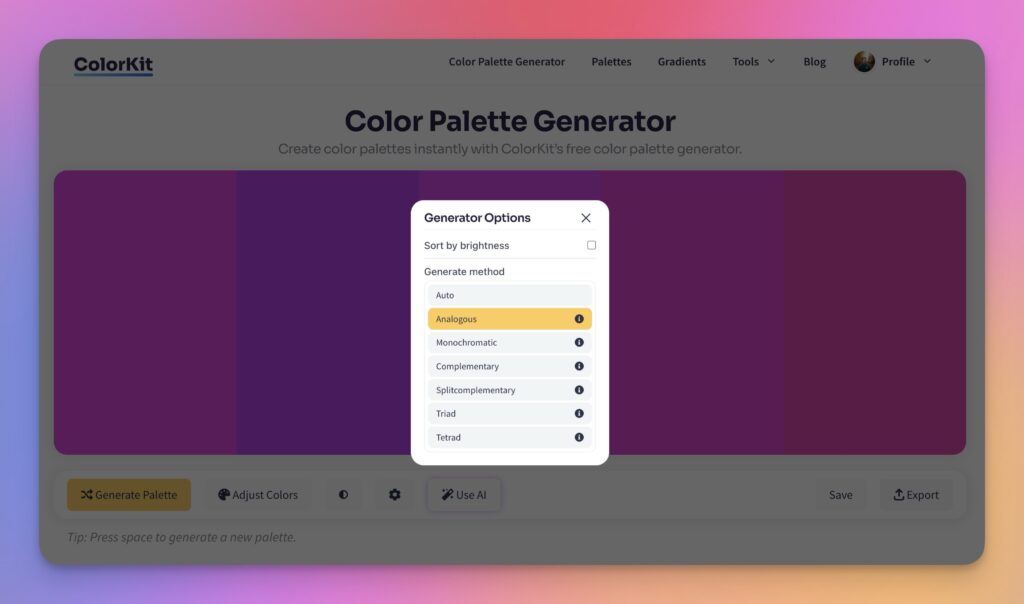
- Open the color palette generator.
- Click the gear icon to open palette settings and switch Generate method to Analogous.
- Drop your base color in and click Generate Palette. ColorKit returns the neighboring hues automatically.
- Trim the palette down to three or four colors. Hover over any swatch and click the delete icon to remove it.
- Use Adjust Colors to fine-tune saturation or brightness across all the colors at once.
You can also pull an analogous palette directly out of an image with color palette from image, or browse curated analogous-leaning palettes in the palette library.
Accessibility Considerations
Analogous palettes are visually pleasing but tricky for accessibility. Adjacent colors share undertones, so the contrast between them is naturally low, which is exactly what you don’t want for readable text or distinguishable UI states. Three things to plan around:
- Color blindness. Roughly 1 in 12 men and 1 in 200 women have some form of color vision deficiency. Two adjacent green hues can read as identical to a viewer with deuteranomaly. Don’t rely on color alone to communicate state, hierarchy, or meaning. Pair color with shape, position, icons, or text labels.
- Text contrast. WCAG AA requires 4.5:1 contrast for body text and 3:1 for large text. Analogous color pairs almost always fail these thresholds. Use neutrals for text, not palette colors.
- UI state distinction. If hover, focus, and active states all use neighboring analogous shades, users can lose track of where they are. Add lightness contrast or non-color cues (underline, border, icon).
Alternatives to Analogous Color Schemes
Analogous is one of six classic color schemes. If you want more contrast or a different mood, try one of these:
- Complementary: Two colors directly opposite on the wheel. Maximum contrast and energy.
- Split-Complementary: Base color plus the two hues flanking its complement. Strong contrast, easier to balance than direct complementary.
- Triadic: Three colors evenly spaced around the wheel. Bright and balanced.
- Tetradic: Two complementary pairs (four colors total). Rich, but harder to balance. Pick one to lead.
- Monochromatic: One hue, varied across tints, shades, and tones. Cohesive by default and almost impossible to get wrong.
All five live on the color wheel page if you want to flip between them and see the same base color in different schemes.
Frequently Asked Questions
How do I find analogous colors on the color wheel?
Pick a base color, then take one or two colors on each side of it. For example, blue with blue-green and blue-violet, or red-orange with red and orange. Three colors is the most common analogous palette.
How many colors should I use in an analogous palette?
Two to four colors works for most projects. Three is the sweet spot: one dominant color, one supporting color, and one accent. Beyond four or five, the palette stops feeling analogous and starts feeling rainbow.
Can I use neutrals with an analogous scheme?
Yes, and you usually should. White, black, gray, or beige give the eye a place to rest and provide enough contrast for readable body text. Most polished analogous designs are actually four colors: three from the wheel plus one neutral.
How do I avoid a muddy look?
Vary lightness and saturation, not just hue. Keep one color richer and more saturated, push another toward a tint, and let the third sit in the middle. If the palette still feels flat, add a near-black or pure white to introduce contrast without breaking the analogous relationship.
Are analogous colors good for branding?
Yes, especially for brands that need to feel calm, unified, or natural (wellness, sustainability, hospitality, food). Most analogous brand systems pair the analogous core with one contrasting accent for calls to action and important affordances. The accent gives the system enough punch without breaking the cohesion.
What’s the difference between analogous and monochromatic?
Monochromatic uses one hue with different tints, shades, and tones. Analogous uses three different hues that sit next to each other on the wheel. Monochromatic is more unified; analogous has more variety while still feeling cohesive.
Can analogous schemes feel too quiet?
They can. If a strict analogous palette feels under-energized, introduce one complementary accent (a color from the opposite side of the wheel) used sparingly. The contrast hits harder against an analogous background than against a busier palette, so even 5% to 10% of the design in the accent is enough to wake things up.
Putting It Into Practice
Start with a base color you already love. Open it on the color wheel, switch the dropdown to Analogous, and see the neighbors. Or run it through the color palette generator on the Analogous setting for a fully built palette. Pull three colors, push the lightness range, and see how it feels.
When analogous feels too unified, the closest neighbors are split-complementary (more contrast, still balanced) or monochromatic (even more cohesive, less variety).