
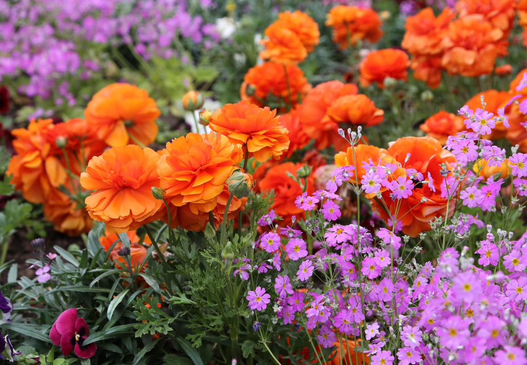
A triadic color scheme uses three colors evenly spaced around the color wheel, forming a perfect triangle. The most familiar example is red, yellow, and blue. Triadic palettes are bold, vibrant, and balanced. They give you strong contrast like a complementary pair, but spread across three hues so the result feels playful rather than aggressive.
Designers reach for triadic palettes when they want energy without overwhelm. The geometry is what makes them work: with three colors at 120 degrees apart, no single hue dominates, and the eye is constantly moving between them. To experiment with any triadic combination in real time, try the color mixer or use ColorKit’s color palette generator set to Triadic mode.

The Quick Version
A triadic color scheme uses three colors evenly spaced 120 degrees apart on the color wheel. Pick a base color, then trace a triangle to the two hues equally distant from it. Examples: red plus yellow plus blue (primary triad); orange plus green plus violet (secondary triad). Use one color to dominate (about 60 percent of your design), the second as support (30 percent), and the third as an accent (10 percent). For a softer take, use desaturated or pastel versions of the three hues.
What Is a Triadic Color Scheme?

A triadic color scheme is built from three colors equally spaced on a 12-segment color wheel. Each color sits 120 degrees from the others, forming an equilateral triangle. Because the three colors are evenly spaced, they share equal visual weight, which creates a balanced, energetic palette without any one hue overpowering the others.
Triadic palettes were a favorite of De Stijl artists in the early 1900s (Piet Mondrian’s red-yellow-blue grid compositions are textbook examples), and they’ve remained a staple in branding, animation, and editorial design ever since. Toy Story relies on the primary triad to make its world feel friendly and toy-like. Burger King’s identity (red, blue, yellow) leans on the same combination.
How to Find Triadic Colors on the Color Wheel
There are three ways, fastest first.
Use the color wheel tool
Open the wheel on ColorKit’s color wheel page and select “Triad” from the scheme dropdown. The wheel will draw a triangle from your starting color to its two triadic partners.
Find it by hand
On a standard 12-segment color wheel, pick your base color, then count four positions clockwise. That’s your second color. Count four more positions clockwise to find your third. The three points form an equilateral triangle. The classic triads are:
- Primary Triad: Red, Yellow, Blue
- Secondary Triad: Orange, Green, Violet
- Tertiary Triad I: Red-Orange, Yellow-Green, Blue-Violet
- Tertiary Triad II: Yellow-Orange, Blue-Green, Red-Violet
Use HSL math
In any design tool that supports HSL, lock the saturation and lightness of your base color and add 120 to the hue value for your second color, then 240 for your third. That’s the exact math the color wheel is doing visually. Wrap around past 360 if you go over.
How to Build a Triadic Palette (Step-by-Step)
- Start with one color. Pick the dominant hue for your brand, project, or piece. This is the color that will take up roughly 60 percent of your design.
- Find its two triadic partners. Rotate 120 degrees clockwise on the color wheel for the second color, and 240 degrees for the third. (Or just use the wheel tool, which does the math for you.)
- Decide which color does what. One dominant, one supporting, one accent. The 60-30-10 split is the safest starting point.
- Adjust saturation if it’s too loud. Pure triadic palettes can feel intense because all three colors compete for attention. Mute one or two by lowering their saturation, or shift them toward tints or shades to calm the result.
- Test against your typography and imagery. Triadic palettes can make text hard to read if you use them at full saturation on text-on-color combinations. Reserve the palette for fills, headers, and accents, and use neutrals for body copy.
- Add a neutral. Almost every working triadic system in the wild includes a white, off-white, gray, or near-black for backgrounds and body content. The neutral is what lets the triad feel intentional instead of chaotic.
Want to test a triadic mix before committing? Drop your three hex codes into the color mixer to see how they blend, or use the color palette generator with Generate Method set to Triadic for instant suggestions.
The Four Standard Triadic Color Schemes
On a 12-segment color wheel, four distinct triadic schemes exist. Each one rotates 30 degrees from the next. Hex codes below are the canonical starting points for each.
| Triad | Color 1 | Color 2 | Color 3 | Combination |
|---|---|---|---|---|
| Primary Triad | #FF0000 | #FFFF00 | #0000FF | Red + Yellow + Blue |
| Secondary Triad | #FFA500 | #008000 | #800080 | Orange + Green + Violet |
| Tertiary Triad I | #E34234 | #9ACD32 | #4B0082 | Red-Orange + Yellow-Green + Blue-Violet |
| Tertiary Triad II | #FFBF00 | #008080 | #C71585 | Yellow-Orange + Blue-Green + Red-Violet |
Ten Example Triadic Palettes
Ten ready-to-use triadic palettes spanning bold, soft, earthy, and contemporary moods. Click any hex to open its full color reference page.
Primary Triad · Red, Yellow, Blue
The textbook triadic palette. Bold, balanced, immediately legible. Used in everything from Mondrian paintings to children’s brands like Toy Story and LEGO.

Secondary Triad · Orange, Green, Violet
The softer cousin of the primary triad. Less aggressive, more sophisticated. Works for autumn campaigns, wellness branding, and editorial layouts.
Tertiary Triad I · Red-Orange, Yellow-Green, Blue-Violet
Warm and earthy with one cool anchor. Common in heritage branding, food packaging, and outdoor/hiking aesthetics.
Tertiary Triad II · Yellow-Orange, Blue-Green, Red-Violet
Tropical and editorial. The teal grounds two bolder accents. Used in beauty, travel, and modern fashion brands.
Retro Soda · Coral, Mint, Mustard
Mid-century, diner-leaning. Warm and friendly. Strong for food, hospitality, and nostalgia-tinged consumer brands.
Pastel Spring · Pastel Pink, Pastel Blue, Pastel Yellow
Soft, lightweight, and feminine. Common in beauty, baby products, and seasonal spring campaigns.
Earthy Modern · Terracotta, Sage, Slate Blue
Grounded and contemporary. Used in interior design, wellness, and minimalist lifestyle brands.
Tropical · Turquoise, Coral, Lime
High energy, vacation-coded. Beach campaigns, summer drinks, swimwear, music festival branding.
Tech Brand · Royal Purple, Cyan, Lime Yellow
Sharp and energetic. Used by SaaS, gaming, and modern AI-leaning brands. The cyan and lime make CTAs pop.
Editorial Bold · Mustard, Teal, Magenta
Magazine-shoot energy. Confident, slightly retro, used in fashion editorials and lifestyle photography.
Want to build your own? Use the color palette generator with the Triadic preset, or experiment with mixes in the color mixer.
Quick Reference: Triadic Palette Cheat Sheet
Every palette above in one extractable table. Save it, copy it, paste it into a doc.
| Palette | Hex Combination | Use Case |
|---|---|---|
| Primary Triad | #FF0000 + #FFFF00 + #0000FF | Bold, energetic, kid-friendly |
| Secondary Triad | #FFA500 + #008000 + #800080 | Softer, more sophisticated than primary |
| Tertiary Triad I | #E34234 + #9ACD32 + #4B0082 | Warm-earthy with cool anchor |
| Tertiary Triad II | #FFBF00 + #008080 + #C71585 | Tropical, editorial, modern |
| Retro Soda | #FF7F50 + #98FF98 + #FFDB58 | Mid-century diner, food brands |
| Pastel Spring | #FFD1DC + #AEC6CF + #FDFD96 | Beauty, baby, spring campaigns |
| Earthy Modern | #C47457 + #87AE73 + #6A5ACD | Interior design, wellness |
| Tropical | #40E0D0 + #FF7F50 + #ADFF2F | Summer, beach, festivals |
| Tech Brand | #6C5CE7 + #00D4FF + #D4FF00 | SaaS, gaming, AI brands |
| Editorial Bold | #D4A017 + #2F7A78 + #C13584 | Fashion editorials, lifestyle |
Triadic Color Schemes in the Wild
Triadic palettes are everywhere once you know what to look for:
- Toy Story. Woody’s red-yellow-blue costume is the primary triad in three pieces. The film leans on the same three colors throughout its production design to keep the world feeling like a child’s toy box.
- Mondrian’s grid paintings. Piet Mondrian’s Composition with Red, Blue, and Yellow (1930) is the canonical fine-art example of a primary triadic palette, anchored by black grid lines and white background.
- Burger King. The chain’s identity uses red, yellow, and blue. The 2021 rebrand softened the saturation but kept the triad intact.
- Firefox browser logo. The classic Firefox mark uses orange, blue, and a hint of yellow, sitting close to the tertiary triadic geometry.
- Superhero costumes. Superman (red, yellow, blue), Spider-Man (red, blue, and a yellow accent in some eras), and Wonder Woman (red, blue, gold) all sit near primary triadic territory. The geometry makes the characters feel bold and balanced at a glance.
- The Simpsons. Yellow skin, blue hair (Marge), red dresses, and orange-leaning accents throughout the show form a soft tertiary triad. The choice was deliberate to make the family pop on a CRT screen.
How to Use Triadic Colors in Design
Use one color to dominate
Triadic palettes feel best when you pick a clear leader. The 60-30-10 rule works well: 60 percent of the design uses the dominant color, 30 percent uses the supporting color, and 10 percent uses the accent. If you weight all three equally, the palette flattens out and the eye loses where to land first.
Soften with tints, shades, or muted tones
Pure primary triads at full saturation can feel loud (think kids’ toy aisle). Soften the effect by pulling one or two of the colors toward a tint (add white), a shade (add black), or a tone (reduce saturation). The Pastel Spring palette above is the same primary triad pushed all the way into tints.
Vary saturation across the three
A pro move: keep one color fully saturated, mute the second slightly, and desaturate the third significantly. This creates depth without breaking the triadic relationship. Useful for editorial layouts and UI design where you need visual hierarchy.
Use neutrals for body content
Triadic palettes rarely give you enough contrast for accessible body copy. Reserve the palette for fills, headers, and accents, and rely on near-black or near-white for text. Always verify text-on-color combinations with a contrast checker before shipping.
Lean into the energy
Triadic schemes are inherently lively. Don’t fight that. They work best for brands and designs that want to feel playful, energetic, optimistic, or attention-grabbing. If you need calm and unified, you want analogous or monochromatic instead.
Why Your Triadic Palette Goes Wrong
Triadic palettes are forgiving but a few common failure modes show up:
- All three colors at full saturation. The result reads as kid-toy or circus loud. Pull one or two back with tints, shades, or muted tones to land in ‘designed’ territory.
- Equal weighting across all three. The eye doesn’t know where to land first. Pick a dominant color and use the other two as supporting roles. 60-30-10 is the reliable split.
- Missing the neutral. A triadic palette without a white, gray, or off-black background is hard to make work. Bake a neutral into the system from the start.
- Body text in palette colors. Triadic colors at full saturation almost never pass WCAG contrast for body copy. Use the palette for fills and headers; use neutrals for text.
- Using HSL math without visual checking. The 120-degree rotation gives you a mathematically perfect triad, but the human eye doesn’t always agree (some hues feel heavier than others at the same saturation). Always eyeball the final palette and adjust by feel.
In digital design, triadic colors sit at hue values 0°, 120°, and 240° in HSL. You can experiment with any starting hue by dropping it into the color mixer with a primary triad prefilled and shifting values from there.
Triadic vs. Other Color Schemes
How triadic compares to other schemes on the wheel:
- vs. Complementary: Complementary uses two colors directly opposite each other (max contrast). Triadic spreads the energy across three colors. Triadic feels more playful, complementary feels more punchy.
- vs. Split-Complementary: Split-comp uses a base plus the two colors next to its complement. Both schemes use three colors, but split-comp keeps strong tension between the base and the two flanking colors. Triadic distributes the tension evenly.
- vs. Analogous: Analogous uses three colors next to each other on the wheel (low contrast, harmonious). Triadic uses three colors far apart (high contrast, energetic). Use analogous for calm, triadic for energy.
- vs. Tetradic: Tetradic uses four colors in two complementary pairs. Richer than triadic but harder to balance. Pick one to dominate or it falls apart.
- vs. Monochromatic: Monochromatic uses one hue varied across tints, shades, and tones. Cohesive by default. Use mono when you want unity, triadic when you want energy.
Generate Triadic Palettes with ColorKit

- Open the color palette generator.
- Click the gear icon to open palette settings and set Generate Method to Triadic.
- Drop in your base color and click Generate Palette. ColorKit returns the two triadic partners for any starting hex.
- Trim or rearrange the palette as needed. Drag colors to reorder, click delete to remove, or use the lock icon to keep favorites while regenerating.
- Need to test how the three colors interact when mixed? Hand the palette off to the color mixer to see the blended result.
Frequently Asked Questions
What is a triadic color scheme?
A triadic color scheme uses three colors that sit evenly spaced on the color wheel, 120 degrees apart. The three colors form a perfect equilateral triangle. The most familiar example is red, yellow, and blue (the primary triad).
What are common triadic color examples?
The four canonical triadic combinations are: primary (red, yellow, blue), secondary (orange, green, violet), tertiary I (red-orange, yellow-green, blue-violet), and tertiary II (yellow-orange, blue-green, red-violet). Beyond these, any triad rotated to a different starting hue is also valid.
How is a triad different from complementary and split-complementary?
Complementary uses two colors directly opposite each other on the wheel (max contrast, max tension). Split-complementary uses a base color plus the two colors flanking its complement (three colors, but with strong tension between base and the flanking pair). Triadic uses three colors evenly spaced 120 degrees apart, which distributes the tension evenly between all three.
How do I avoid a loud or messy look?
Three things. First, pick a dominant color and use the other two as supporting roles (60-30-10). Second, mute one or two of the colors with tints, shades, or reduced saturation. Third, anchor the palette with a neutral background (white, off-white, gray, or near-black). Most professional triadic palettes look ‘designed’ precisely because they soften two of the three hues and rely on a neutral for body content.
What pitfalls should I watch for?
The biggest is using all three colors at equal weighting and full saturation. The result reads as kid-toy or carnival. The fix is the 60-30-10 split and softening one or two of the hues. The second pitfall is text on color: triadic palettes rarely pass WCAG contrast for body copy, so use neutrals for text and reserve the palette for headers and fills.
Are triadic palettes good for branding?
Yes, especially for brands that want to feel energetic, optimistic, or playful. Toy Story, Burger King, Firefox, and many superhero franchises all use near-triadic palettes. The format works because three colors give you enough variety to express different brand moments (primary, accent, alert) while staying inherently balanced.
Can I use a triadic palette with neutrals?
Yes, and you usually should. Most working triadic systems pair the three colors with a neutral background and a neutral text color (typically white or off-white background, near-black text). The neutral is what makes the triad feel intentional rather than chaotic.
How do I find a triadic palette for an existing brand color?
Drop your existing hex into the color wheel and switch to the Triadic scheme. The wheel will show you the two partners. Or, in any HSL-aware tool, lock saturation and lightness, then add 120 and 240 to the hue value to find your triad mathematically.
Putting It Into Practice
Pick a base color you already love. Open it in the color wheel, switch the dropdown to Triadic, and see the two partners that come back. Pull the three hex codes into the palette generator or the color mixer and start adjusting saturation, weight, and balance until the palette feels right.
When triadic feels too energetic, the closest neighbors are split-complementary (more contrast, three colors with a clear focal pair) or analogous (calmer, three colors next to each other on the wheel).