
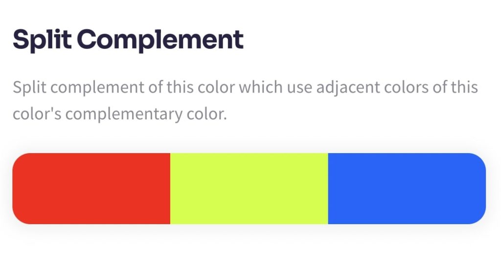
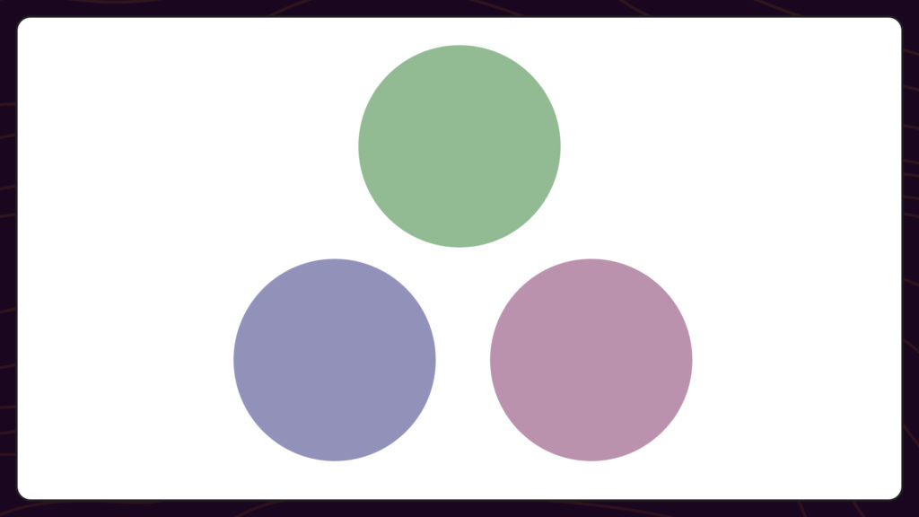
A split-complementary color scheme uses one base color and the two colors that sit next to its complement on the color wheel. The result is a three-color palette with the contrast of a complementary pair, but softer and easier to balance.

Where a complementary scheme pulls one color directly across the wheel, a split-complementary scheme stops short on either side of that opposite. You keep the warm-versus-cool tension that makes complementary palettes pop, but you trade some intensity for a third color and a more forgiving balance. That makes split-complementary one of the easiest schemes to use well, especially if you’re new to color theory.
The Quick Version
A split-complementary palette starts with one base hue and adds the two colors flanking its opposite on the color wheel. You get three colors that feel lively and balanced, with plenty of contrast and less harshness than a direct complementary pairing. Pair blue with yellow-orange and red-orange for a bold, sun-warmed look. Pair green with red-purple and red-orange for something vibrant but easy on the eyes.
How to Find Split-Complementary Colors
There are three ways to land on a split-complementary set, fastest first.
Use the color picker
The fastest path is the ColorKit color picker. Pick your base color, then scroll down to see the split-complementary colors generated for it. Or open the wheel on the color wheel page and select “Split-Complementary” from the scheme dropdown.
Use the color wheel by hand
On a standard 12-color wheel, pick your base color, find the color directly opposite (its complement), then take the two colors that sit immediately on either side of that complement. Those two, plus your base, are your split-complementary set.
For example: start with red. Red’s complement is green. The colors on either side of green are yellow-green and blue-green. Your split-complementary set is #ff0000 + yellow-green + blue-green.
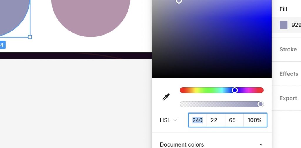
Shift the hue in your design tool
If you’re working in Figma, Photoshop, or any tool with a hue slider, you can build the palette by hand:
- Drop your base color onto the canvas three times.
- Leave one untouched (the base).
- On the second swatch, increase the hue value by 150°.
- On the third swatch, decrease the hue value by 150° (or add 210°). If you go below zero, loop around:
−60becomes300. - Adjust saturation and brightness on the two new colors until they sit well next to the base.

The 12 Split-Complementary Color Combinations
On a 12-spoke color wheel there are twelve possible split-complementary sets, one per base color. Here they are with hex codes you can drop straight into a design file.
| Base color | Split #1 | Split #2 |
|---|---|---|
Red #ff0000 | Yellow-Green #9acd32 | Blue-Green #008080 |
Red-Orange #e34234 | Green #008000 | Blue #0000ff |
Orange #ffa500 | Blue-Green #008080 | Blue-Purple #4b0082 |
Yellow-Orange #ffbf00 | Blue #0000ff | Purple #800080 |
Yellow #ffff00 | Red-Purple #c71585 | Blue-Purple #4b0082 |
Yellow-Green #9acd32 | Purple #800080 | Red #ff0000 |
Green #008000 | Red-Purple #c71585 | Red-Orange #e34234 |
Blue-Green #008080 | Red #ff0000 | Orange #ffa500 |
Blue #0000ff | Red-Orange #e34234 | Yellow-Orange #ffbf00 |
Blue-Purple #4b0082 | Orange #ffa500 | Yellow #ffff00 |
Purple #800080 | Yellow-Orange #ffbf00 | Yellow-Green #9acd32 |
Red-Purple #c71585 | Yellow #ffff00 | Green #008000 |
You can stick to the three pure hues, or push them further with shades and tints. Once you bring in a fourth distinct color, you’ve technically left split-complementary territory and moved into something tetradic or more loosely inspired. Need shades or tints? Run any base through the color shades generator.
When Split-Complementary Works Best
Split-complementary palettes are forgiving, which makes them a strong default for situations where straight complementary pairs feel too aggressive.
- UI design. Use the base hue as your primary color, one split for calls to action, and the other for highlights or status indicators. The contrast is loud enough for affordances to pop without making the whole interface feel busy.
- Branding. A base plus two accents gives you a primary identity color and two flexible secondaries for marketing material, illustration, and product packaging.
- Illustration and posters. The natural warm-cool split adds depth and makes focal elements stand out without going monochromatic.
- Photography and color grading. Sunset and golden-hour scenes are essentially split-complementary in nature: warm orange and yellow against cool blue and violet shadows.
- Interior design. Pick a dominant wall or fabric color as the base, then introduce the two split colors through accents, art, and lighting.
Tips for Balancing the Palette
- 60-30-10 rule. Use the base for roughly 60% of the surface, the first split color for 30%, and the second for the remaining 10% as an accent. Adjust to taste.
- Don’t run all three at full saturation. Pick one to stay vivid and pull the other two back with shades, tints, or muted tones.
- Watch contrast for text. The bold colors look great as fills, but body text usually needs a near-black or near-white. Test with a contrast checker before shipping.
- Leave room for neutrals. White, gray, beige, or off-black give the eye a place to rest between the three hues.
Alternatives to Split-Complementary
If a split-complementary palette feels off for the project, one of these schemes might fit better:
- Complementary: Two colors directly opposite on the wheel. Maximum contrast and energy. Use when you want punch.
- Analogous: Three colors next to each other on the wheel. Smooth and harmonious. Use when you want flow over contrast.
- Triadic: Three colors evenly spaced around the wheel. Bright, balanced, and playful.
- Tetradic: Two complementary pairs (four colors total). Rich, but harder to balance. Pick one to lead.
- Monochromatic: One hue, varied across tints, shades, and tones. Cohesive by default and almost impossible to get wrong.
All five live on the color wheel page if you want to flip between them and see the same base color in different schemes.
Frequently Asked Questions
What is a split-complementary color scheme?
A split-complementary scheme uses one base color and the two colors next to its direct complement on the color wheel. You get a three-color palette with high contrast and less tension than a straight complementary pair.
How do I find split complements on a color wheel?
Pick a base hue. Find its direct complement (the color directly opposite). Take the two hues immediately on either side of that complement. Those two, plus your base, form the set.
How does it compare to triadic and tetradic schemes?
Triadic uses three evenly spaced hues, which feels balanced but less focused. Tetradic uses two complementary pairs (four colors), which is richer but harder to control. Split-complementary sits in the middle: bold, but still manageable.
What are common mistakes to avoid?
Don’t use all three hues at equal strength, don’t run every color at full saturation, and don’t put low-contrast text over busy backgrounds. Test the palette on multiple screens (and in print, if relevant) before locking it in.
How do I apply a split-complementary scheme in UI design?
Make the base hue your primary UI color. Use one accent for calls to action and important affordances. Use the other for highlights, status states, or visited links. Keep text colors accessible by checking contrast against every background you use them on.
Can I use a split-complementary palette in photography or interior design?
Yes. Use the base as the dominant scene or room tone, then bring the two splits in through props, textiles, lighting, or accent walls. Keeping one accent subtle (closer to a tint or shade) tends to land better than equal weighting.
Is split-complementary good for beginners?
It’s one of the most forgiving schemes. The base color does most of the work, and the two splits are easier to balance than a direct complement. If you’re new to building palettes from scratch, this is a strong place to start.
Putting It Into Practice
Start with a base color you already love. Open it in the color picker or set it on the wheel on the color wheel page, switch to the split-complementary scheme, and see what comes back. If the palette doesn’t feel right, adjust the base hue by 30 degrees and try again, or pull the splits toward shades and tints until everything sits well together.
Want a deeper tour of how every scheme on the wheel relates? Read the full guide to the color wheel.