
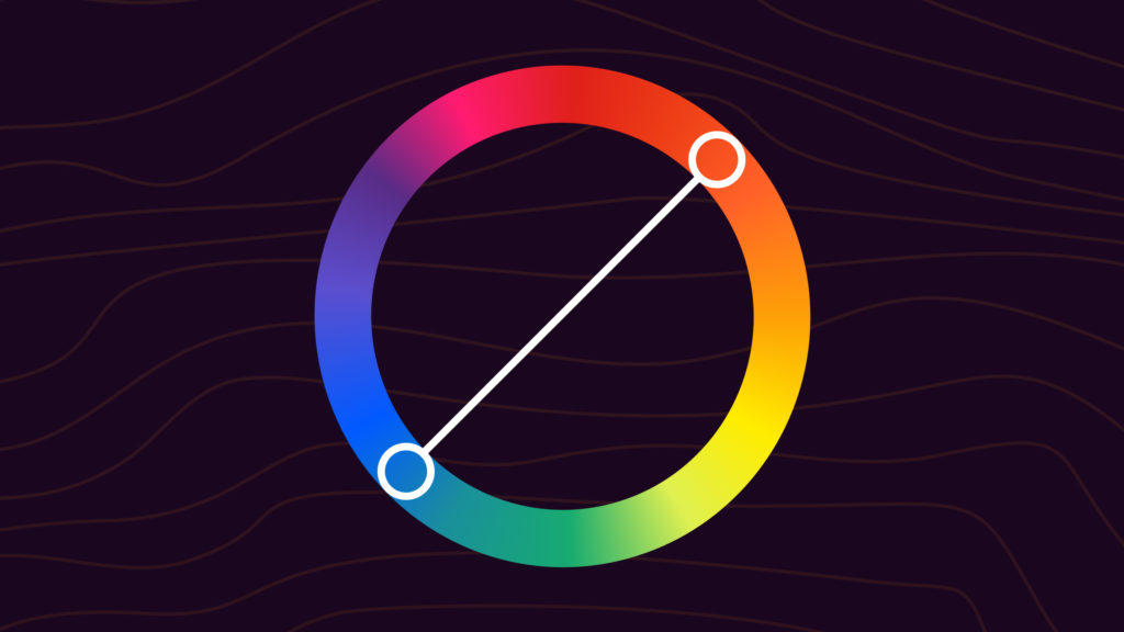
Complementary colors are pairs of colors that sit directly opposite each other on the color wheel. Common pairs include red and green, blue and orange, and yellow and purple. Place them next to each other and they make both colors look brighter and more saturated. Mix them as paint and they cancel out into gray or brown.
Designers and artists reach for complementary pairs when they need contrast: a button that has to draw the eye, a focal point in a painting, a brand color that needs an accent. The downside is intensity. Complementary palettes are loud by default and need careful balancing to keep from feeling chaotic.
The Quick Version
Complementary colors are two hues directly opposite on the color wheel. They create maximum contrast and make each other look more vivid. Pick one to dominate and use the other as an accent (a 70/30 or 80/20 split usually works), and balance the lightness of each. Common pairs: blue and orange, red and green, yellow and purple. For a softer take, try a split-complementary scheme instead.
Why Complementary Colors Work
The eye sees color through three types of cone cells, tuned to roughly red, green, and blue light. Complementary pairs sit on opposite sides of the wheel because they trigger different cone responses, which the brain reads as strong contrast.
Two effects show up when complements sit next to each other:
- Simultaneous contrast. Each color makes the other look more saturated. A muted orange next to a muted blue will both read more vivid than they would on a white background.
- After-images. Stare at a red square for ten seconds, then look at a white wall. You’ll see a green ghost. Your cones briefly fatigue, and the complement is what’s left.
Painters figured this out long before science explained it. Van Gogh wrote about pairing yellow with violet and red with green deliberately to push intensity in his paintings. Hokusai’s The Great Wave works because of the orange against deep blue. The wheel is a shortcut to an effect that’s been used for centuries.
RGB vs. RYB Complements
There’s no single “correct” set of complementary pairs. The complement depends on which color model you’re working in.
RYB (paint and traditional art)
On the painter’s wheel, the complement of red is green, the complement of blue is orange, and the complement of yellow is purple. This is the wheel almost everyone learns in school, and it’s the one designers reach for when they’re talking about color theory in the abstract.
RGB (screens and digital design)
On a digital RGB wheel, the math is different. The complement of red is cyan, the complement of green is magenta, and the complement of blue is yellow. You can compute any RGB complement by inverting the hex value: subtract each pair of digits from FF. Red #FF0000 becomes cyan #00FFFF. Hot pink #FF1493 becomes #00EB6C.
In practice, most designers stick with the RYB convention even when designing for screens, because the warm-cool tension is more interesting to look at. RGB complements are the technically correct inverse but often feel flat or unnatural. Use whichever wheel matches the effect you want.
The 6 Classic Complementary Color Pairs (RYB)
Here are the six standard complementary pairs from a 12-spoke RYB color wheel, with hex codes you can drop into a design file. Click any code to open that color’s full reference page.
| Color | Complement | Notes |
|---|---|---|
Red #ff0000 | Green #008000 | The classic. High contrast and high recognition. Used in everything from holiday packaging to retail call-to-action buttons. |
Red-Orange #e34234 | Blue-Green #008080 | Sun-warmed against deep water. Works for travel, hospitality, and wellness brands. |
Orange #ffa500 | Blue #0000ff | Used heavily in tech and sports branding. The two hues feel energetic without clashing. |
Yellow-Orange #ffbf00 | Blue-Purple #4b0082 | Warm honey against deep indigo. Premium, late-night, editorial. |
Yellow #ffff00 | Purple #800080 | Loud and theatrical. Common in entertainment, music, and high-energy events. |
Yellow-Green #9acd32 | Red-Purple #c71585 | Fresh and unexpected. Reads modern, especially with desaturated tints. |
Mix any of these with shades, tints, and tones to soften the effect. Run a base color through the color shades generator to get a full ramp, or use the palette generator to build a complete palette around a complementary pair.
RGB Complementary Pairs
If you’re working in a strict RGB color space (a CSS file, a 3D engine, anywhere you need the mathematical inverse), these are the pure complements:
| Color | RGB Complement |
|---|---|
Red #ff0000 | Cyan #00ffff |
Green #00ff00 | Magenta #ff00ff |
Blue #0000ff | Yellow #ffff00 |
Orange #ff7f00 | Azure #0080ff |
Lime #7fff00 | Violet #8000ff |
Pink #ff007f | Spring Green #00ff80 |
How Complementary Colors Show Up in the Wild

Once you know what to look for, complementary palettes are everywhere:
- Sunset photography. Warm orange and yellow against cool blue and violet shadows. The most common complementary palette in nature, and the easiest to use as a reference.
- Movie posters. The orange-and-teal grade that took over Hollywood in the 2000s is the bluntest example. Skin tones (warm orange) against blue-shifted shadows make actors pop.
- Sports branding. Most NFL and NBA teams use a complementary pair for their primary identity. The contrast holds up at any size, from a stadium screen to a phone icon.
- Retail call-to-action buttons. A site with a blue or green primary color often uses orange or red for the buy button. The complement does the work of pulling attention without needing a giant arrow.
- Holiday and seasonal design. Red and green for winter holidays, orange and blue for autumn, pink and green for spring. Most of these pairs land near a complementary relationship by accident.
How to Use Complementary Colors in Design
Pick one to dominate
The biggest mistake with complementary palettes is using both colors in equal amounts. Equal weighting cancels the effect, the eye gets confused, and the design feels noisy. A 70/30 or 80/20 split lets one color set the mood and the other do the pointing.
Vary the lightness
Two pure complements at the same lightness will buzz against each other. To soften that, push one toward a tint (lighter) and one toward a shade (darker). Light blue with deep orange is friendlier than royal blue with pure orange. Same colors, very different feel.
Use the complement as an accent
In UI work, the most reliable pattern is dominant color + complementary accent. The dominant sets the brand or section tone. The complement appears only on important affordances (buttons, links, alerts, badges). The complement does its job because it’s rare, not because it’s loud.
Mind contrast for text
Pure complementary pairs almost never make good text-on-background combinations. The colors vibrate, especially at small sizes. Use the palette for fills and accents; rely on near-black or near-white for body text. Run any combination through a contrast checker to confirm WCAG AA before shipping.
Add a neutral
A complementary pair plus white, gray, or off-black gives the eye a place to rest. Most well-known complementary brand palettes are actually three colors: the primary, the complement, and a neutral that takes up most of the surface.
Common Mistakes to Avoid
- Equal saturation across both hues. Pull one back with a tint, shade, or muted tone.
- Body text in complementary colors. Use neutrals for text. Save the palette for fills.
- Too many complementary pairs in one design. Stick to one pair per layout. Two pairs becomes tetradic and needs a different balance.
- Forgetting accessibility. The colors that pop hardest visually often fail contrast checks. Verify every text-over-color combination.
- Ignoring the value (lightness) difference. Two complements at the same lightness create vibration. Different lightness creates contrast.
Build a Complementary Palette in ColorKit

- Open the color palette generator.
- Click the gear icon to open palette settings and switch Generate method to Complementary.
- Drop your starting color into the first slot, then click Generate Palette. The tool returns the two complementary hues plus desaturated versions and a neutral.
- Cycle through different base colors (a soft lavender, a deep teal, a warm coral) to see how the complement shifts.
You can also pull a palette directly from an image with color palette from image, or browse complementary-leaning ready-made palettes in the palette library.
Alternatives to Complementary Color Schemes
If a straight complementary palette feels too intense, one of these schemes might fit better:
- Split-Complementary: Replaces the direct complement with the two colors flanking it. Same warm-cool tension, easier to balance, three colors instead of two.
- Analogous: Three colors next to each other on the wheel. Smooth and harmonious. Use when you want flow rather than contrast.
- Triadic: Three colors evenly spaced around the wheel. Bright and balanced.
- Tetradic: Two complementary pairs (four colors). Rich, but harder to balance. Pick one to lead.
- Monochromatic: One hue, varied across tints, shades, and tones. Cohesive by default.
All of these live on the color wheel page if you want to flip between them and see the same base color in different schemes.
Frequently Asked Questions
What are complementary colors?
Complementary colors are pairs of hues that sit directly opposite each other on the color wheel. The most common pairs are red and green, blue and orange, and yellow and purple. Side by side, they boost contrast. Mixed together as paint, they neutralize toward gray.
How do I find a color’s complement quickly?
Look 180 degrees across the color wheel from your starting color. In a design tool, switch to HSL mode and add 180 to the hue value (wrap around if you go over 360). For a hex code, take the inverse: subtract each pair of digits from FF. Red #FF0000 becomes cyan #00FFFF.
Do complementary colors always create high contrast?
Usually, but lightness matters more than hue. Two complements at the same lightness can blend or vibrate against each other. For strong, readable contrast, pair a light hue with a darker complement, not just two opposite hues at the same value.
Can I mix complements to make gray?
Yes, in paint or pigment. Balanced complements reduce saturation and move toward gray or brown. Try any complementary pair in the color mixer to see exactly where the muted result lands. The exact result depends on the pigments, which are rarely chemically pure, so the gray often leans warm or cool depending on which side you weighted.
What’s the difference between RGB and RYB complements?
RYB complements (red/green, blue/orange, yellow/purple) are the traditional pairs from paint mixing and what most designers mean when they say “complementary.” RGB complements are the mathematical inverse on a screen: red’s RGB complement is cyan, not green. Most digital designers still use the RYB convention because the pairs feel more intentional, but if you need the literal opposite hue in code, use the RGB inverse.
What is split-complementary, and when should I use it?
A split-complementary scheme replaces the direct opposite with the two hues flanking it. For example, base blue with yellow-orange and red-orange. You keep the warm-cool tension but get three colors instead of two, and the palette is easier to balance. Full breakdown in the split-complementary guide.
Are complementary colors good for accessibility?
Not by default. The colors that pop hardest visually often fail WCAG contrast requirements when used for text. Treat the palette as decoration: use complements for fills, accents, and focal points, and rely on near-black or near-white for body text. Always verify with a contrast checker.
Putting It Into Practice
Pick a base color you already love. Open the color wheel, switch to the complementary scheme, and see what comes back. If the pair feels too aggressive, push one color toward a tint or shade until it sits right. If it feels flat, take both back to pure hues and move the lightness apart instead.
And if a straight complementary pair never lands for the project, try a split-complementary scheme. Same idea, softer execution.