
#B7D145 Hex Color
Online color picker to view shades, tints, color codes, and complementary colors
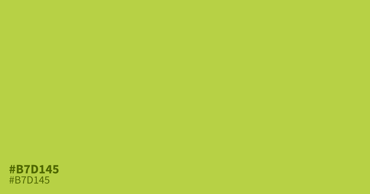
#b7d145 is a high-energy chartreuse that leans heavily into neon territory. This bright, glowing tone demands attention, making it effective for sale banners or UI alerts, though it can overwhelm if used too broadly. It performs best as an accent color rather than a large background. Pair it with deep charcoals for readability. If you are experimenting with similar warm tones, check what colors make orange for palette ideas.
Questions about #b7d145
What is #b7d145 in RGB, HSL and CMYK?
In RGB, #b7d145 is rgb(183, 209, 69), in HSL hsl(71, 60%, 55%) and in CMYK 12%, 0%, 67%, 18%. Browse more shades of green with names and hex codes.
How can I use #b7d145 effectively in my design?
#b7d145 acts best as an aggressive accent rather than a primary background color. To maintain balance, limit its use to call-to-action buttons, status alerts, or small graphic elements where you need to direct immediate user attention.
Is #b7d145 readable on white or black?
#b7d145 has a 1.71:1 contrast ratio on white and 12.21:1 on black. WCAG asks for 4.5:1 for body text and 3:1 for large text, so on white it is too faint for text and on black it works for body text. Try other pairs in the contrast checker.