
#B688D6 Hex Color
Online color picker to view shades, tints, color codes, and complementary colors
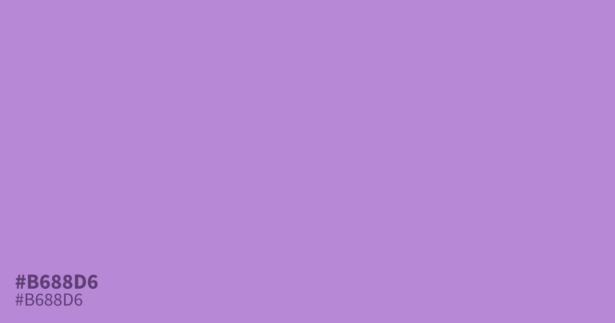
This unsaturated lavender tone feels composed and serene rather than vivid or loud. Because of its cool undertones and medium lightness, #b688d6 works best as a supporting color or secondary accent in UI design rather than a main background. It pairs well with charcoal grays or deep teals. Interestingly, designers often ask what colors make pink to find similar pastel complements for this specific hex code.
Questions about #b688d6
What is #b688d6 in RGB, HSL and CMYK?
In RGB, #b688d6 is rgb(182, 136, 214), in HSL hsl(275, 49%, 69%) and in CMYK 15%, 36%, 0%, 16%. Browse more shades of purple with names and hex codes.
What colors pair well with #b688d6?
Is #b688d6 better as a background or accent color?
Due to its medium lightness and muted saturation, #b688d6 is ideally suited as a secondary accent rather than a primary background color. Using it for buttons, borders, or iconography allows it to provide visual interest without overwhelming the user interface.
Is #b688d6 readable on white or black?
#b688d6 has a 2.80:1 contrast ratio on white and 7.48:1 on black. WCAG asks for 4.5:1 for body text and 3:1 for large text, so on white it is too faint for text and on black it works for body text. Try other pairs in the contrast checker.