
#8BA7D1 Hex Color
Online color picker to view shades, tints, color codes, and complementary colors
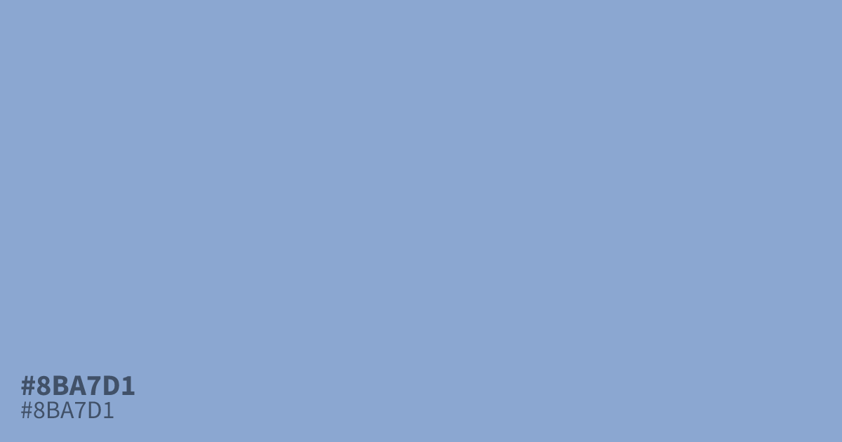
#8ba7d1 is a desaturated, dusty periwinkle with cool undertones. Because it sits between blue and gray, it works effectively as a stable background color for corporate UI or healthcare applications. While black text provides excellent readability against this shade, avoid using it as a primary highlight, as it can appear washed out. Designers often find mixing gray helps balance its softness in complex layouts.
Questions about #8ba7d1
What is #8ba7d1 in RGB, HSL and CMYK?
In RGB, #8ba7d1 is rgb(139, 167, 209), in HSL hsl(216, 43%, 68%) and in CMYK 33%, 20%, 0%, 18%. Browse more shades of blue with names and hex codes.
Where does #8ba7d1 work best in UI design?
#8ba7d1 functions as an excellent, stable background color for corporate and healthcare applications where readability is paramount. Because it is desaturated and dusty, it creates a professional, calming environment that supports dark text without causing eye strain.
What colors pair well with #8ba7d1?
Pair #8ba7d1 with charcoal or deep navy for high-contrast, readable text elements that ground the softness of this shade. Using lighter off-whites or soft creams can enhance its airy, periwinkle qualities without making the layout appear too washed out.
Is #8ba7d1 readable on white or black?
#8ba7d1 has a 2.45:1 contrast ratio on white and 8.54:1 on black. WCAG asks for 4.5:1 for body text and 3:1 for large text, so on white it is too faint for text and on black it works for body text. Try other pairs in the contrast checker.