
#6F1013 Hex Color
Online color picker to view shades, tints, color codes, and complementary colors
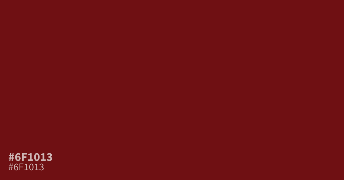
This deep, moody red projects intensity and seriousness without being overly loud. Because it is quite dark and low in brightness, #6f1013 works best as an accent color for formal branding or luxury packaging rather than a full page background. It offers excellent contrast for white text, so pair it with a stark cream or off-white to keep the color palette sophisticated and legible.
Questions about #6f1013
What is #6f1013 in RGB, HSL and CMYK?
In RGB, #6f1013 is rgb(111, 16, 19), in HSL hsl(358, 75%, 25%) and in CMYK 0%, 86%, 83%, 56%. Browse more shades of red with names and hex codes.
What colors pair well with #6f1013?
Is #6f1013 suitable for text usage?
Using #6f1013 as body text is not recommended because its deep, low-brightness tone lacks sufficient contrast against most backgrounds. It is best reserved for headlines, small design accents, or brand identity elements where legibility is less critical than visual impact.
Is #6f1013 readable on white or black?
#6f1013 has a 11.93:1 contrast ratio on white and 1.75:1 on black. WCAG asks for 4.5:1 for body text and 3:1 for large text, so on white it works for body text and on black it is too faint for text. Try other pairs in the contrast checker.