
#50429A Hex Color
A deep and moody muted violet
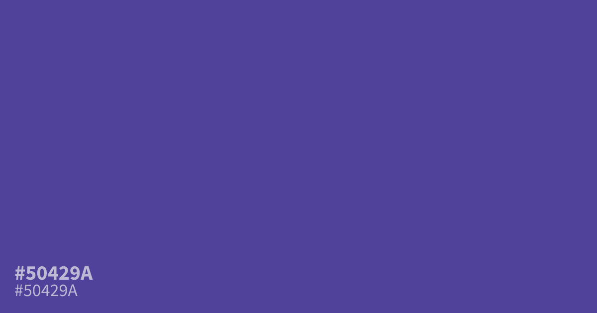
#50429a is a moody, muted violet with a serious edge. Its cool, dark saturation provides a grounded base for designs needing an air of mystery or sophisticated depth. While it works well for dark mode interfaces, use it sparingly as a primary background to avoid a muddy effect. Pairing this hex code with crisp white text ensures high legibility, as the contrast ratio is excellent.
Questions about #50429a
What is #50429a in RGB, HSL and CMYK?
In RGB, #50429a is rgb(80, 66, 154), in HSL hsl(250, 40%, 43%) and in CMYK 48%, 57%, 0%, 40%. Browse more shades of purple with names and hex codes.
How should I use #50429a in interface design?
#50429a is a dark, heavy hue that functions best as an accent color or a sophisticated background for high-contrast text. Avoid using it as a full-page background, as its saturation can feel muddy without enough light to balance the depth.
What colors pair well with #50429a?
Pair #50429a with crisp, high-contrast shades like ivory or soft, neutral silver to maintain legibility. Using a complementary yellow-green or a soft gold can also create a striking, balanced visual contrast that highlights the purple undertones effectively.
Is #50429a readable on white or black?
#50429a has a 8.11:1 contrast ratio on white and 2.58:1 on black. WCAG asks for 4.5:1 for body text and 3:1 for large text, so on white it works for body text and on black it is too faint for text. Try other pairs in the contrast checker.