
#30144E Hex Color
A moody deep purple with unsaturated tones
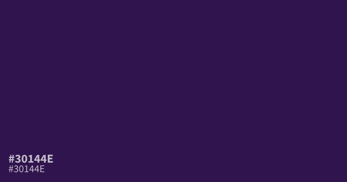
This dark, dim purple feels moody and unsaturated. Because it is so deep, it serves well as a background for high-contrast UI elements, providing exceptional legibility for white text. It avoids the intensity of brighter violets, making it a solid choice for branding that requires seriousness. If you are learning what colors make black, try mixing this hex code #30144e with a touch of dark green.
Questions about #30144e
What is #30144e in RGB, HSL and CMYK?
In RGB, #30144e is rgb(48, 20, 78), in HSL hsl(269, 59%, 19%) and in CMYK 38%, 74%, 0%, 69%. Browse more shades of purple with names and hex codes.
What colors pair well with the deep purple #30144e?
Is #30144e suitable for UI text or backgrounds?
The hex code #30144e is ideal as a background color for UI design because it provides enough depth for white text to remain highly readable. Avoid using it for small body text as its dark saturation can make thin letterforms difficult to distinguish.
Is #30144e readable on white or black?
#30144e has a 15.72:1 contrast ratio on white and 1.33:1 on black. WCAG asks for 4.5:1 for body text and 3:1 for large text, so on white it works for body text and on black it is too faint for text. Try other pairs in the contrast checker.