Pure black is the absence of light. On a screen, that means every pixel turned off (#000000). In paint, it means absorbing every visible wavelength – which no pigment does perfectly. But you can get remarkably close by mixing the right colors, and you almost always get a more interesting black than what comes out of a tube.
This guide walks through the recipes painters actually use, the warm-versus-cool decisions that change the feel of a piece, and the hex codes you need when you’re working on screen instead of canvas.
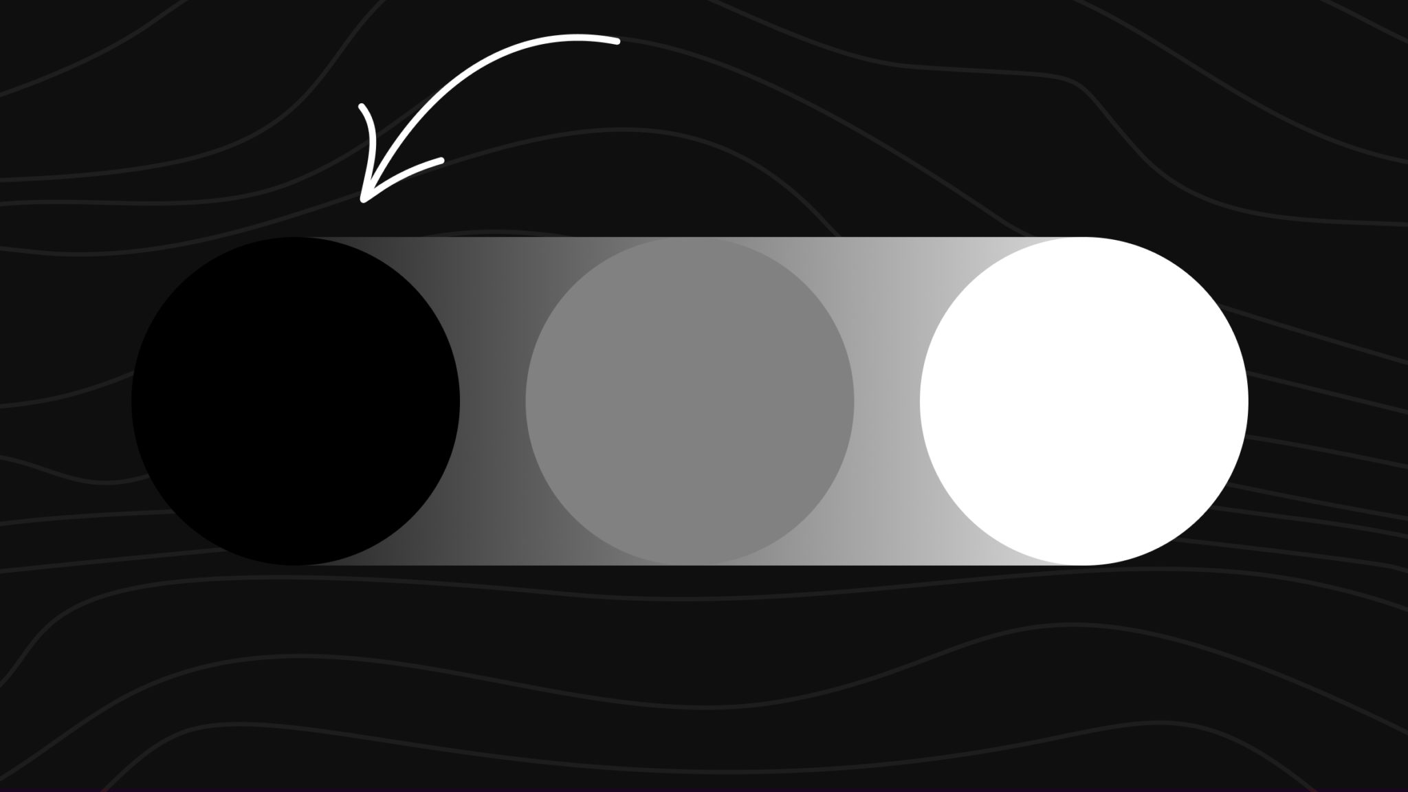
The Quick Recipe
If you only remember one mix: ultramarine blue + burnt umber, 1:1. That’s the workhorse near-black painters have leaned on for centuries. It reads as a true deep black, neutralizes cleanly, and shifts warm or cool with the smallest adjustment.
No paint at hand? On a digital screen, black is #000000 – RGB(0, 0, 0). In print, the K in CMYK adds true black ink because cyan + magenta + yellow alone produces a muddy near-black.
Want to test mixes without wasting paint? Use the ColorKit color mixer to dial in ratios and see the result before you touch a brush.
How to Make Black: The Universal Method
Every recipe in this guide comes from the same idea: mix complementary or near-complementary colors and they cancel each other out. Red and green, blue and orange, yellow and purple – opposites on the color wheel neutralize into dark, near-black grays.
The cleanest way to start is with the three primaries (red, blue, yellow) at roughly 1:1:1. Use the darkest, most saturated versions of each – cadmium red, ultramarine blue, cadmium yellow – and adjust by eye. If the mix leans purple, add yellow. If it leans green, add red. If it leans orange, add blue.
Below are the named blacks worth knowing, with the mix recipe and resulting hex code for each.
Universal Black (RYB Primaries) (#0A0A0A)

The simplest paint route to black: mix your three primary colors at roughly equal ratios. The result reads as a dark neutral – almost black, often with a faint warm or cool cast depending on which pigment dominates. Use the darkest, most saturated primaries you own; lighter tints will land on brown or gray instead.
Blue-Black (#06081C)

The classic painter’s near-black. Ultramarine blue and burnt umber are complements on the color wheel, so they neutralize each other into a deep, cool black with subtle blue undertones. This is the mix most artists reach for instead of a tube black.
Green-Black (#001308)

Phthalo green and alizarin crimson are near-complements, so combining them at 1:1 cancels both hues and lands on a dark, slightly cool black with a green whisper. Great for forests, deep shadows, and dark foliage that still needs life.
Cool Black (#002E63)

When you want black that recedes – distance, depth, night skies – push the mix cool. Ultramarine dominates, dioxazine purple deepens, phthalo green keeps it from going too violet. Cool blacks visually sink back from warm colors next to them.
Warm Black (#1F1E1C)

Warm blacks feel closer to the viewer. Burnt sienna carries the warmth, ultramarine pulls it toward neutral, alizarin adds depth. Use it in foregrounds, skin shadows, or anywhere a flat black would look dead.
Ebony (#080402)

Ebony reads as the deepest natural-wood black. Heavy on burnt umber for the brown undertone, with ultramarine and alizarin pulling the mix toward true black without losing its earthy character.
Charcoal (#28231D)

A soft, paper-friendly black that doesn’t punch holes through a layout. Sits closer to deep brown-gray than a pure black. Charcoal is the safe choice for body text and large surfaces where pure black feels harsh.
Phthalo Black (#0C1419)

Swap ultramarine for phthalo blue and you get a slightly cooler, more transparent black that glazes beautifully. Useful when you want black that still reads as a color, not as opaque pigment.
Warm Black vs Cool Black: Which to Use
Black isn’t one color, and the warm-cool distinction does most of the heavy lifting in real artwork.
Cool blacks lean blue, green, or purple. They visually recede – perfect for night skies, distant shadows, depth, and anywhere you want the black to sit back.
Warm blacks lean toward brown, red, or orange undertones. They feel closer to the viewer – useful in foregrounds, on faces, or for objects that should pop forward.
Inside a single piece, painters often mix both: cool blacks in the background, warm blacks in the foreground. The eye registers the temperature shift even if it can’t name it.
Black Mixing Cheat Sheet
Quick reference for the recipes above:
| Goal | Mix | Result |
|---|---|---|
| Simplest near-black | Ultramarine blue + burnt umber (1:1) | Deep, slightly cool |
| From scratch with primaries | Red + blue + yellow (1:1:1) | Neutral dark |
| Cool, atmospheric black | Ultramarine + dioxazine purple + phthalo green | Recedes, night-sky feel |
| Warm, advancing black | Burnt sienna + ultramarine + alizarin | Black with red undertone |
| Forest / shadow black | Phthalo green + alizarin crimson (1:1) | Green-tinged black |
| Soft black for text or layouts | Burnt umber + ultramarine + ivory black | Charcoal, easier on eyes |
| Glazing black | Phthalo blue + burnt umber | Transparent, cool |
Common Black and Near-Black Hex Codes
When you’re working on screen, you almost never want pure #000000 for body text or large surfaces. The contrast against white is harsher than it needs to be, and it makes most designs feel cheap. Use a softer near-black.
| Name | Hex Code | RGB | Use Case |
|---|---|---|---|
| Pure Black | #000000 | rgb(0, 0, 0) | Logos, icons, max-contrast accents |
| Eerie Black | #0A0A0A | rgb(10, 10, 10) | Better default than pure black |
| Rich Black | #111111 | rgb(17, 17, 17) | Body text on light backgrounds |
| Jet Black | #1C1C1C | rgb(28, 28, 28) | Dark mode backgrounds |
| Charcoal | #28231D | rgb(40, 35, 29) | Warm, paper-friendly body text |
| Ebony | #080402 | rgb(8, 4, 2) | Premium, leather-bound feel |
| Blue-Black | #06081C | rgb(6, 8, 28) | Tech, finance, editorial |
| Onyx | #353839 | rgb(53, 56, 57) | Soft contrast, neutral |
Black in Branding and the Real World
Black is the most loaded color in branding. It signals luxury, authority, modernity, rebellion, and minimalism all at once. A few worth studying:
Chanel built an entire luxury identity around black. The interlocking C logo, the little black dress, the packaging – black became shorthand for timeless. Coco Chanel reportedly said black “has it all.”
Apple uses black strategically. The “Space Black” finish on the Pro lineup signals the high-end tier. The keynote backdrops are deep near-black, never pure black, because pure black on stage absorbs detail and reads flat.
Schwarzkopf (which literally means “black head” in German) leans into the silhouette logo. The brand uses dense black across all packaging to anchor the hair-care category.
Vantablack is the famous “blackest black” pigment that absorbs about 99.965% of visible light. Artist Anish Kapoor controversially licensed exclusive artistic rights to it, which sparked a multi-year feud with the art world. Stuart Semple responded by creating “Black 3.0,” available to anyone except Kapoor.
Nike uses black to mean performance and seriousness – the Jordan brand, “blacked-out” sneaker drops, the Just Do It campaigns shot in stark black-and-white.
These brands don’t use the same black. Tech and luxury lean blue-black. Fashion houses lean warm, almost-brown blacks. Performance brands use the deepest near-true black they can print. The undertone is part of the brand voice.
Why Mix Your Own Black?
Tube black is convenient, but it’s also flat. Mass Tone black (mars, ivory, lamp) is one color across every painting you ever make. Mixed black changes with the subject.
A portrait wants a warm black under the skin. A seascape wants a cool black for distance. A still life wants a black that picks up the dominant colors in the rest of the piece. You can’t get that from a tube.
Mixed black also keeps a painting unified. When the same pigments that make up your shadows are also doing the heavy lifting in your blacks, every dark area harmonizes automatically.
Common Mistakes When Mixing Black
Using lighter primaries. A pastel red and a sky blue will never combine into black. They land on brown or gray. Use the darkest, most saturated tubes you have.
Adding white to “deepen” black. White lightens. Always. If your mix isn’t dark enough, add more of the existing pigments or introduce a darker complement, not white.
Mixing on the brush instead of the palette. You’ll under-mix and end up streaking two colors instead of blending them. Use a palette knife and combine fully before applying.
Stopping at the first dark color. If you stop when the mix looks dark, you’ll usually have a brown-black or a green-black, not a neutral one. Push the mix a little past where you think it’s done and test it on a white surface.
FAQs
What two colors make black?
The most common painter’s recipe is ultramarine blue + burnt umber at a 1:1 ratio. They’re near-complements, so they neutralize each other into a deep, cool near-black. Other two-color combos that work: phthalo green + alizarin crimson, phthalo blue + burnt sienna.
What three colors make black?
Mix the three primaries – red, blue, and yellow – at roughly 1:1:1. Use the most saturated, darkest versions you can find (cadmium red, ultramarine blue, cadmium yellow work well). Adjust by eye: if it leans purple add yellow, if it leans green add red, if it leans orange add blue.
Can you make black with cyan, magenta, and yellow?
Yes, but the result is usually a muddy near-black, not a true black. That’s why printers add a fourth ink, K (black), in CMYK. The K does the heavy lifting and the CMY layers add depth.
How do I make black on a screen?
Use hex code #000000 or rgb(0, 0, 0). For most design work though, a softer near-black like #0A0A0A or #111111 reads better than pure black on screen.
Why does my homemade black look brown?
Either your red is dominating or your yellow is too warm. Add a touch more blue or a tiny amount of green to neutralize the warm cast. Test on a white surface before judging – black on a palette can look very different from black on canvas.
What’s the deepest black possible?
The deepest physical black is Vantablack, which absorbs about 99.965% of visible light. It’s not commercially available to artists. The deepest painter-accessible blacks come from carbon-based pigments like Mars Black or Bone Black combined with the mix recipes in this guide.
Does adding white make a better black?
No. White always lightens and grays a mix. To deepen black, add more of the darker complement or introduce a small amount of a darker pigment. Save white for transitioning into grays.
Is black warmer or cooler than other colors?
Black itself is neutral, but the pigments you mix to create it carry temperature. Burnt umber + ultramarine leans cool. Burnt sienna + alizarin leans warm. You choose the temperature by choosing the ingredients.
What’s the hex code for true black?
#000000. That’s RGB(0, 0, 0) and CMYK(0, 0, 0, 100). For softer near-blacks on screen, try #0A0A0A, #111111, or #1C1C1C.
Wrapping Up
Pure black exists on screens but not really on canvas. Every painter’s black is a mixed near-black, and the undertone (warm, cool, green, blue) is what gives the work depth. Start with ultramarine + burnt umber, then experiment from there.
Try the recipes in this guide hands-on with the color mixer, or browse the guide to mixing gray and guide to mixing brown for the two colors most often confused with bad black.