
#2F449C Hex Color
Online color picker to view shades, tints, color codes, and complementary colors
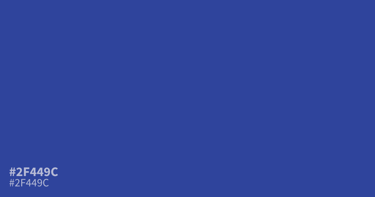
This dim, cool blue carries a heavy, serious weight, making it a reliable choice for finance or law enforcement interfaces. Because #2f449c offers an 8.6:1 contrast ratio against white text, it functions well as a bold background for readability. Pair it with soft creams or warm grays to balance its intensity, or use it to understand what colors make gray in a desaturated palette.
Questions about #2f449c
What is #2f449c in RGB, HSL and CMYK?
In RGB, #2f449c is rgb(47, 68, 156), in HSL hsl(228, 54%, 40%) and in CMYK 70%, 56%, 0%, 39%. Browse more shades of blue with names and hex codes.
When is #2f449c best used in UI design?
Use #2f449c for high-contrast accessibility in finance or law enforcement interfaces where clarity and authority are essential. Because it maintains an 8.6:1 contrast ratio against white text, it works exceptionally well as a bold background color or a primary brand identifier.
What colors balance the intensity of #2f449c?
Pair #2f449c with soft creams or warm grays to soften its heavy, serious presence and create a more approachable palette. These neutral tones counteract the cool intensity of the blue, preventing your design from appearing too dark or cold in professional settings.
Is #2f449c readable on white or black?
#2f449c has a 8.64:1 contrast ratio on white and 2.42:1 on black. WCAG asks for 4.5:1 for body text and 3:1 for large text, so on white it works for body text and on black it is too faint for text. Try other pairs in the contrast checker.