
#215779 Hex Color
Online color picker to view shades, tints, color codes, and complementary colors
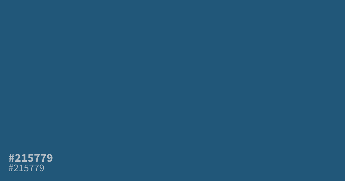
This dusty, desaturated blue feels serious and controlled, making it a reliable choice for professional tech or finance interfaces. Because it leans cool and shadowy, #215779 works best as a primary background color where white text provides excellent, high-contrast readability. If you want to soften this look, mixing gray can help adjust the saturation. Use this hex code sparingly to avoid a gloomy, closed-in feel.
Questions about #215779
What is #215779 in RGB, HSL and CMYK?
In RGB, #215779 is rgb(33, 87, 121), in HSL hsl(203, 57%, 30%) and in CMYK 73%, 28%, 0%, 53%. Browse more shades of blue with names and hex codes.
Where does #215779 work best in UI design?
#215779 serves as a grounded, professional background color that maintains high legibility for white or light-toned typography. It is particularly effective in finance or enterprise software dashboards where a restrained, serious, and controlled aesthetic is required over playful branding.
Which colors complement the dusty tone of #215779?
Is #215779 readable on white or black?
#215779 has a 7.76:1 contrast ratio on white and 2.70:1 on black. WCAG asks for 4.5:1 for body text and 3:1 for large text, so on white it works for body text and on black it is too faint for text. Try other pairs in the contrast checker.