
Pastel colors are typically pale colors with a light hue and low saturation. The name originates from the pastel art medium which is known for its neutral hue and low saturation using powder pigment with a binder. Most people would call pastel colors soothing with their soft tones they are very easy for the eyes to take in.
You can think of pastel colors as a pale version of any color, meaning the color mixed with white. You can use our color shade generator to find lighter shades of a color. This is useful for finding lighter shades of your brand colors for that pastel vibe.
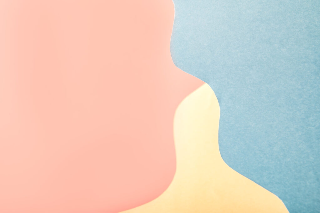
Pastel Color Palette Inspiration
ColorKit offers plenty of pastel color palettes to gather inspiration from. Our collection features curated pastel color palettes tailored for different design needs.
Here are some of our most popular pastel color palettes to use in your designs. Each palette includes hex codes for easy use in digital design.
Exploring different pastel color combinations can help designers find the perfect palette for their project.
Introduction to Pastel Colors
Pastel colors are soft, muted, and easy on the eyes. These gentle hues are made by adding white to a base color, which tones down the intensity and creates a lighter, more calming version of the original shade.
Because of their soothing feel, pastels are popular across many design fields. In interior design, they help create peaceful, relaxing spaces. On websites and apps, pastel tones can make user experiences feel light and welcoming. In fashion, pastels bring a modern, elegant vibe without being too bold.
Whether you’re designing a cozy bedroom, a minimal brand, or a playful landing page, pastel colors are a flexible choice. They help create calm, style, and warmth—without overwhelming the viewer.
Understanding Pastel Shades
Pastel shades come from mixing a color with white. The more white you add, the lighter and softer the result. Add just a little, and you’ll get a brighter pastel with a touch more saturation.
This makes pastels great for building balanced color palettes. You can go for a monochromatic look—like several shades of pastel pink—or mix different pastel tones for variety. Try combining pale blue, mint green, and lavender for a soft, playful style that still feels cohesive.
Because pastels are so versatile, they can work in nearly any setting. Whether you’re going for a calm mood or just want to tone things down, pastel shades give you lots of creative options.
How to Use Pastel Colors in Design
Pastel colors are super versatile and can work in all sorts of designs. Their soft, calming vibes make them great for specific uses. Here are some cool ways to use pastel colors in your designs:
- Make Things Feel Chill: Pastel colors are perfect for creating a relaxed mood. Use them in bedrooms, baby rooms, or wellness apps to make everything feel calm and peaceful.
- Add Interest Without Going Overboard: Want to make your design pop without being too much? Try using pastel colors for backgrounds or small details. They’ll add depth without stealing the show.
- Balance Out Bold Colors: Pair pastel shades with brighter, bolder colors to create eye-catching designs. For example, a light pastel blue looks awesome next to a deep navy.
- Bring Back Old-School Vibes: Pastel colors often remind people of the past. Use them in designs for things like ice cream shops or kids’ toys to create a fun, nostalgic feel.
- Make Text Easier to Read: Light pastel backgrounds can make words stand out more, especially for longer bits of text. Just make sure there’s enough difference between the text color and background color.
- Get Seasonal: People often think of spring and Easter when they see pastel colors. Use them in designs for these seasons to capture that fresh, new feeling.
Remember, while pastel colors are usually easy on the eyes, using too many can make your design look washed out. Try mixing pastels with darker or brighter colors to keep things interesting.
Creating a Pastel Color Palette
Building a pastel palette gives you endless creative options. The key is finding colors that work well together without overwhelming the design.
Start by picking two or three pastel shades that share a similar mood. Analogous pastel colors—like soft pink, peach, and lavender—sit next to each other on the color wheel. These combinations feel natural and soothing.
If you want more contrast, try complementary pastel colors. For example, pairing pastel blue with a soft peach creates visual interest while keeping things light. You can also experiment with a triadic palette. A mix like pastel pink, blue, and yellow offers more variety while staying balanced.
A simple trick to keep your palette looking clean is the 60-30-10 rule. Use one color as the main shade (60%), another as a secondary (30%), and a third as a small accent (10%). This structure helps your design stay balanced without feeling flat or cluttered.
Tips for Working with Pastel Colors
Pastel colors are soft by nature, so it’s easy to go overboard. To keep your design sharp, use them with intention.
First, don’t use too many pastels at once. Stick to a small group of shades and add contrast with neutrals like white, beige, or gray. This helps the pastels stand out without looking washed out.
Pastels also work well for creating focus. Try a pastel pink button on a muted background or a soft blue headline to guide the viewer’s eye. These subtle pops can make your design more engaging without being loud.
Finally, remember that pastel colors carry emotional weight. Pastel pink can feel warm and nurturing. Light blue often signals calm and trust. By thinking about how these colors make people feel, you can create designs that look good and feel even better.
Color Psychology of Pastels
Pastel colors aren’t just easy on the eyes—they can also influence how people feel. Their low saturation and light tones make them great for creating certain moods and emotional responses in design.
1. Calming and Romantic Vibes
Pastels often evoke a sense of peace and softness. Their gentle appearance can help create a romantic or dreamy atmosphere, which is why they’re often used in weddings, spa branding, or relaxation apps. Lavender, in particular, is known for its calming effect and is commonly associated with rest and tranquility.
2. Childhood and Baby Associations
Pale shades like pastel blue, pink, and yellow are closely linked to baby products and nursery decor. These colors feel safe, innocent, and comforting—making them a go-to choice for anything related to parenting, early childhood, or gentle care.
3. Emotional Softness
Unlike bold or neon colors that can feel intense or aggressive, pastels feel open and approachable. They help lower visual tension, which makes them useful in mental health apps, wellness products, or brands aiming for a friendly, welcoming tone.
Whether you’re trying to make something feel peaceful, nostalgic, or nurturing, pastels are a smart and subtle way to connect with your audience emotionally.
Final Thoughts
Pastel colors are more than just soft and pretty. They are useful tools for creating calm, friendly, and nostalgic designs. Their gentle appearance makes them perfect for everything from branding to seasonal graphics.
If you want your design to feel light and approachable, pastel colors are a smart choice. Just be sure to mix in some contrast so the overall look stays clear and easy to read.
Looking for more pastel design inspiration? I’d recommend checking out dribbble.
🙌🙌🙌
Hopefully it was helpful!