
Pale Pearl
A luminous beige with soft grey undertones
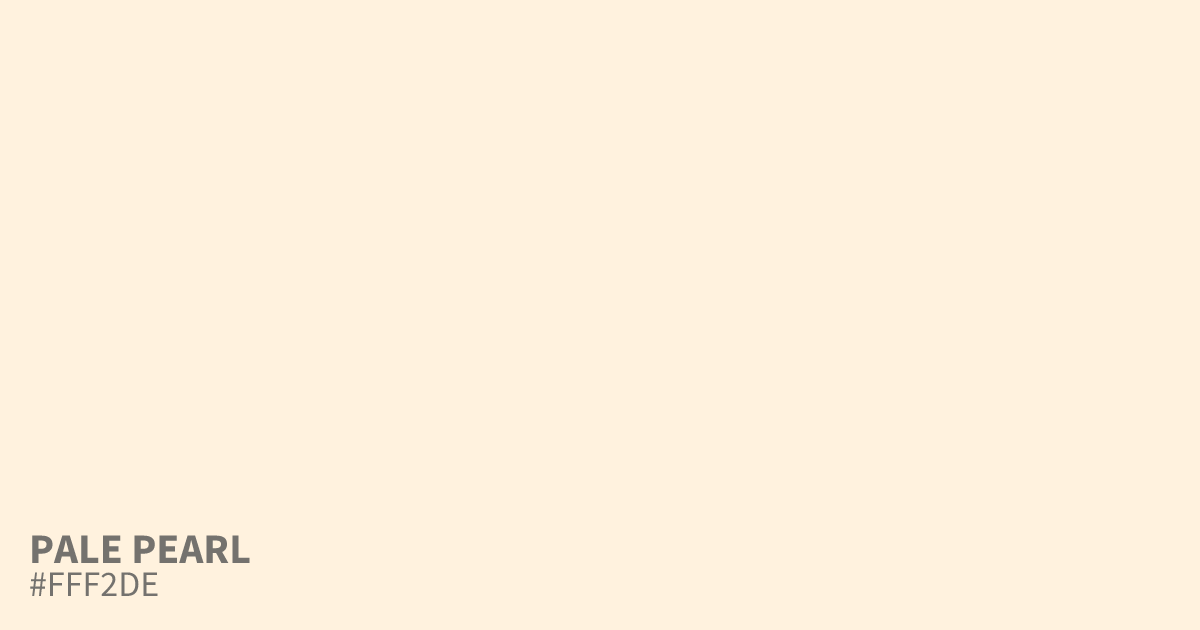
Pale Pearl is a luminous, desaturated orange that leans heavily into beige territory with a subtle grey cast. As a light, neutral base, #fff2de offers an elegant alternative to stark white, providing high contrast for black text. It shines in minimalist UI design or luxury packaging, especially when paired with deep charcoal or forest green to ground its airy, warm aesthetic.
Questions about Pale Pearl
What is the hex code for Pale Pearl?
Pale Pearl is #fff2de. In RGB that is rgb(255, 242, 222), in HSL hsl(36, 100%, 94%) and in CMYK 0%, 5%, 13%, 0%. Browse more shades of brown with names and hex codes.
How should Pale Pearl #fff2de be used in UI design?
Pale Pearl #fff2de works best as a background color that keeps content legible while providing more warmth than standard white. It creates a soft, luxury feel when paired with deep charcoal text or dark gray UI elements.
What colors pair well with Pale Pearl #fff2de?
This shade acts as a versatile neutral that shines when grounded by darker, cooler tones like forest green or deep navy. It balances these heavier colors by lightening the overall palette while maintaining a clean, professional aesthetic.
Is Pale Pearl readable on white or black?
Pale Pearl has a 1.10:1 contrast ratio on white and 19.00:1 on black. WCAG asks for 4.5:1 for body text and 3:1 for large text, so on white it is too faint for text and on black it works for body text. Try other pairs in the contrast checker.