
#FFCAFF Hex Color
Airy, delicate violet for modern designs
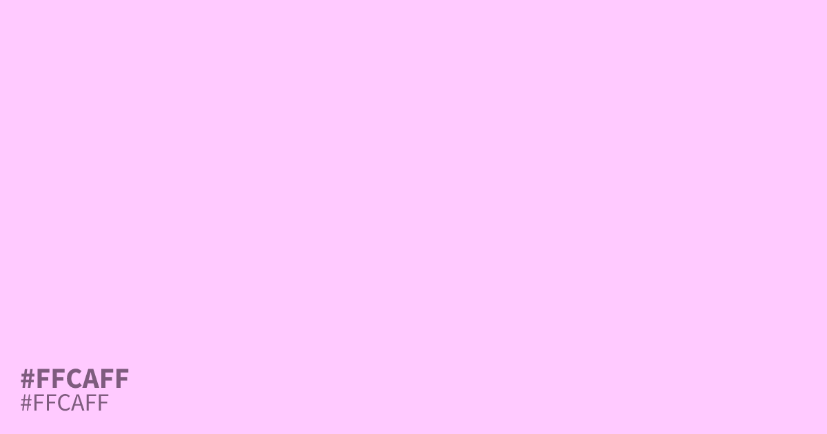
#ffcaff is a pale, unsaturated violet that feels delicate and airy. Because it is so light, it functions best as a spacious background rather than a focal point. Use it sparingly with dark charcoal text to ensure maximum readability. This cool, sparkling shade pairs unexpectedly well with deep forest greens or muted slate, adding a modern, refreshing touch to spring-themed palettes.
Questions about #ffcaff
What is #ffcaff in RGB, HSL and CMYK?
In RGB, #ffcaff is rgb(255, 202, 255), in HSL hsl(300, 100%, 90%) and in CMYK 0%, 21%, 0%, 0%. Browse more shades of purple with names and hex codes.
How can I use #ffcaff effectively in web design?
Use #ffcaff as a light, spacious background to create an airy aesthetic. Because the color is extremely pale, it lacks the contrast needed for text; always pair it with dark charcoal or deep navy to ensure your content remains readable.
What color combinations work best with #ffcaff?
Pair #ffcaff with earthy tones like forest green or slate to ground the ethereal violet. These deeper, muted colors provide the necessary visual weight to prevent the palette from feeling too washed out or overly feminine.
Is #ffcaff readable on white or black?
#ffcaff has a 1.38:1 contrast ratio on white and 15.14:1 on black. WCAG asks for 4.5:1 for body text and 3:1 for large text, so on white it is too faint for text and on black it works for body text. Try other pairs in the contrast checker.