
#FFB281 Hex Color
Online color picker to view shades, tints, color codes, and complementary colors
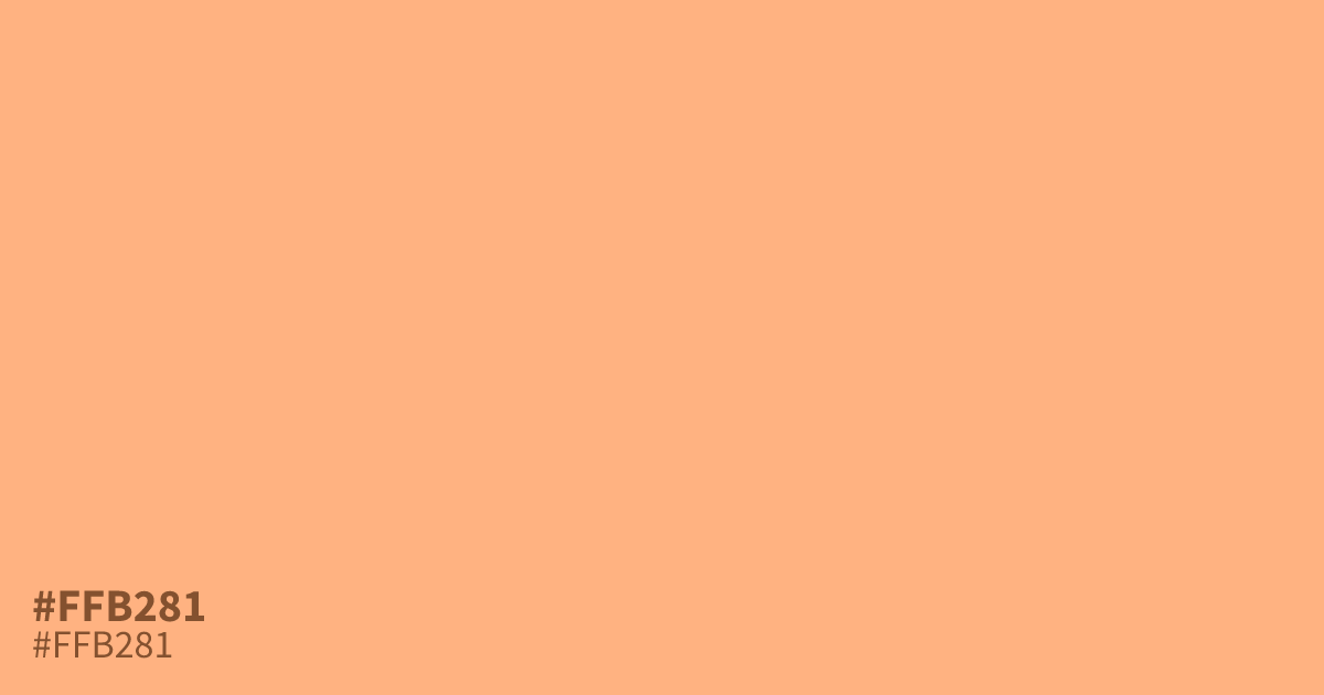
This pastel orange feels youthful and bright, offering a cheerful alternative to harsh tones. Because it is highly saturated but light, #ffb281 works well as a supporting accent in playful branding or seasonal marketing. It pairs surprisingly well with deep forest greens, which ground its sunny nature. While black text remains readable, use this color sparingly to avoid overwhelming your design layout.
Questions about #ffb281
What is #ffb281 in RGB, HSL and CMYK?
In RGB, #ffb281 is rgb(255, 178, 129), in HSL hsl(23, 100%, 75%) and in CMYK 0%, 30%, 49%, 0%. Browse more shades of orange with names and hex codes.
What colors work best with #ffb281 in a design?
#ffb281 pairs best with deep, grounded colors that balance its high energy. Using a dark forest green or a rich navy blue creates a sophisticated contrast that prevents the palette from feeling too overwhelming for the viewer.
Is #ffb281 suitable for text on a white background?
Using #ffb281 for text on a white background is not recommended for accessibility. Because the color is quite light and saturated, it fails most readability standards. Reserve this color for graphic accents, icons, or large headings instead.
Is #ffb281 readable on white or black?
#ffb281 has a 1.75:1 contrast ratio on white and 11.93:1 on black. WCAG asks for 4.5:1 for body text and 3:1 for large text, so on white it is too faint for text and on black it works for body text. Try other pairs in the contrast checker.