
#FF746C Hex Color
Online color picker to view shades, tints, color codes, and complementary colors
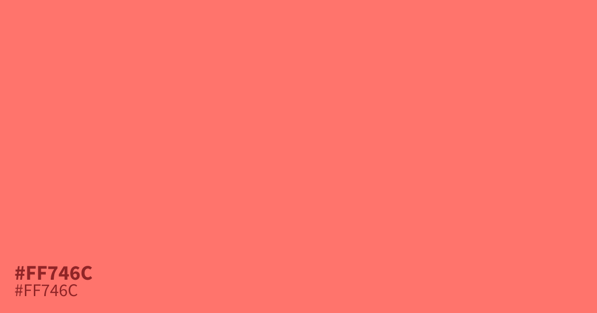
This intense, coral-leaning red brings immediate energy to any interface. Because #ff746c is so saturated and high-impact, it functions best as an accent color for calls to action or alert highlights rather than a background. Pair it with deep charcoal or slate greys to ground its brightness. The hex code #ff746c offers excellent contrast with black text, making it highly readable for UI elements.
Questions about #ff746c
What is #ff746c in RGB, HSL and CMYK?
In RGB, #ff746c is rgb(255, 116, 108), in HSL hsl(3, 100%, 71%) and in CMYK 0%, 55%, 58%, 0%. Browse more shades of pink with names and hex codes.
What colors pair well with #ff746c?
Should #ff746c be used for large backgrounds?
Using #ff746c for large backgrounds is generally discouraged because its high saturation can quickly overwhelm the viewer's eyes. It performs significantly better as a targeted accent color for buttons, notification badges, or important links where you need immediate visual contrast.
Is #ff746c readable on white or black?
#ff746c has a 2.63:1 contrast ratio on white and 7.96:1 on black. WCAG asks for 4.5:1 for body text and 3:1 for large text, so on white it is too faint for text and on black it works for body text. Try other pairs in the contrast checker.