
#F9C9C2 Hex Color
A warm and approachable pastel peach
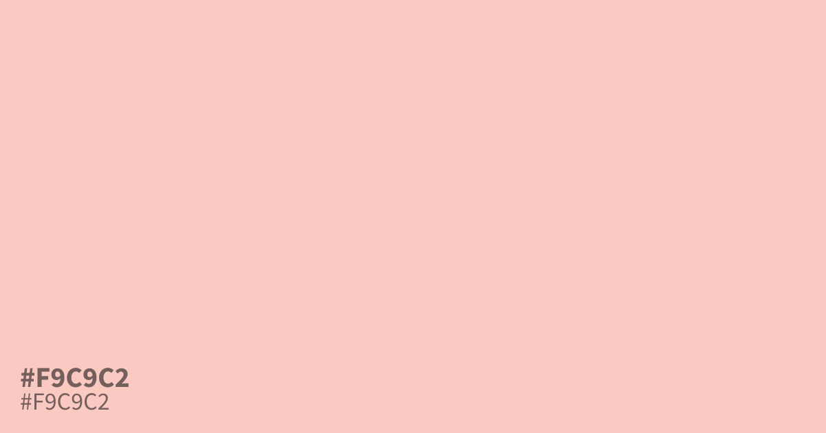
This pastel red is a warm, desaturated peach tone that reads as soft and approachable. Because of its light chroma, #f9c9c2 works effectively as a subtle background color that avoids the harshness of plain white. It pairs well with slate gray or charcoal text to maintain high readability. Designers should use this hex code for branding projects needing a gentle, inviting touch rather than bold energy.
Questions about #f9c9c2
What is #f9c9c2 in RGB, HSL and CMYK?
In RGB, #f9c9c2 is rgb(249, 201, 194), in HSL hsl(8, 82%, 87%) and in CMYK 0%, 19%, 22%, 2%. Browse more shades of pink with names and hex codes.
What design styles suit #f9c9c2?
This pastel peach creates a welcoming atmosphere, making it ideal for wellness brands, baby products, or modern lifestyle blogs. Use it to soften hard UI elements without losing the clarity required for text, especially when paired with charcoal or dark gray accents.
How does #f9c9c2 behave on digital screens?
Because it is a desaturated, light-chroma red, #f9c9c2 remains gentle on the eyes during prolonged viewing. It provides enough warmth to feel inviting while maintaining a neutral enough presence to avoid overwhelming the primary content or user interface components.
Is #f9c9c2 readable on white or black?
#f9c9c2 has a 1.48:1 contrast ratio on white and 14.16:1 on black. WCAG asks for 4.5:1 for body text and 3:1 for large text, so on white it is too faint for text and on black it works for body text. Try other pairs in the contrast checker.