
#F8D7DA Hex Color
Online color picker to view shades, tints, color codes, and complementary colors
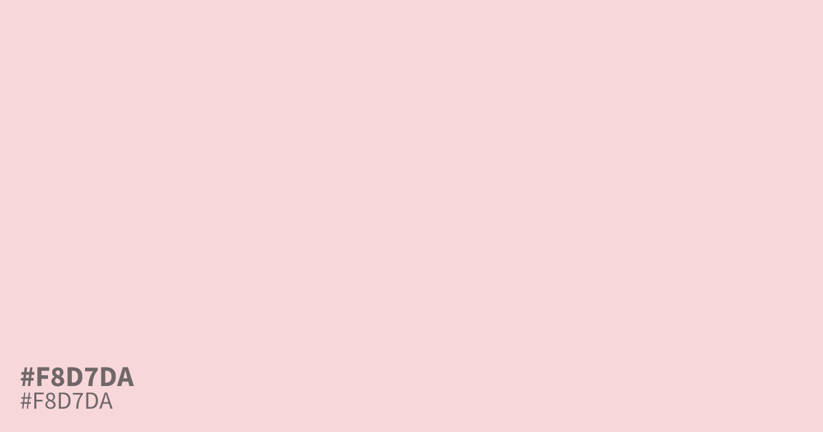
This pale, desaturated pink acts as a gentle, accessible background tone. Because black text maintains high readability against #f8d7da, it functions well for error messages or soft UI alerts where standard red feels too aggressive. Pair this hex code with dark charcoals to soften the visual intensity of an interface. Avoid using it as a primary brand color, as it lacks the saturated impact needed for strong calls to action.
Questions about #f8d7da
What is #f8d7da in RGB, HSL and CMYK?
In RGB, #f8d7da is rgb(248, 215, 218), in HSL hsl(355, 70%, 91%) and in CMYK 0%, 13%, 12%, 3%. Browse more shades of pink with names and hex codes.
Why is #f8d7da useful for interface alerts?
Because #f8d7da is desaturated and pale, it offers a softer alternative to aggressive standard reds while maintaining necessary readability for black text. It creates a calming visual feedback loop, preventing interface notifications from feeling too jarring or overwhelming for the user.
What colors pair well with #f8d7da?
Pair #f8d7da with dark charcoal or deep neutral grays to ground the composition and reduce visual intensity. Because the color itself is very light, high-contrast dark text ensures accessibility and legibility, preventing the design from looking washed out or indistinct.
Is #f8d7da readable on white or black?
#f8d7da has a 1.33:1 contrast ratio on white and 15.72:1 on black. WCAG asks for 4.5:1 for body text and 3:1 for large text, so on white it is too faint for text and on black it works for body text. Try other pairs in the contrast checker.