
#F7BA85 Hex Color
Online color picker to view shades, tints, color codes, and complementary colors
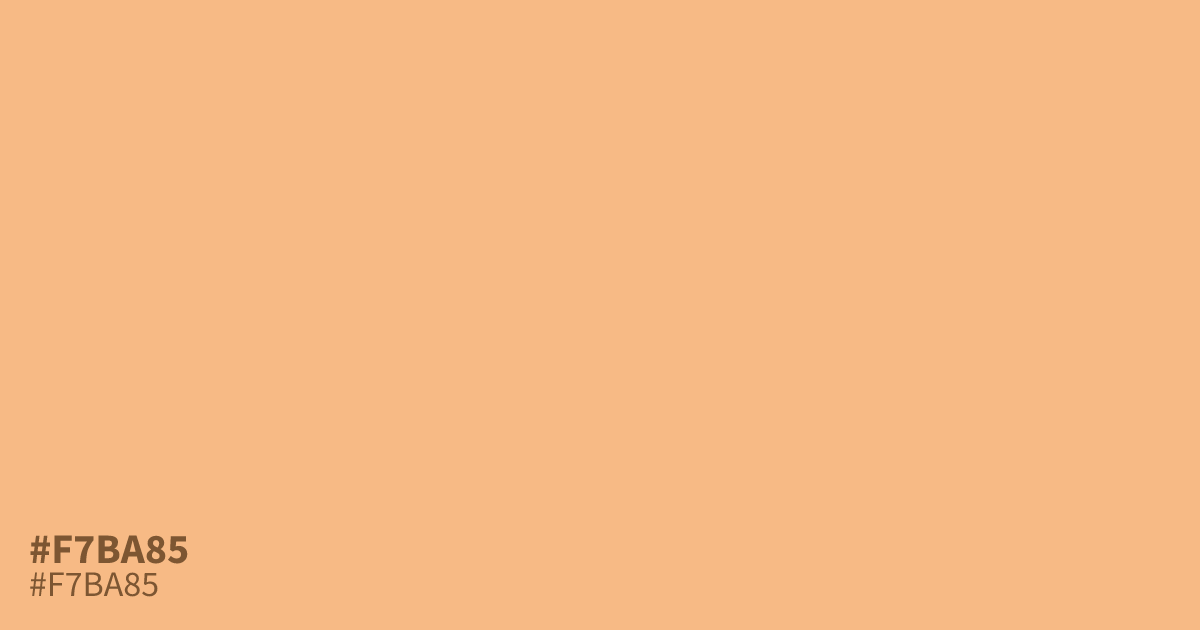
Reach for #f7ba85 when a design needs warmth without loudness. This pastel orange is light and unsaturated, with a soft peachy glow that suits spring themes, baby products, and food packaging. Its high lightness keeps things mellow, but it can wash out against white, so treat it as a supporting tone or background with dark text, which reads at about 12.3:1 contrast. Pair it with deep navy or olive for balance.
Questions about #f7ba85
What is #f7ba85 in RGB, HSL and CMYK?
In RGB, #f7ba85 is rgb(247, 186, 133), in HSL hsl(28, 88%, 75%) and in CMYK 0%, 25%, 46%, 3%. Browse more shades of orange with names and hex codes.
What colors pair well with #f7ba85?
#f7ba85 pairs well with deep navy for a grounded, warm-cool contrast, and with olive or terracotta for an earthy fall palette. Its low saturation lets darker, richer colors carry the design.
What mood does #f7ba85 convey?
#f7ba85 reads gentle, youthful, and optimistic. Its lightness and muted saturation keep it mellow rather than energetic, which fits baby products, spring campaigns, and friendly brand work.
Is #f7ba85 readable on white or black?
#f7ba85 has a 1.70:1 contrast ratio on white and 12.31:1 on black. WCAG asks for 4.5:1 for body text and 3:1 for large text, so on white it is too faint for text and on black it works for body text. Try other pairs in the contrast checker.