
#F7A360 Hex Color
Online color picker to view shades, tints, color codes, and complementary colors
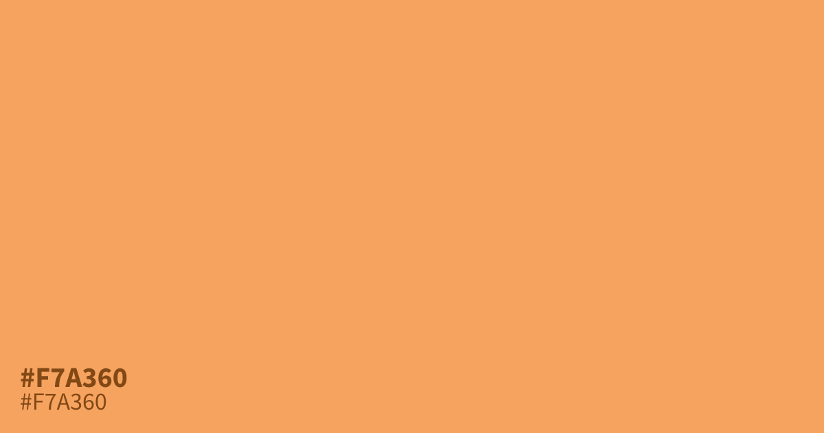
This pastel orange is bright, cheerful, and carries a strong glow. It works best as a vibrant accent color rather than a large background, which can quickly feel overwhelming. Pair #f7a360 with deep teal or slate gray to ground its intensity. Because this hex code offers excellent contrast, black text remains highly readable over it, making it a functional choice for modern UI details.
Questions about #f7a360
What is #f7a360 in RGB, HSL and CMYK?
In RGB, #f7a360 is rgb(247, 163, 96), in HSL hsl(27, 90%, 67%) and in CMYK 0%, 34%, 61%, 3%. Browse more shades of orange with names and hex codes.
What colors pair best with #f7a360?
Is #f7a360 suitable for web text?
While #f7a360 is excellent for buttons, icons, or decorative accents, it is generally too light for body text. You should use black or very dark gray text over this color to ensure your interface meets readability and accessibility standards.
Is #f7a360 readable on white or black?
#f7a360 has a 2.02:1 contrast ratio on white and 10.36:1 on black. WCAG asks for 4.5:1 for body text and 3:1 for large text, so on white it is too faint for text and on black it works for body text. Try other pairs in the contrast checker.