
#F5B0B0 Hex Color
Online color picker to view shades, tints, color codes, and complementary colors
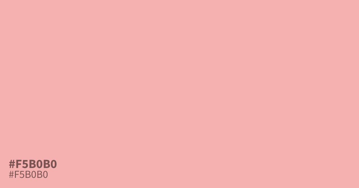
This pastel red acts as a warm, unsaturated neutral that brings immediate softness to a UI. Because #f5b0b0 offers high contrast against black text, it functions effectively as a large background area or a gentle interface card. Try pairing it with deep charcoal or slate blue to ground its inherent sweetness. It is a solid choice for baby products or health-focused branding needing a approachable, mellow energy.
Questions about #f5b0b0
What is #f5b0b0 in RGB, HSL and CMYK?
In RGB, #f5b0b0 is rgb(245, 176, 176), in HSL hsl(0, 78%, 83%) and in CMYK 0%, 28%, 28%, 4%. Browse more shades of pink with names and hex codes.
Which colors pair best with #f5b0b0?
Use deep charcoal or cool slate blue to ground the sweetness of #f5b0b0 effectively. These dark, high-contrast pairings prevent the color from feeling washed out while maintaining a sophisticated, modern aesthetic in your interface designs.
Is #f5b0b0 suitable for text-heavy layouts?
While #f5b0b0 works well as a background or accent, it is too light for main body text. Always pair it with a dark, high-contrast shade like charcoal to ensure your design remains accessible and readable for all users.
Is #f5b0b0 readable on white or black?
#f5b0b0 has a 1.79:1 contrast ratio on white and 11.71:1 on black. WCAG asks for 4.5:1 for body text and 3:1 for large text, so on white it is too faint for text and on black it works for body text. Try other pairs in the contrast checker.