
#F33E66 Hex Color
Online color picker to view shades, tints, color codes, and complementary colors
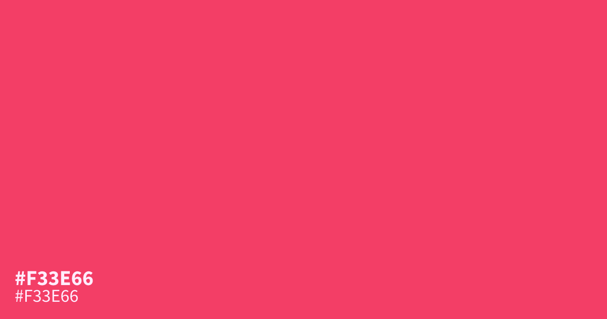
#f33e66 is a bold, saturated red with a warm pink undertone — the kind of color that demands attention before a single word of copy does. It reads as confident and energetic, which makes it a natural fit for calls to action, sale badges, and buttons that need to stand out in a crowded layout. One practical warning: paired against white, this shade sits in a tricky contrast zone, so always check your text combinations. Black or very dark text passes comfortably on top of it, while white text fails WCAG contrast requirements. Use #f33e66 as a statement color for accents, banners, and highlights rather than as a background for long-form reading, and it will reward you with instant visual punch.
Questions about #f33e66
What is #f33e66 in RGB, HSL and CMYK?
In RGB, #f33e66 is rgb(243, 62, 102), in HSL hsl(347, 88%, 60%) and in CMYK 0%, 74%, 58%, 5%. Browse more shades of red with names and hex codes.
What colors pair well with #f33e66?
#f33e66 pairs beautifully with deep navy, charcoal, and warm cream. The contrast between its heat and a cool, dark neutral keeps layouts balanced — try it with #1b1b3a for text and backgrounds, or soft cream #f5e6c8 for breathing room.
Can I use white text on a #f33e66 background?
Not recommended. White text on #f33e66 has a contrast ratio of roughly 2.1:1, which fails WCAG AA requirements. Use black or very dark text instead, or reserve #f33e66 for graphic elements and place text on a separate light surface.
Is #f33e66 a good color for buttons?
Yes — its saturation and warmth make it excellent for primary buttons and calls to action. Just make sure the label text has enough contrast against it, and avoid placing light gray or white text directly on top.
Is #f33e66 readable on white or black?
#f33e66 has a 3.68:1 contrast ratio on white and 5.69:1 on black. WCAG asks for 4.5:1 for body text and 3:1 for large text, so on white it works only for large text (24px, or 18.5px bold) and on black it works for body text. Try other pairs in the contrast checker.