
#F19586 Hex Color
Online color picker to view shades, tints, color codes, and complementary colors
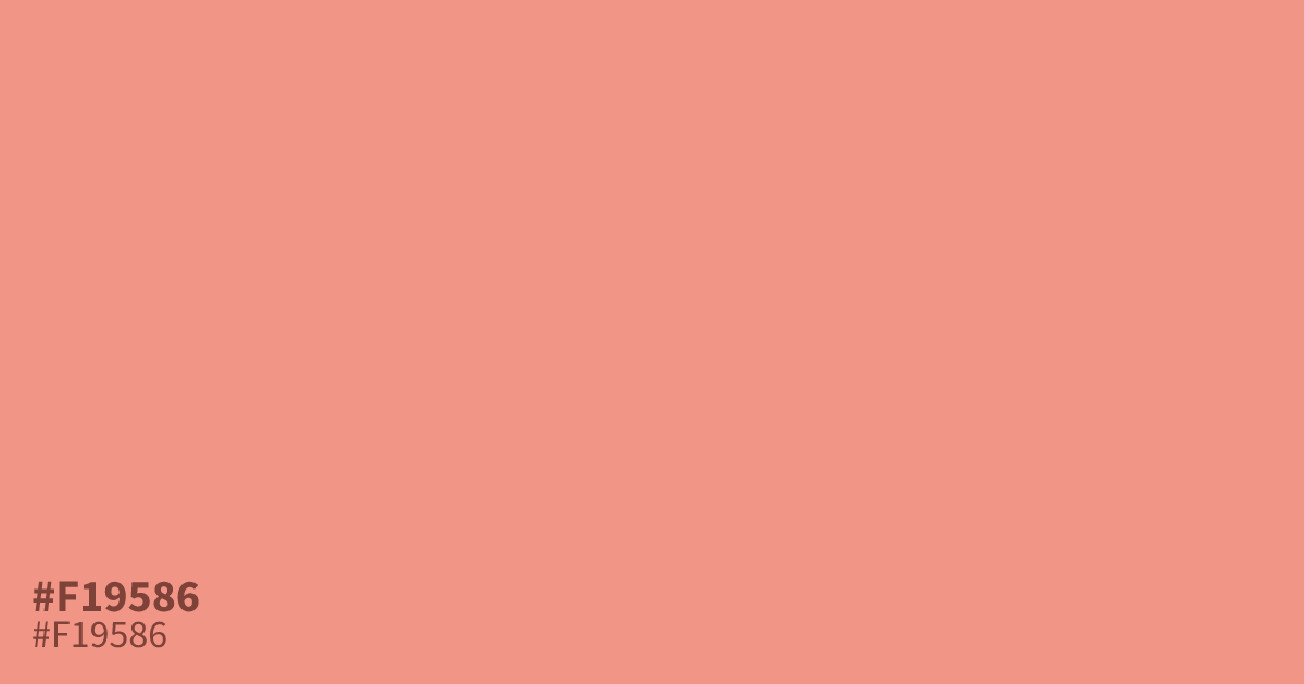
This pastel reddish hue is warm and approachable with a playful, energetic finish. Because it is highly readable against black text, #f19586 works well as a supporting background tone for UI layouts. It pairs best with cool, deep grays or slate blues to balance its high saturation. Use it sparingly as an accent to add life to otherwise neutral brand palettes.
Questions about #f19586
What is #f19586 in RGB, HSL and CMYK?
In RGB, #f19586 is rgb(241, 149, 134), in HSL hsl(8, 79%, 74%) and in CMYK 0%, 38%, 44%, 5%. Browse more shades of pink with names and hex codes.
What colors pair well with #f19586?
#f19586 is a high-energy coral that balances beautifully against cool, deep neutrals like slate blue or charcoal gray. Using these darker, cooler tones helps ground the vibrancy of the color without overwhelming your design's overall readability.
Is #f19586 suitable for text in UI design?
While #f19586 is excellent as a soft background or accent color, it lacks sufficient contrast for use with standard text against light backgrounds. Keep it for decorative elements, buttons, or illustrations rather than body copy to ensure your interface remains accessible.
Is #f19586 readable on white or black?
#f19586 has a 2.23:1 contrast ratio on white and 9.38:1 on black. WCAG asks for 4.5:1 for body text and 3:1 for large text, so on white it is too faint for text and on black it works for body text. Try other pairs in the contrast checker.