
#EBAB42 Hex Color
Online color picker to view shades, tints, color codes, and complementary colors
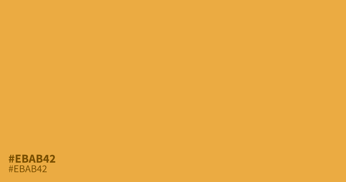
#ebab42 is a warm, medium-light orange with golden undertones and enough saturation to feel fresh without looking harsh. Its glowing character suggests optimism, independence, and creative energy, making it useful for food branding, sports graphics, autumn campaigns, and safety accents. The hex code #ebab42 also supports clear black text, making it practical for readable labels and interface elements.
Questions about #ebab42
What is #ebab42 in RGB, HSL and CMYK?
In RGB, #ebab42 is rgb(235, 171, 66), in HSL hsl(37, 81%, 59%) and in CMYK 0%, 27%, 72%, 8%. Browse more shades of orange with names and hex codes.
What colors pair well with #ebab42 in a palette?
Is #ebab42 a warm or cool color?
#ebab42 reads as a warm orange because its hue leans toward yellow, while its medium-light value and moderate saturation keep it lively, approachable, and less heavy than deeper orange shades. That golden undertone adds an optimistic, energetic feel.
Does #ebab42 work with black or white text?
#ebab42 provides strong contrast with black text, while white text has low contrast and may fail WCAG requirements for normal-sized text in interfaces, labels, and other content-heavy design where readability matters most. Use a contrast checker to confirm final choices.
Where does #ebab42 work well in design?
#ebab42 works well for food branding, sports graphics, autumn campaigns, warm calls to action, and safety accents because its golden orange tone feels energetic, visible, and optimistic without the harshness of neon orange.
Is #ebab42 readable on white or black?
#ebab42 has a 2.01:1 contrast ratio on white and 10.43:1 on black. WCAG asks for 4.5:1 for body text and 3:1 for large text, so on white it is too faint for text and on black it works for body text. Try other pairs in the contrast checker.