
#E39E83 Hex Color
Online color picker to view shades, tints, color codes, and complementary colors
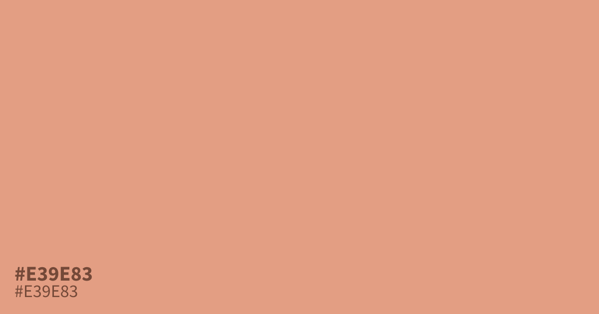
This unsaturated pastel orange feels gentle and optimistic. With its warm, mellow undertones, #e39e83 works best as a supporting background color for spring themes or baby products. While it is readable with black text, avoid using it for fine details where it might lose definition. Pair it with deep charcoal or slate gray to ground its airy, approachable quality.
Questions about #e39e83
What is #e39e83 in RGB, HSL and CMYK?
In RGB, #e39e83 is rgb(227, 158, 131), in HSL hsl(17, 63%, 70%) and in CMYK 0%, 30%, 42%, 11%. Browse more shades of orange with names and hex codes.
Which colors pair best with #e39e83 for a balanced palette?
Use deep, neutral tones like charcoal or slate gray to ground the airy quality of #e39e83. Because this is a pastel orange, it benefits from high-contrast darks to prevent the design from looking washed out or overly whimsical.
Is #e39e83 readable on white or black?
#e39e83 has a 2.21:1 contrast ratio on white and 9.48:1 on black. WCAG asks for 4.5:1 for body text and 3:1 for large text, so on white it is too faint for text and on black it works for body text. Try other pairs in the contrast checker.