
#E385AF Hex Color
Online color picker to view shades, tints, color codes, and complementary colors
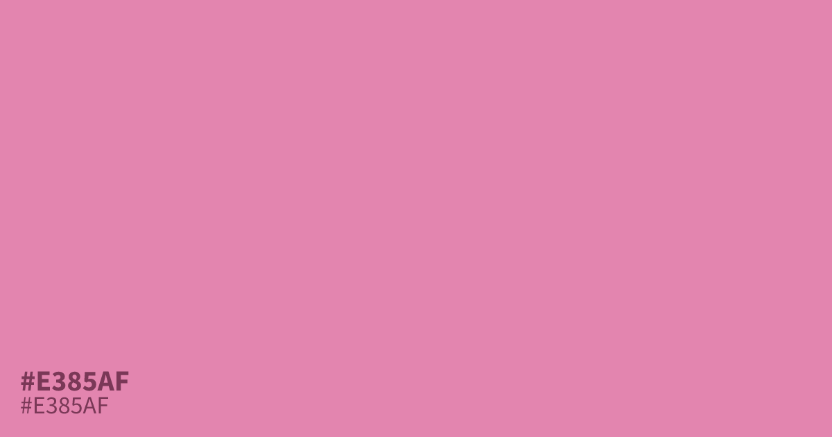
#e385af is a warm pastel pink with enough depth to avoid washing out next to white. Its moderate saturation keeps it mellow, which suits spring themes, cosmetics, and confectionery branding. Black text reads clearly on top at roughly 8.2:1 contrast, so it clears WCAG AA even for small body text. For a less obvious palette, pair it with deep teal or muted plum.
Questions about #e385af
What is #e385af in RGB, HSL and CMYK?
In RGB, #e385af is rgb(227, 133, 175), in HSL hsl(333, 63%, 71%) and in CMYK 0%, 41%, 23%, 11%. Browse more shades of pink with names and hex codes.
What text color reads best on #e385af?
Black text reads most clearly on #e385af, with about 8.2:1 contrast. That clears WCAG AA for small body text, making it a dependable background for readable layouts.
What colors pair well with #e385af?
Deep teal and muted plum make #e385af feel richer than pairing it with plain white. Use it as the dominant tone and keep dark accents to about ten percent.
Is #e385af readable on white or black?
#e385af has a 2.54:1 contrast ratio on white and 8.24:1 on black. WCAG asks for 4.5:1 for body text and 3:1 for large text, so on white it is too faint for text and on black it works for body text. Try other pairs in the contrast checker.