
#E2B7B6 Hex Color
Online color picker to view shades, tints, color codes, and complementary colors
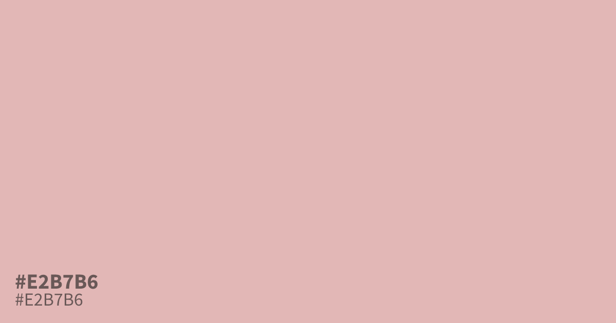
#e2b7b6 is a light, dusty red with low saturation and soft gray undertones. Its delicate, ashy finish suits spring layouts, baby products, romance branding, and spacious backgrounds. Use it as a supporting tone beside charcoal or deep plum, since white can wash it out. The hex code for this color is #e2b7b6, with strong contrast for black text.
Questions about #e2b7b6
What is #e2b7b6 in RGB, HSL and CMYK?
In RGB, #e2b7b6 is rgb(226, 183, 182), in HSL hsl(1, 43%, 80%) and in CMYK 0%, 19%, 19%, 11%. Browse more shades of pink with names and hex codes.
What colors pair well with #e2b7b6?
The hex color #e2b7b6 pairs well with charcoal or deep plum, which add definition to its pale, dusty red base while respecting its soft gray undertones and keeping the palette suitable for gentle, romantic layouts. White can wash it out, so use it as a spacious accent rather than the only supporting tone.
Does #e2b7b6 read as warm or cool?
#e2b7b6 reads as softly warm, since its red base adds gentle warmth while low saturation and gray undertones keep the impression muted, balanced, and distinctly less vivid than a bright red. It suits tender, calm, and understated visual themes.
Does #e2b7b6 work well with black or white text?
Black text provides strong contrast on #e2b7b6, making it a practical choice for readable labels and body copy; white text has weaker contrast and may disappear into this light, dusty red. Check the final font size and weight with a contrast tool before publishing.
Is #e2b7b6 readable on white or black?
#e2b7b6 has a 1.79:1 contrast ratio on white and 11.68:1 on black. WCAG asks for 4.5:1 for body text and 3:1 for large text, so on white it is too faint for text and on black it works for body text. Try other pairs in the contrast checker.