
#DFDDF1 Hex Color
Online color picker to view shades, tints, color codes, and complementary colors
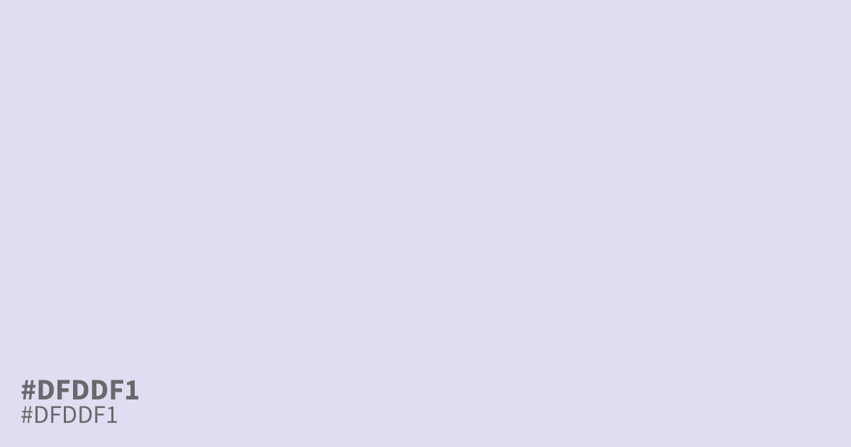
This pale, desaturated violet carries a quiet, ethereal quality. Because #dfddf1 is so light, it works best as a soft background or a supporting neutral rather than a main focal point. It pairs cleanly with charcoal grey text, maintaining excellent contrast for readability. The hex code #dfddf1 brings a modern, airy feel to interface designs that need to avoid the harshness of pure white.
Questions about #dfddf1
What is #dfddf1 in RGB, HSL and CMYK?
In RGB, #dfddf1 is rgb(223, 221, 241), in HSL hsl(246, 42%, 91%) and in CMYK 7%, 8%, 0%, 5%. Browse more shades of purple with names and hex codes.
What colors pair well with #dfddf1?
Is #dfddf1 suitable for text in interface design?
#dfddf1 is much too light to serve as a primary text color, as it fails standard accessibility contrast requirements against white backgrounds. Instead, treat it as a background color or decorative accent, ensuring all actual text content uses a significantly darker, readable tone.
Is #dfddf1 readable on white or black?
#dfddf1 has a 1.33:1 contrast ratio on white and 15.75:1 on black. WCAG asks for 4.5:1 for body text and 3:1 for large text, so on white it is too faint for text and on black it works for body text. Try other pairs in the contrast checker.