
#DE8B97 Hex Color
A gentle and sophisticated muted pastel red
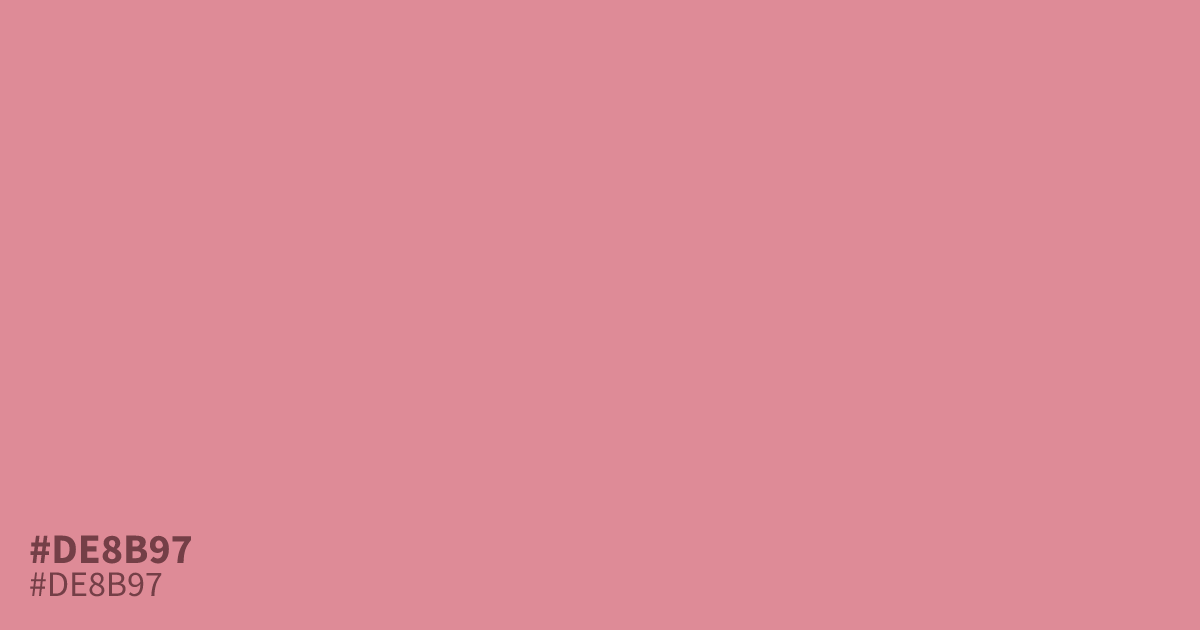
This muted, pastel red offers a gentle alternative to saturated, aggressive tones. Because of its desaturated quality, #de8b97 works best as a supporting tone in a 60/30/10 palette rather than a dominant background. It pairs effectively with dark charcoal greys, grounding the warmth and preventing the color from feeling too candy-like or juvenile. For web accessibility, ensure you use high-contrast black text over this shade.
Questions about #de8b97
What is #de8b97 in RGB, HSL and CMYK?
In RGB, #de8b97 is rgb(222, 139, 151), in HSL hsl(351, 56%, 71%) and in CMYK 0%, 37%, 32%, 13%. Browse more shades of pink with names and hex codes.
How should I use #de8b97 in a balanced color palette?
#de8b97 functions best as a supporting accent rather than a primary background color. Use it sparingly in a 60/30/10 ratio to bring warmth to neutral designs without overwhelming the viewer with an overly bright or juvenile tone.
What colors pair best with #de8b97 for a professional look?
This color pairs beautifully with deep charcoal or dark slate tones, which ground its inherent warmth. These dark neutrals provide enough contrast to make #de8b97 feel sophisticated and intentional, preventing it from appearing washed out or too soft.
Is #de8b97 readable on white or black?
#de8b97 has a 2.54:1 contrast ratio on white and 8.24:1 on black. WCAG asks for 4.5:1 for body text and 3:1 for large text, so on white it is too faint for text and on black it works for body text. Try other pairs in the contrast checker.