
#DDB7B2 Hex Color
Online color picker to view shades, tints, color codes, and complementary colors
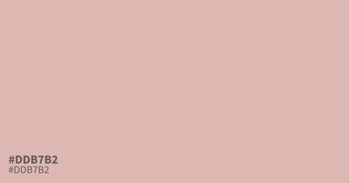
Soft as pressed face powder, #ddb7b2 is a dusty pastel red with a distinct gray undertone. Its very low saturation keeps things calm where pure red would shout, and black text on it hits about 11.5:1 contrast, clearing WCAG AA with room to spare. Use it as a wide background base or dominant tone, and pair it with deep forest green or charcoal so it never washes out next to plain white.
Questions about #ddb7b2
What is #ddb7b2 in RGB, HSL and CMYK?
In RGB, #ddb7b2 is rgb(221, 183, 178), in HSL hsl(7, 39%, 78%) and in CMYK 0%, 17%, 19%, 13%. Browse more shades of pink with names and hex codes.
What colors pair well with #ddb7b2?
Pair #ddb7b2 with deep sage or charcoal to give its pastel softness something to push against. Rich burgundy also works, lending the pale pink a grounded, mature edge.
Is #ddb7b2 readable on white or black?
#ddb7b2 has a 1.82:1 contrast ratio on white and 11.49:1 on black. WCAG asks for 4.5:1 for body text and 3:1 for large text, so on white it is too faint for text and on black it works for body text. Try other pairs in the contrast checker.