
#DD9292 Hex Color
A gentle and warm pastel red
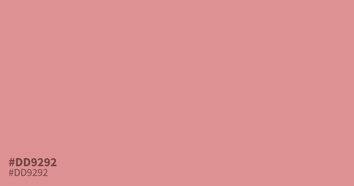
This pastel red possesses a desaturated, warm character that reads as friendly rather than aggressive. Because it offers high readability for text, #dd9292 works well as a background color, though its softness makes it ideal for baby-focused branding or spring-themed palettes. Pair this hex code with a dark charcoal instead of pure black for a modern, sophisticated look that avoids harsh contrast.
Questions about #dd9292
What is #dd9292 in RGB, HSL and CMYK?
In RGB, #dd9292 is rgb(221, 146, 146), in HSL hsl(0, 52%, 72%) and in CMYK 0%, 34%, 34%, 13%. Browse more shades of pink with names and hex codes.
Does #dd9292 work well as a text background?
Yes, #dd9292 is an excellent choice for background applications because its desaturated nature creates high readability for text. Pairing it with a deep charcoal or very dark gray instead of pure black will soften the contrast while maintaining a professional and modern look.
What design themes suit the color #dd9292?
The soft, muted quality of #dd9292 makes it ideal for baby-focused branding, spring-themed palettes, and wellness visuals. Its warmth reads as approachable rather than aggressive, helping to establish a calm and welcoming atmosphere in your design projects.
Is #dd9292 readable on white or black?
#dd9292 has a 2.44:1 contrast ratio on white and 8.60:1 on black. WCAG asks for 4.5:1 for body text and 3:1 for large text, so on white it is too faint for text and on black it works for body text. Try other pairs in the contrast checker.