
#DB9FDB Hex Color
Online color picker to view shades, tints, color codes, and complementary colors
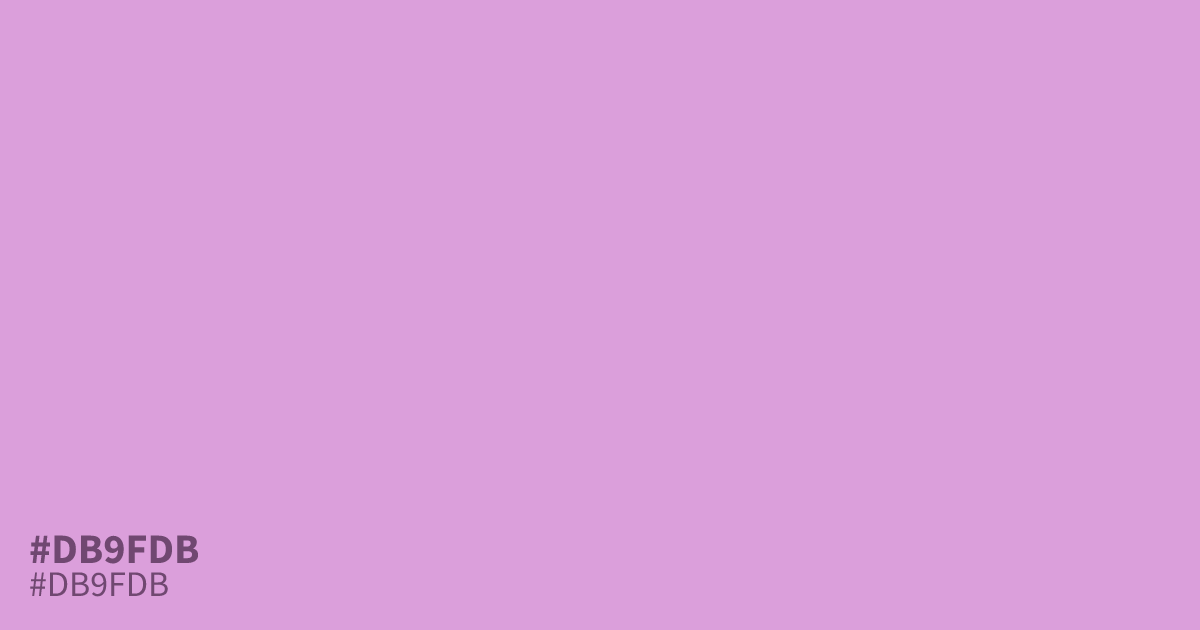
This pastel purple is a light, unsaturated shade that feels both fresh and gentle. As a soft tone, #db9fdb works well as a background color for spring themes or wellness branding. Designers find this hex code pairs effectively with deep charcoal text for high legibility. Because black text offers 10.0:1 contrast, it provides a clean, accessible choice for UI designs.
Questions about #db9fdb
What is #db9fdb in RGB, HSL and CMYK?
In RGB, #db9fdb is rgb(219, 159, 219), in HSL hsl(300, 45%, 74%) and in CMYK 0%, 27%, 0%, 14%. Browse more shades of purple with names and hex codes.
What design moods work best with #db9fdb?
#db9fdb evokes a sense of gentle wellness, spring freshness, and approachable sophistication. Because it is unsaturated and light, it avoids being overwhelming, making it an ideal choice for health, beauty, or lifestyle projects that require a calming, clean, and welcoming user experience.
Is #db9fdb readable on white or black?
#db9fdb has a 2.10:1 contrast ratio on white and 9.99:1 on black. WCAG asks for 4.5:1 for body text and 3:1 for large text, so on white it is too faint for text and on black it works for body text. Try other pairs in the contrast checker.