
#DB9FB3 Hex Color
Online color picker to view shades, tints, color codes, and complementary colors
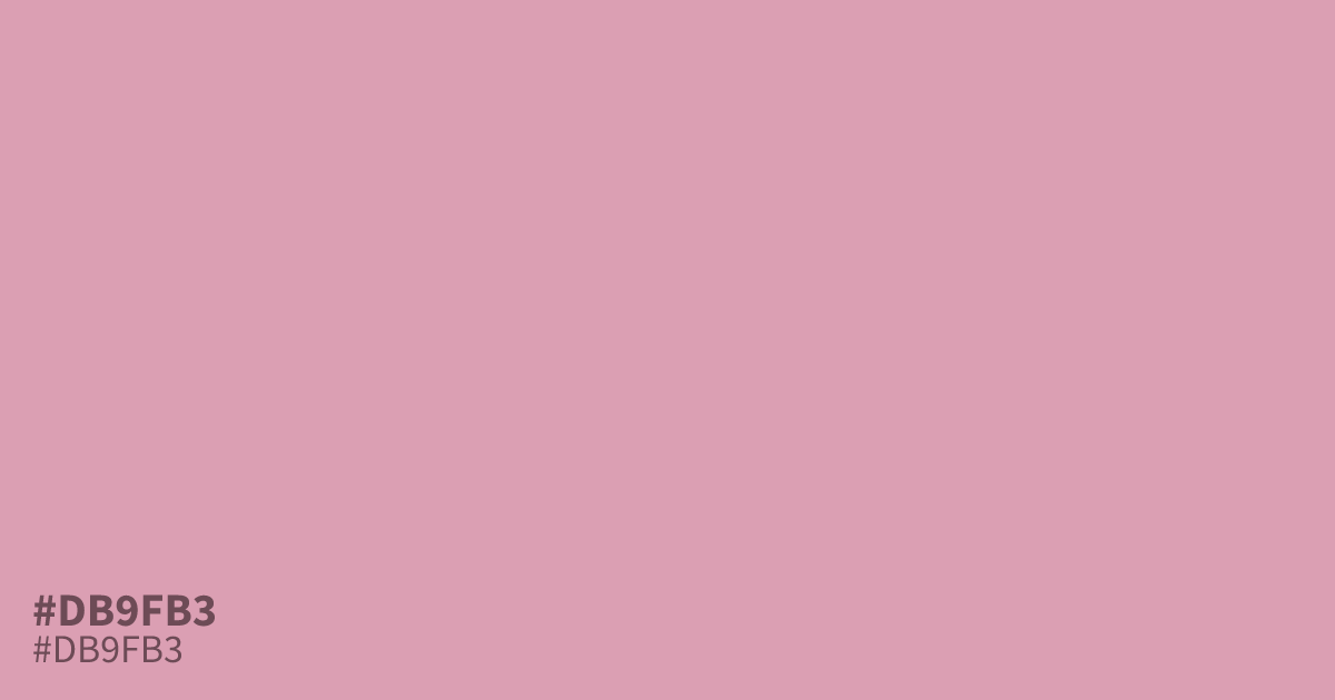
This dusty, desaturated pink balances warmth with a mellow, ashy undertone. Because it leans muted rather than vivid, #db9fb3 works well as a grounding background or a secondary accent in cosmetic and fashion design. It pairs beautifully with slate grays or muted greens to avoid looking overly sweet. Black text provides excellent readability against this shade, ensuring clarity in user interfaces.
Questions about #db9fb3
What is #db9fb3 in RGB, HSL and CMYK?
In RGB, #db9fb3 is rgb(219, 159, 179), in HSL hsl(340, 45%, 74%) and in CMYK 0%, 27%, 18%, 14%. Browse more shades of pink with names and hex codes.
What colors pair best with #db9fb3?
Is #db9fb3 suitable for UI design text?
While #db9fb3 is excellent for background elements or secondary brand accents, it generally lacks the contrast required for primary body text. For better readability, pair this dusty pink with dark charcoal or deep neutral tones to ensure your interface remains accessible and clear.
Is #db9fb3 readable on white or black?
#db9fb3 has a 2.18:1 contrast ratio on white and 9.62:1 on black. WCAG asks for 4.5:1 for body text and 3:1 for large text, so on white it is too faint for text and on black it works for body text. Try other pairs in the contrast checker.